10 superb examples of flat design done right
Flat design is the hot topic of the moment: check out these brilliant examples of flat design to inspire your own projects.
In the fast-changing world of UI design, many designers are waving goodbye to 3D effects, textures and gradients.
For now at least, it's about simple shapes, bold contrasting colours, considered use of type and grids, and smooth, intuitive navigation. That's right: the flat design trend is here to stay.
Microsoft's official release of Windows 8 in October 2012 was a landmark moment for the trend: tied to the release of the Surface, it was optimised for touch and marked a real aesthetic turning point for the much-mocked software behemoth. And as last week's sneak peek of iOS 7 shows, even the mighty Apple - once a glowing beacon of skeuomorphism, complete with realistic flame texture of course - has begun to pare everything back, with the legendary Jony Ive at the helm.
And the trend goes well beyond operating systems. Whether it’s an app design, a device interface or the simplest portfolio website, these 10 great examples show flat design aficionados how it should be done...
- Read all our web design articles here
01. Hundreds
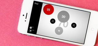
Pitched intriguingly as “a puzzle game about the space between you and the serene”, Hundreds is a beautifully simple app based around circles and numbers. To win, you tap the bubbles to reach a target of 100. If that sounds easy, each bubble you tap turns red - and if two red bubbles collide, it's game over.
Levels get progressively harder, of course, but the combination of flat-colour shapes and simple typography puts the addictive gameplay at the forefront throughout, without unnecessary graphic frills and flourishes. In short, this is the very essence of great flat design.
02. Etch
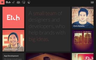
An app design studio based in Canterbury, Kent, Etch describes itself as "5 designers, 2 developers and 1 person counting the pennies". Working across iOS, Android and the web, the studio specialises in UI design, and it practises what it preaches on its own portfolio website.
Get the Creative Bloq Newsletter
Daily design news, reviews, how-tos and more, as picked by the editors.
The website’s look and feel has an unmistakable 'Windows 8' flavour to it, built around a sliding grid of coloured squares and clean, thin sans-serif type. A strip of flat-colour pictograms comprises the navigation bar, rounding off the flat design effect nicely.
03. Wiselist
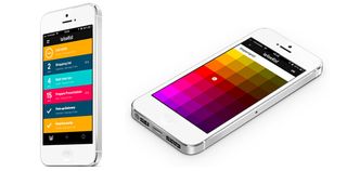
One of a slew of beautifully crafted task management apps that draw on the flat design aesthetic (such as Realmac’s Clear), Wiselist was designed by Albert Pereta and Miguel Sanchez, who describe it as "not only simple, but wise".
In a particularly neat touch, each of its colour-coded categories (or 'wiselists') can contain its own sub-checklists, notes or even relevant files to help you complete the task at hand. Of course, each one is fully customisable to keep your life in order in your own way.
04. LayerVault
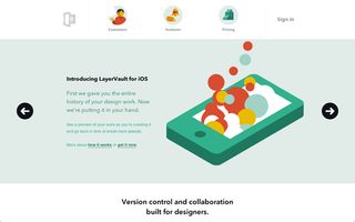
A stylish open-source tool that enables file storage, version control and an easy delivery and review platform all in one place, LayerVault is a multi-platform solution that's built for OS X, and now also available as an iOS app to synch the latest iterations of your design from your desktop to your mobile or tablet.
Best of all, LayerVault is a proud exponent of the flat design revolution: from the design of its website, complete with engaging flat-colour illustrations, right through to the app interface itself, where bold graphic grids in a rainbow of hues are the order of the day.
05. Taasky
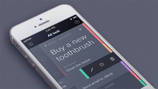
Following in the footsteps of Clear and Wiselist, this rather crisply designed task management app is proudly minimalist, putting simplicity, speed and ease of use above of all else.
Taasky is all about prioritising tasks, with the rationale that we work best when focusing on one thing at once - hence the larger 'priority' task at the top of the list.
The app is still in development: you can sign up on the website to be notified when it's ready for release, or follow creator Jakub Antalík's progress on Dribbble.
06. Mailchimp
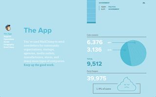
Everyone's favourite e-newsletter design, creation and management tool, Mailchimp recently underwent a ground-up makeover - stripping out unnecessary clutter from the app (as well as the company's website) to put clean, flat design firmly at its core.
Mailchimp's use of mellow hues - it opts for shades of olive, teal or terracotta, rather than bright primary colours - ties the slick design together beautifully, with subtle, gently rounded corners softening the edges.
07. COWON X9 Super Player
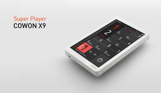
It's not often that the interface design of a portable media player gets a look in alongside Cupertino's ubiquitous iDevices or its immediate competitors, but this South Korean electronics firm's take on UI design puts its own twist on flat design.
The X9 Super Player in particular splits the home screen into an appealing grid of black and grey rectangles, with minimal white and red typography and simple line-drawing icons. It also rotates seamlessly between vertical and horizontal orientations.
08. Lorenzo Verzini
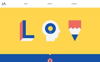
An Italian designer and art director living in London, Lorenzo Verzini specialises in 'digital branding experiences' for a range of clients. After spending four years working at leading digital studio Sennep, he's now an in-demand freelancer and his portfolio website is an inspiring showcase of flat design craft.
The neat little animated icons that are dotted around the site - including a blinking eye, sliding pencil, and flipping journal - are kept very graphic and simple, with a four-colour palette of red, blue, white and yellow tying the design together neatly.
09. Currency
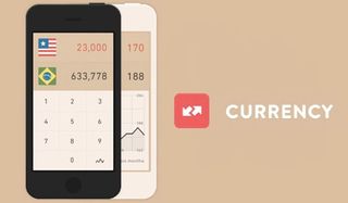
Built around a system of graphic flat colour flags, this neat little app makes the process of converting currencies considerably more visually appealing than many of its rivals, and is a great example of flat design done well.
Some 180 countries are represented in total, each with its own square flag icon – and the app also includes live comparison charts, all contained within a simple one gesture interface that enables delete, clear and undo functions with one swipe of your finger.
10. Squidee
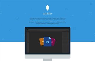
Finally, we have Squidee: a simple tool to aid the creative process when working remotely, enabling designers to share incremental changes to a project quickly and easily, so revisions can be compared visually to cut out the need for explaining every little detail over email or phone.
Like Taasky, this app is still in development, but you can sign up for an invite on the site and try out a demo version. The site has already caught the attention of various design bloggers for its visually appealing flat design aesthetic, and it’s easy to see why.
Words: Nick Carson
Liked this? Read these!
- Brilliant Wordpress tutorial selection
- The ultimate guide to designing the best logos
- The best free web fonts for designers
What do you think of the flat design trend? Let us know in the comments below!

Thank you for reading 5 articles this month* Join now for unlimited access
Enjoy your first month for just £1 / $1 / €1
*Read 5 free articles per month without a subscription

Join now for unlimited access
Try first month for just £1 / $1 / €1
The Creative Bloq team is made up of a group of design fans, and has changed and evolved since Creative Bloq began back in 2012. The current website team consists of eight full-time members of staff: Editor Georgia Coggan, Deputy Editor Rosie Hilder, Ecommerce Editor Beren Neale, Senior News Editor Daniel Piper, Editor, Digital Art and 3D Ian Dean, Tech Reviews Editor Erlingur Einarsson and Ecommerce Writer Beth Nicholls and Staff Writer Natalie Fear, as well as a roster of freelancers from around the world. The 3D World and ImagineFX magazine teams also pitch in, ensuring that content from 3D World and ImagineFX is represented on Creative Bloq.

