There is an unfathomable amount of tradition, history and pride that accompanies Major League Baseball teams and their logos. For the Chicago Cubs this history extends way back to the 1876 when they play their first National League Baseball game as the Chicago White Stockings against Louisville, and win 4-0. Skip forward a few years to 1902, and the Chicago Daily News pens the Nickname "Cubs" as the team moniker. The moniker became popular with fans over the next few years and was officially adopted by the club in 1907 - the same year they win their first World Series title against the Tigers 2-0. Amazingly, it is one of the longest running and most beloved-alias' in baseball.
Unfortunately the wonder years for the mighty Chicago Cubs has been and gone and they are now sitting in last place in their division. There has been some new developments at the club though, with the introduction of a new mascot "Clark the Cub" in an effort to re-vitalize both the fans and the team. Clark may not have had the desired effect for the team, but a complete overhaul of the logo design might do the trick. Carlos Nazario from Da Windy City had some insights into a redesigned logo for the Cubs:
Perhaps it is time to refresh it a bit. With the team struggling for another season, a new logo could inject some enthusiasm. Of course, fielding a winning team could do the same. Hey, it can’t be as bad as Clark the mascot, right?
The club has had many logos over the years, but the current iteration has been in place since 1979 – the Cubs have both the oldest stadium and the oldest logo.
To give the Chicago Cubs a little helping hand back onto the winning podium and to get some World Series pendants around those players necks, we invited our designers from across the globe to re-imagine the Cubs signature design with a logo design contest - with or without Clark.
The team over at Sports Grid, who absolutely love the current Cubs logo, were curious of the results.
Not saying we don’t absolutely love the Cubs logo — it’s timeless — but we’re interested to see how graphic artists re-imagined the iconic emblem
So, with another dismal season for the Chicago Cubs underway in 2014, let's have a look at how the designers here at DesignCrowd did in giving the team a facelift.
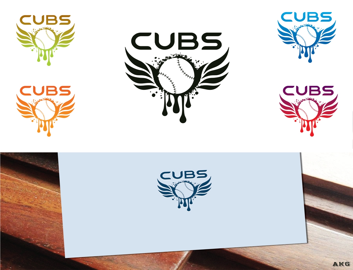
by AKG from India
What do you think of the logo designs? Inspired you to launch your own logo design contest? Do you think the Chicago Cubs could have done better if they had crowdsourced the logo design in the first place? Let us know in the comments.
See more ...
Sports Logo Maker
Baseball Logo Maker
Bear Logo Maker
Team Logo Maker
Written by Clancy Clarke on Friday, August 22, 2014
Clancy is the Organic Search manager at DesignCrowd. Clancy has over 7 years of online marketing experience and a passion for analytics. Get in touch via Google+.
