Designing a richer YouTube experience for your TVs
Mar 13, 2024 – [[read-time]] minute read

Mar 13, 2024 – [[read-time]] minute read
More than ever before, viewers are turning to the largest screen in their homes – their TVs – to watch their favorite YouTube content from vlogs, to video games, to sports highlights and more.
And while watching television has historically been considered a passive experience, one where you can sit back and enjoy your favorite programs, we’re building one that is uniquely YouTube that gives viewers the opportunity to engage with the content they’re watching, even on the big screen. As watchtime on TVs has grown to more than 1 billion hours per day, we’re faced with a fun challenge: How can we bring familiar YouTube features and interactivity to the living room while ensuring that the video remains at the center of the experience?

While the living room has traditionally been a place for “lean back” experiences, we’ve learned through our user research that when a viewer is excited about the content, they like to multitask: they flow between leaning back to watch, and leaning in to enhance their experience. As a result, viewers want a richer, distraction-free TV experience that they feel in control of. With this in mind, our team sought to find a way to add greater engagement to the living room, while still striking the right balance between interactivity and immersion.
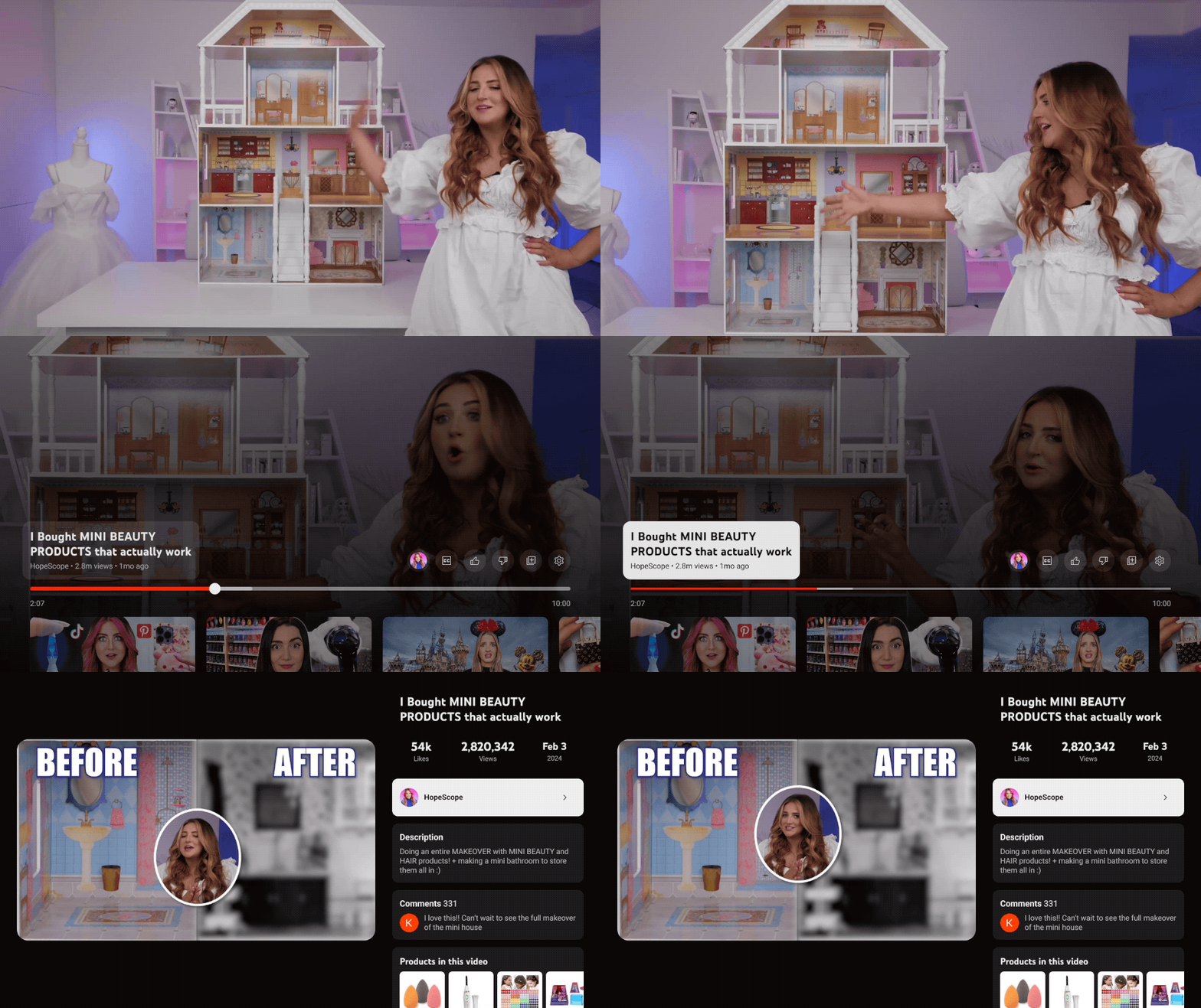
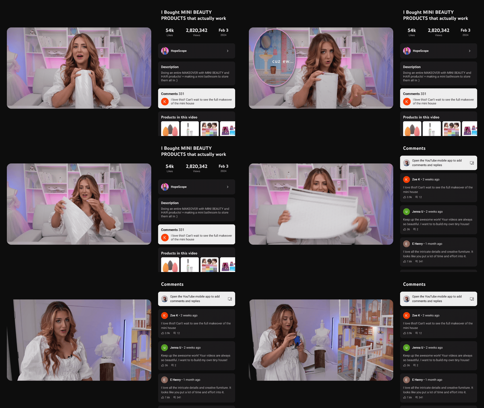
We began tinkering with the idea of reducing the size of the video player and simplifying the interactions, so signature features such as comments can live alongside the content rather than obscuring it. This became the foundation for how we could bring the best of YouTube directly to the living room. Rolling out over the next few weeks, our new design will not only improve existing functionality like accessing video descriptions and comments, but also open the door for a broad range of new experiences such as shopping for your creators’ favorite products and viewing live scores for sports fans.

While we wanted to introduce more interactivity for viewers, we needed to ensure that the primary video actions (pause, rewind, fast forward) remained easily accessible and intuitive - after all, content is the core of YouTube.
Finding this balance meant simplifying user interactions to accommodate the remote control, while simultaneously making sure the new design would be applicable to a wide range of use cases.
We developed a series of prototypes, ranging in complexity based on the number of steps a user would need to take ranging from simple (toggling the design on or off) to moderate (enabling lightweight controls over the video player) to complex (all controls are accessible in the small player window).

To gather insights, we tapped into user feedback provided by participants who could interact with these three different approaches to watch different types of content directly on a TV with a remote.
What we learned from our users was:
This research allowed us to gauge the usability of each prototype and better understand if this overall new design aligned with our goal to enable a more interactive experience on TV.

What users will be able to see on their TVs is a design solution that keeps the video front and center, but layers in the ability to access the features that make YouTube unique — all without interrupting the viewing experience.
During testing, users shared with us that they wanted the video to be smaller so they could better read comments while watching. And we hope this design enables users to engage more deeply with other features such as chapters, key plays and shopping, all directly on their TVs.
On the YouTube app on TV, viewers can use this new experience to read through comments and video descriptions, and in the next few days we’re also bringing this to our YouTube TV subscribers so they can explore Views without disrupting the game they're watching.
We’ll continue to explore how we can extend this to support our growing set of interactive experiences on TVs, such as live chat, fantasy view, and multiview. And as always, we’d love your feedback!