Who will be the next
?





Meet the HOSTS
Meet the JUDGES
Analysis and Insight - Presentations

Luke ran an in depth analysis using data collection tools Python vs. R, SQL vs. XLS, and Tableau vs. Power BI. 1:42

Shashank filtered through a heavy dataset to map out and visualize location based job data using an open source API. 6:23

Zach maps out the data jop postings from the full dataset and creates a dashboard listing skills, requirements, demand and more. 3:36

Hunter narrows down the datased based on keywork idenrifiers and creates uniqe visualisations to explain the data. 4:12

Mark uses advance filters to identidy data related jobs and shows which cities have the most opportunities for data analysts. 2:50

Keith integrates job data with an open source mapping API in order to find cities with the most opportunities for jobs (Remote Oregon?). 3:55
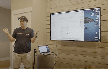
Avery ploughs his way through mounds of unemployment data in order to identify corelations in job postings. 5:08
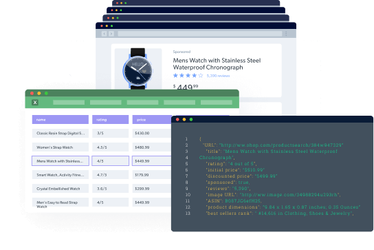
Datasets and Web Data Collection Tools Powered by Bright Data
With Bright Data you can:
- Tap into all publicly available data points on a website, which can be very challenging to discover when collecting yourself.
- Get fresh, precise, and complete datasets, covering millions of pages and tens of millions of public data points.
- Increase the value and usability of your dataset by integrating multiple data sources to create a valuable enriched dataset.
Learn More - Full Analysis Videos
Learn more about how our analysist tackled their dataset and turned data into actionable insights.
Follow these videos to learn from their though process and data anlysis skills. If they can take on a full dataset so can you, the data is out there now it’s in your hands.
Are you the next Iron Analyst?
Interested in collaborating with Bright Data?


