

As part of our series on the new taxi logo at right, we invited readers to submit their own designs. This is the final set we’ll be publishing at the post level, but readers are welcome to continue posting links to their proposals in the comments below.
From Amanda P.:
Srta. Puri explains her contribution, below: “It’s a Spanish-Madrid city taxi turned into a yellow cab, to help foreigners abroad find a taxi.”
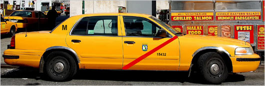
Alistair Hall at We Made This writes, “If they’re gonna integrate the NYC logo into a taxi logo, they should just go the whole hog (with the added bonus of being NYC going from A to B). With hugs and kisses from London.”
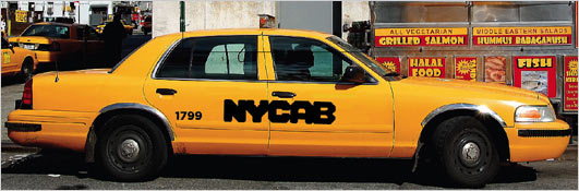
Jennifer Ward of Brooklyn sent us this one:
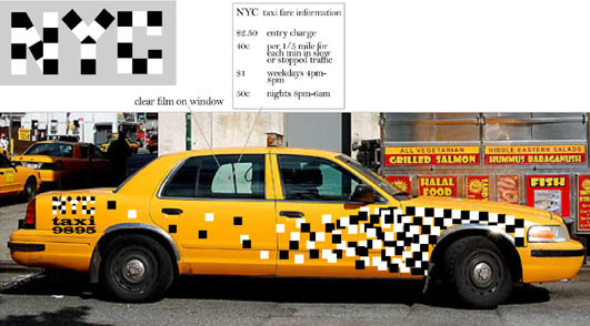
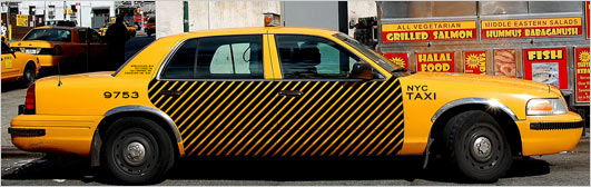
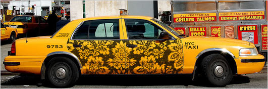
“Instead of worrying about text so much, why not just make them simple and beautiful?” asks Bobby S. “What if cabs across the city were decorated with different patterns, making cabs something beautiful to look at?” Here are his proposals:
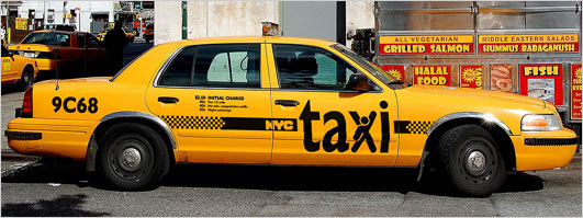
And lastly, from Michael Condouris, who writes about his design below: “Make it easy to read, incorporate the checker pattern into the X for a little designiness, and you’ve got something fun, obvious and clear.”
Thanks, everybody.
Comments are no longer being accepted.