1. Introduction
Material Design is a system for building bold and beautiful digital products. By uniting style, branding, interaction, and motion under a consistent set of principles and components, product teams can realize their greatest design potential.
| Material Components (MDC) help developers implement Material Design. Created by a team of engineers and UX designers at Google, MDC features dozens of beautiful and functional UI components and is available for Android, iOS, web and Flutter.material.io/develop |
What is Material's motion system for Flutter?
The Material motion system for Flutter is a set of transition patterns within the animations package that can help users understand and navigate an app, as described in the Material Design guidelines.
The four main Material transition patterns are as follows:
- Container Transform: transitions between UI elements that include a container; creates a visible connection between two distinct UI elements by seamlessly transforming one element into another.
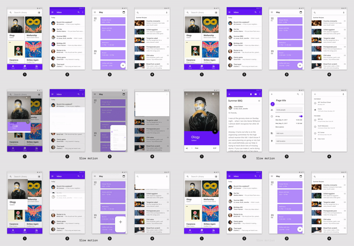
- Shared Axis: transitions between UI elements that have a spatial or navigational relationship; uses a shared transformation on the x, y, or z axis to reinforce the relationship between elements.
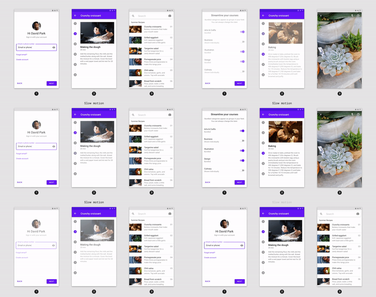
- Fade Through: transitions between UI elements that do not have a strong relationship to each other; uses a sequential fade out and fade in, with a scale of the incoming element.

- Fade: used for UI elements that enter or exit within the bounds of the screen.

The animations package offers transition widgets for these patterns, built on top of both the Flutter animations library (flutter/animation.dart) and the Flutter material library (flutter/material.dart):
In this codelab you will be using the Material transitions built on top of the Flutter framework and Material library, meaning you will be dealing with widgets. :)
What you'll build
This codelab will guide you through building some transitions into an example Flutter email app called Reply, using Dart, to demonstrate how you can use transitions from the animations package to customize the look and feel of your app.
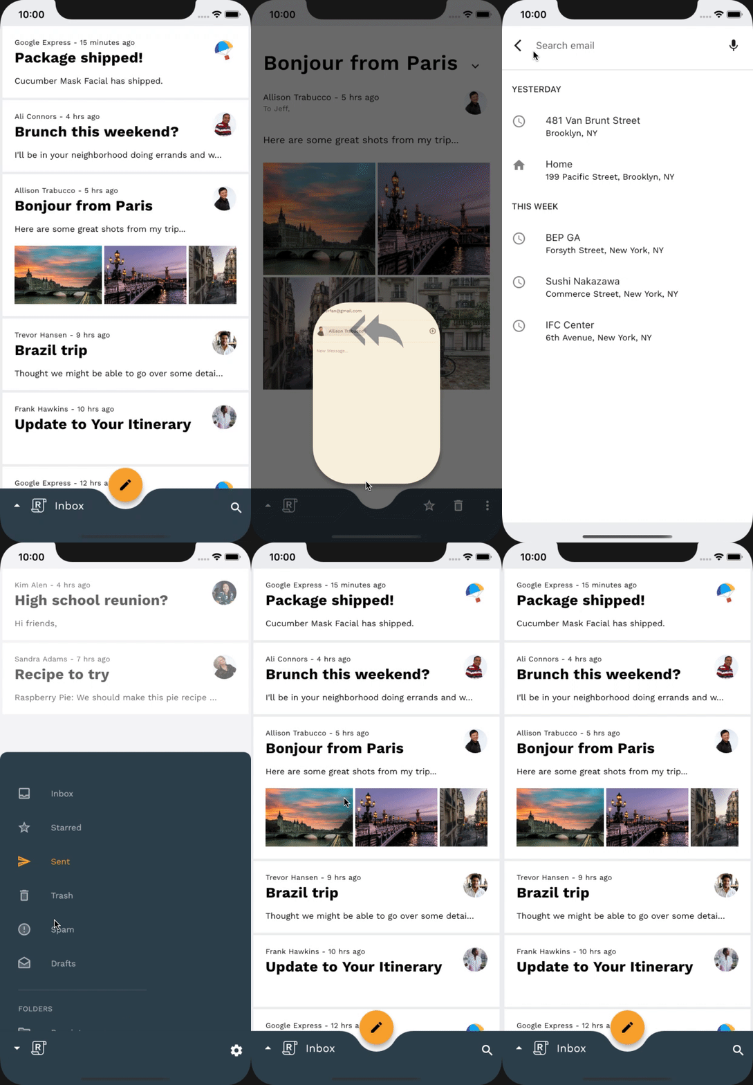
The starter code for the Reply app will be provided, and you will incorporate the following Material transitions into the app, which can be seen in the completed codelab's GIF below:
- Container Transform transition from email list to email detail page
- Container Transform transition from FAB to compose email page
- Shared Z-Axis transition from search icon to search view page
- Fade Through transition between mailbox pages
- Fade Through transition between compose and reply FAB
- Fade Through transition between disappearing mailbox title
- Fade Through transition between bottom app bar actions

What you'll need
- Basic knowledge of Flutter development and Dart
- A code editor
- An Android/iOS emulator or device
- The sample code (see next step)
How would you rate your level of experience building Flutter apps?
What would you like to learn from this codelab?
2. Set up your Flutter development environment
You need two pieces of software to complete this lab—the Flutter SDK and an editor.
You can run the codelab using any of these devices:
- A physical Android or iOS device connected to your computer and set to Developer mode.
- The iOS simulator (requires installing Xcode tools).
- The Android Emulator (requires setup in Android Studio).
- A browser (Chrome is required for debugging).
- As a Windows, Linux, or macOS desktop application. You must develop on the platform where you plan to deploy. So, if you want to develop a Windows desktop app, you must develop on Windows to access the appropriate build chain. There are operating system-specific requirements that are covered in detail on docs.flutter.dev/desktop.
3. Download the codelab starter app
Option 1: Clone the starter codelab app from GitHub
To clone this codelab from GitHub, run the following commands:
git clone https://github.com/material-components/material-components-flutter-motion-codelab.git
cd material-components-flutter-motion-codelab
Option 2: Download the starter codelab app zip file
The starter app is in the material-components-flutter-motion-codelab-starter directory.
Verify project dependencies
The project depends on the animations package. In the pubspec.yaml, notice the dependencies section includes the following:
animations: ^2.0.0
Open the project and run the app
- Open the project in your editor of choice.
- Follow the instructions to "Run the app" in Get Started: Test drive for your chosen editor.
Success! The starter code for Reply's homepage should run on your device/emulator. You should see the Inbox containing a list of emails.

Optional: Slow down device animations
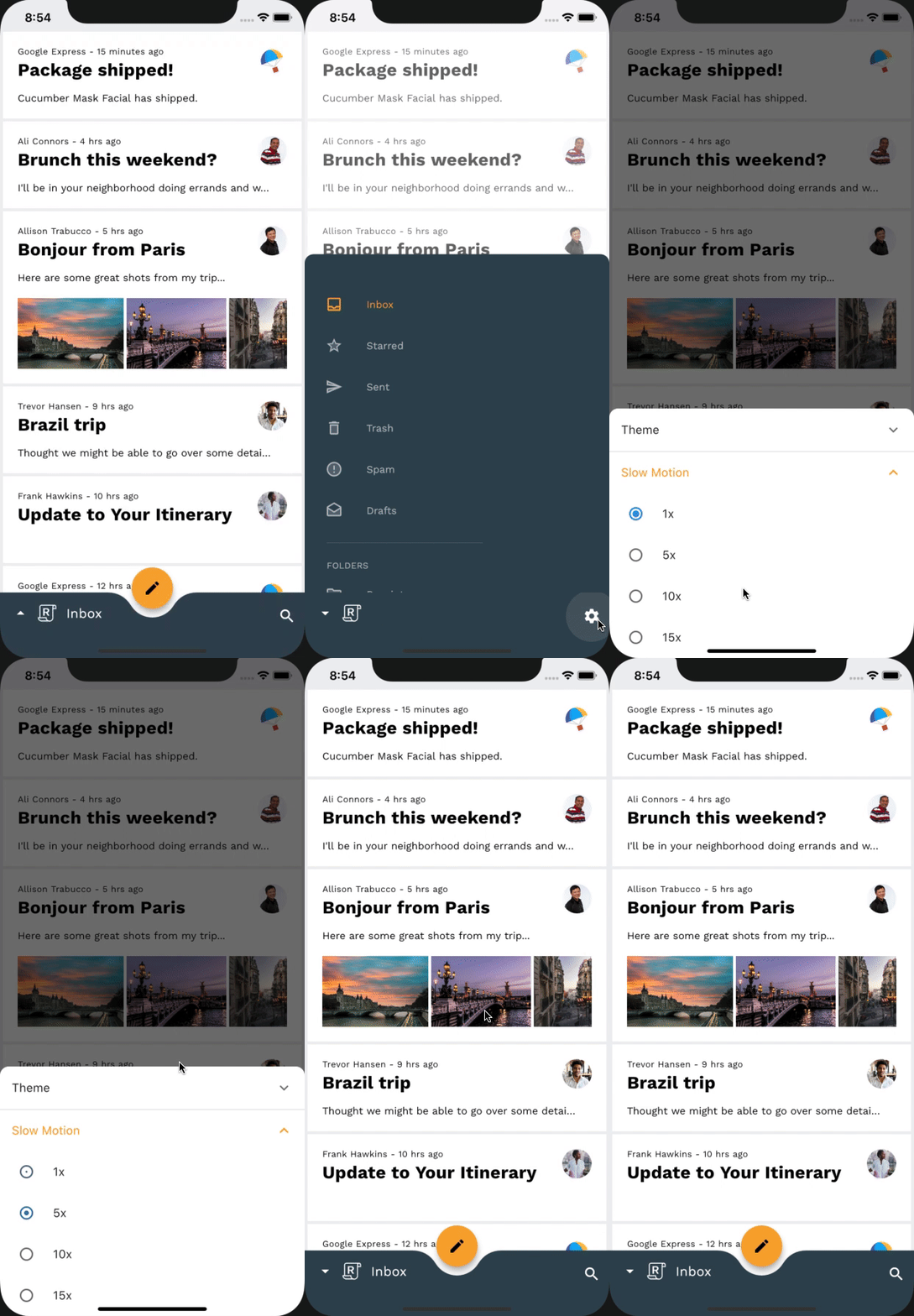
Since this codelab involves quick, yet polished transitions, it can be useful to slow down the device's animations to observe some finer details of the transitions as you are implementing. This can be accomplished through an in-app setting, accessible through a tap on the settings icon when the bottom drawer is open. Do not worry, this method of slowing down device animations will not affect animations on the device outside of the Reply app.
Optional: Dark Mode
If the bright theme of Reply is hurting your eyes, look no further. There is an included in-app setting that allows you to change the app theme to dark mode, to better suit your eyes. This setting is accessible by tapping the settings icon when the bottom drawer is open.

4. Get familiar with the sample app code
Let's look at the code. We've provided an app that uses the animations package to transition between different screens in the application.
- HomePage: displays the selected mailbox
- InboxPage: displays a list of emails
- MailPreviewCard: displays a preview of an email
- MailViewPage: displays a single, full email
- ComposePage: allows for the composition of a new email
- SearchPage: displays a search view
router.dart
First, to understand how the app's root navigation is setup, open up router.dart in the lib directory:
class ReplyRouterDelegate extends RouterDelegate<ReplyRoutePath>
   with ChangeNotifier, PopNavigatorRouterDelegateMixin<ReplyRoutePath> {
 ReplyRouterDelegate({required this.replyState})
     : navigatorKey = GlobalObjectKey<NavigatorState>(replyState) {
   replyState.addListener(() {
     notifyListeners();
   });
 }

 @override
 final GlobalKey<NavigatorState> navigatorKey;

 RouterProvider replyState;

 @override
 void dispose() {
   replyState.removeListener(notifyListeners);
   super.dispose();
 }

 @override
 ReplyRoutePath get currentConfiguration => replyState.routePath!;

 @override
 Widget build(BuildContext context) {
   return MultiProvider(
     providers: [
       ChangeNotifierProvider<RouterProvider>.value(value: replyState),
     ],
     child: Selector<RouterProvider, ReplyRoutePath?>(
       selector: (context, routerProvider) => routerProvider.routePath,
       builder: (context, routePath, child) {
         return Navigator(
           key: navigatorKey,
           onPopPage: _handlePopPage,
           pages: [
             // TODO: Add Shared Z-Axis transition from search icon to search view page (Motion)
             const CustomTransitionPage(
               transitionKey: ValueKey('Home'),
               screen: HomePage(),
             ),
             if (routePath is ReplySearchPath)
               const CustomTransitionPage(
                 transitionKey: ValueKey('Search'),
                 screen: SearchPage(),
               ),
           ],
         );
       },
     ),
   );
 }

 bool _handlePopPage(Route<dynamic> route, dynamic result) {
   // _handlePopPage should not be called on the home page because the
   // PopNavigatorRouterDelegateMixin will bubble up the pop to the
   // SystemNavigator if there is only one route in the navigator.
   assert(route.willHandlePopInternally ||
       replyState.routePath is ReplySearchPath);

   final bool didPop = route.didPop(result);
   if (didPop) replyState.routePath = const ReplyHomePath();
   return didPop;
 }

 @override
 Future<void> setNewRoutePath(ReplyRoutePath configuration) {
   replyState.routePath = configuration;
   return SynchronousFuture<void>(null);
 }
}
This is our root navigator, and it handles our app's screens that consume the entire canvas, such as the HomePage and the SearchPage. It listens to our app's state to check if we have set the route to the ReplySearchPath. If we have, then it rebuilds our navigator with the SearchPage at the top of the stack. Notice that our screens are wrapped in a CustomTransitionPage with no transitions defined. This shows you one way to navigate between screens without any custom transition.
home.dart
We set our route to ReplySearchPath in our app's state by doing the following inside of _BottomAppBarActionItems in home.dart:
Align(
 alignment: AlignmentDirectional.bottomEnd,
 child: IconButton(
   icon: const Icon(Icons.search),
   color: ReplyColors.white50,
   onPressed: () {
     Provider.of<RouterProvider>(
       context,
       listen: false,
     ).routePath = const ReplySearchPath();
   },
 ),
);
In our onPressed parameter, we access our RouterProvider and set its routePath to ReplySearchPath. Our RouterProvider keeps track of our root navigators state.
mail_view_router.dart
Now, let's see how our app's inner navigation is set up, open up mail_view_router.dart in the lib directory. You'll see a navigator similar to the one above:
class MailViewRouterDelegate extends RouterDelegate<void>
   with ChangeNotifier, PopNavigatorRouterDelegateMixin {
 MailViewRouterDelegate({required this.drawerController});

 final AnimationController drawerController;

 @override
 Widget build(BuildContext context) {
   bool _handlePopPage(Route<dynamic> route, dynamic result) {
     return false;
   }

   return Selector<EmailStore, String>(
     selector: (context, emailStore) => emailStore.currentlySelectedInbox,
     builder: (context, currentlySelectedInbox, child) {
       return Navigator(
         key: navigatorKey,
         onPopPage: _handlePopPage,
         pages: [
           // TODO: Add Fade through transition between mailbox pages (Motion)
           CustomTransitionPage(
             transitionKey: ValueKey(currentlySelectedInbox),
             screen: InboxPage(
               destination: currentlySelectedInbox,
             ),
           )
         ],
       );
     },
   );
 }
...
}
This is our inner navigator. It handles our app's inner screens that consume only the body of the canvas, such as the InboxPage. The InboxPage displays a list of emails depending on what the current mailbox is in our app's state. The navigator is rebuilt with the correct InboxPage on top of the stack, whenever there is a change in the currentlySelectedInbox property of our app's state.
home.dart
We set our current mailbox in our app's state by doing the following inside of _HomePageState in home.dart:
void _onDestinationSelected(String destination) {
 var emailStore = Provider.of<EmailStore>(
   context,
   listen: false,
 );

 if (emailStore.onMailView) {
   emailStore.currentlySelectedEmailId = -1;
 }

 if (emailStore.currentlySelectedInbox != destination) {
   emailStore.currentlySelectedInbox = destination;
 }

 setState(() {});
}
In our _onDestinationSelected function, we access our EmailStore and set its currentlySelectedInbox to the selected destination. Our EmailStore keeps track of our inner navigators state.
home.dart
Lastly, to see an example of a navigation routing being used, open up home.dart in the lib directory. Locate the _ReplyFabState class, inside the InkWell widget's onTap property, which should look like this:
onTap: () {
 Provider.of<EmailStore>(
   context,
   listen: false,
 ).onCompose = true;
 Navigator.of(context).push(
   PageRouteBuilder(
     pageBuilder: (
       BuildContext context,
       Animation<double> animation,
       Animation<double> secondaryAnimation,
     ) {
       return const ComposePage();
     },
   ),
 );
},
This shows how you can navigate to the email compose page, without any custom transition. During this codelab, you will dive into Reply's code to set up Material transitions that work in tandem with the various navigation actions throughout the app.
Now that you're familiar with the starter code, let's implement our first transition.
5. Add Container Transform transition from email list to email detail page
To begin, you will add a transition when clicking on an email. For this navigation change, the container transform pattern is well suited, as it's designed for transitions between UI elements that include a container. This pattern creates a visible connection between two UI elements.
Before adding any code, try running the Reply app and clicking on an email. It should do a simple jump-cut, which means the screen is replaced with no transition:
Before

Begin by adding an import for the animations package at the top of mail_card_preview.dart as shown in the following snippet:
mail_card_preview.dart
import 'package:animations/animations.dart';
Now that you have an import for the animations package, we can begin adding beautiful transitions to your app. Let's start by creating a StatelessWidget class that will house our OpenContainer widget.
In mail_card_preview.dart, add the following code snippet after the class definition of the MailPreviewCard:
mail_card_preview.dart
// TODO: Add Container Transform transition from email list to email detail page (Motion)
class _OpenContainerWrapper extends StatelessWidget {
 const _OpenContainerWrapper({
   required this.id,
   required this.email,
   required this.closedChild,
 });

 final int id;
 final Email email;
 final Widget closedChild;

 @override
 Widget build(BuildContext context) {
   final theme = Theme.of(context);
   return OpenContainer(
     openBuilder: (context, closedContainer) {
       return MailViewPage(id: id, email: email);
     },
     openColor: theme.cardColor,
     closedShape: const RoundedRectangleBorder(
       borderRadius: BorderRadius.all(Radius.circular(0)),
     ),
     closedElevation: 0,
     closedColor: theme.cardColor,
     closedBuilder: (context, openContainer) {
       return InkWell(
         onTap: () {
           Provider.of<EmailStore>(
             context,
             listen: false,
           ).currentlySelectedEmailId = id;
           openContainer();
         },
         child: closedChild,
       );
     },
   );
 }
}
Now let's put our new wrapper to use. Inside of the MailPreviewCard class definition we will wrap the Material widget from our build() function with our new _OpenContainerWrapper:
mail_card_preview.dart
// TODO: Add Container Transform transition from email list to email detail page (Motion)
return _OpenContainerWrapper(
 id: id,
 email: email,
 closedChild: Material(
...
Our _OpenContainerWrapper has an InkWell widget and the color properties of the OpenContainer define the color of the container it encloses. Therefore, we can remove the Material and Inkwell widgets. The resulting code looks as follows:
mail_card_preview.dart
// TODO: Add Container Transform transition from email list to email detail page (Motion)
return _OpenContainerWrapper(
 id: id,
 email: email,
 closedChild: Dismissible(
   key: ObjectKey(email),
   dismissThresholds: const {
     DismissDirection.startToEnd: 0.8,
     DismissDirection.endToStart: 0.4,
   },
   onDismissed: (direction) {
     switch (direction) {
       case DismissDirection.endToStart:
         if (onStarredInbox) {
           onStar();
         }
         break;
       case DismissDirection.startToEnd:
         onDelete();
         break;
       default:
     }
   },
   background: _DismissibleContainer(
     icon: 'twotone_delete',
     backgroundColor: colorScheme.primary,
     iconColor: ReplyColors.blue50,
     alignment: Alignment.centerLeft,
     padding: const EdgeInsetsDirectional.only(start: 20),
   ),
   confirmDismiss: (direction) async {
     if (direction == DismissDirection.endToStart) {
       if (onStarredInbox) {
         return true;
       }
       onStar();
       return false;
     } else {
       return true;
     }
   },
   secondaryBackground: _DismissibleContainer(
     icon: 'twotone_star',
     backgroundColor: currentEmailStarred
         ? colorScheme.secondary
         : theme.scaffoldBackgroundColor,
     iconColor: currentEmailStarred
         ? colorScheme.onSecondary
         : colorScheme.onBackground,
     alignment: Alignment.centerRight,
     padding: const EdgeInsetsDirectional.only(end: 20),
   ),
   child: mailPreview,
 ),
);
At this stage, you should have a fully working container transform. Clicking on an email expands the list item into a details screen while receding the list of emails. Pressing back collapses the email details screen back into a list item while scaling up in the list of emails.
After

6. Add Container Transform transition from FAB to compose email page
Let's continue with container transform and add a transition from the Floating Action Button to ComposePage expanding the FAB to a new email to be written by the user. First, re-run the app and click on the FAB to see that there is no transition when launching the email compose screen.
Before

The way we configure this transition will be very similar to how we did it in the last step, since we are using the same widget class, the OpenContainer.
In home.dart, let's import the package:animations/animations.dart at the top of the file, and modify the _ReplyFabState build() method. Let's wrap the returned Material widget with an OpenContainer widget:
home.dart
// TODO: Add Container Transform from FAB to compose email page (Motion)
return OpenContainer(
 openBuilder: (context, closedContainer) {
   return const ComposePage();
 },
 openColor: theme.cardColor,
 onClosed: (success) {
   Provider.of<EmailStore>(
     context,
     listen: false,
   ).onCompose = false;
 },
 closedShape: circleFabBorder,
 closedColor: theme.colorScheme.secondary,
 closedElevation: 6,
 closedBuilder: (context, openContainer) {
   return Material(
     color: theme.colorScheme.secondary,
     ...
In addition to the parameters used to configure our previous OpenContainer widget, onClosed is now also being set. onClosed is a ClosedCallback that is called when the OpenContainer route has been popped or has returned to the closed state. The return value of that transaction is passed to this function as an argument. We use this Callback to notify our app's provider that we have left the ComposePage route, so that it can notify all listeners.
Similar to what we did for our last step, we will remove the Material widget from our widget since the OpenContainer widget handles the color of the widget returned by the closedBuilder with closedColor. We will also remove our Navigator.push() call inside of our InkWell widget's onTap, and replace it with the openContainer() Callback given by the OpenContainer widget's closedBuilder, since now the OpenContainer widget is handling its own routing.
The resulting code is as follows:
home.dart
// TODO: Add Container Transform from FAB to compose email page (Motion)
return OpenContainer(
 openBuilder: (context, closedContainer) {
   return const ComposePage();
 },
 openColor: theme.cardColor,
 onClosed: (success) {
   Provider.of<EmailStore>(
     context,
     listen: false,
   ).onCompose = false;
 },
 closedShape: circleFabBorder,
 closedColor: theme.colorScheme.secondary,
 closedElevation: 6,
 closedBuilder: (context, openContainer) {
   return Tooltip(
     message: tooltip,
     child: InkWell(
       customBorder: circleFabBorder,
       onTap: () {
         Provider.of<EmailStore>(
           context,
           listen: false,
         ).onCompose = true;
         openContainer();
       },
       child: SizedBox(
         height: _mobileFabDimension,
         width: _mobileFabDimension,
         child: Center(
           child: fabSwitcher,
         ),
       ),
     ),
   );
 },
);
Now to clean up some old code. Since our OpenContainer widget now handles notifying our app's provider that we are no longer on the ComposePage through the onClosed ClosedCallback, we can remove our previous implementation in mail_view_router.dart:
mail_view_router.dart
// TODO: Add Container Transform from FAB to compose email page (Motion)
emailStore.onCompose = false; /// delete this line
return SynchronousFuture<bool>(true);
That's it for this step! You should have a transition from the FAB to compose screen that looks like the following:
After

7. Add Shared Z-Axis transition from search icon to search view page
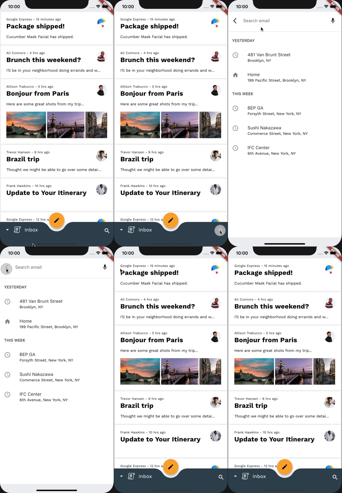
In this step, we'll add a transition from the search icon to the full screen search view. Since there is no persistent container involved in this navigation change, we can use a Shared Z-Axis transition to reinforce the spatial relationship between the two screens and indicate moving one level upward in the app's hierarchy.
Before adding additional code, try running the app and tapping the search icon at the bottom right corner of the screen. This should bring up the search view screen with no transition.
Before
To begin, let's go to our router.dart file. After our ReplySearchPath class definition add the following snippet:
router.dart
// TODO: Add Shared Z-Axis transition from search icon to search view page (Motion)
class SharedAxisTransitionPageWrapper extends Page {
 const SharedAxisTransitionPageWrapper(
     {required this.screen, required this.transitionKey})
     : super(key: transitionKey);

 final Widget screen;
 final ValueKey transitionKey;

 @override
 Route createRoute(BuildContext context) {
   return PageRouteBuilder(
       settings: this,
       transitionsBuilder: (context, animation, secondaryAnimation, child) {
         return SharedAxisTransition(
           fillColor: Theme.of(context).cardColor,
           animation: animation,
           secondaryAnimation: secondaryAnimation,
           transitionType: SharedAxisTransitionType.scaled,
           child: child,
         );
       },
       pageBuilder: (context, animation, secondaryAnimation) {
         return screen;
       });
 }
}
Now, let's utilize our new SharedAxisTransitionPageWrapper to achieve the transition we want. Inside of our ReplyRouterDelegate class definition, under the pages property, let's wrap our search screen with a SharedAxisTransitionPageWrapper instead of a CustomTransitionPage:
router.dart
return Navigator(
 key: navigatorKey,
 onPopPage: _handlePopPage,
 pages: [
   // TODO: Add Shared Z-Axis transition from search icon to search view page (Motion)
   const CustomTransitionPage(
     transitionKey: ValueKey('Home'),
     screen: HomePage(),
   ),
   if (routePath is ReplySearchPath)
     const SharedAxisTransitionPageWrapper(
       transitionKey: ValueKey('Search'),
       screen: SearchPage(),
     ),
 ],
);
Now try re-running the app.

Things are starting to look great! When you click on the search icon in the bottom app bar, a shared axis transition scales the search page into view. However, notice how the home page does not scale out and instead stays static as the search page scales in over it. Additionally, when pressing the back button, the home page does not scale into view, instead it stays static as the search page scales out of view. So we're not done yet.
Let's fix both issues by also wrapping the HomePage with our SharedAxisTransitionWrapper instead of a CustomTransitionPage:
router.dart
return Navigator(
 key: navigatorKey,
 onPopPage: _handlePopPage,
 pages: [
   // TODO: Add Shared Z-Axis transition from search icon to search view page (Motion)
   const SharedAxisTransitionPageWrapper(
     transitionKey: ValueKey('home'),
     screen: HomePage(),
   ),
   if (routePath is ReplySearchPath)
     const SharedAxisTransitionPageWrapper(
       transitionKey: ValueKey('search'),
       screen: SearchPage(),
     ),
 ],
);
That's it! Now try re-running the app and tapping on the search icon. The home and search view screens should simultaneously fade and scale along the Z-axis in depth, creating a seamless effect between the two screens.
After
8. Add Fade Through transition between mailbox pages
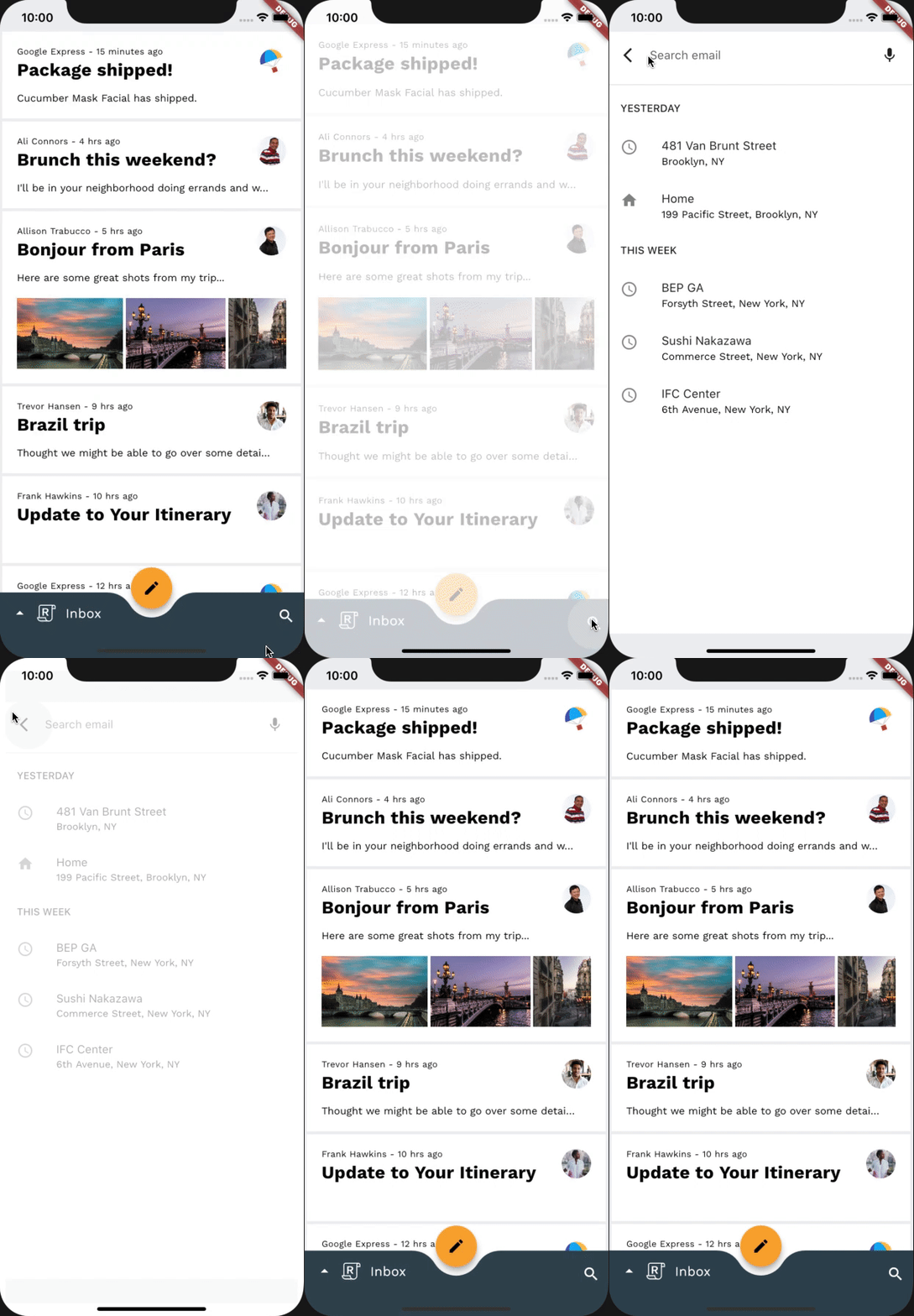
In this step, we'll add a transition between different mailboxes. Since we don't want to emphasize a spatial or hierarchical relationship, we'll use a fade through to perform a simple "swap" between lists of emails.
Before adding any additional code, try running the app, tapping on the Reply logo in the Bottom App Bar, and switching mailboxes. The list of emails should change with no transition.
Before

To begin, let's go to our mail_view_router.dart file. After our MailViewRouterDelegate class definition add the following snippet:
mail_view_router.dart
// TODO: Add Fade through transition between mailbox pages (Motion)
class FadeThroughTransitionPageWrapper extends Page {
 const FadeThroughTransitionPageWrapper({
   required this.mailbox,
   required this.transitionKey,
 })  : super(key: transitionKey);

 final Widget mailbox;
 final ValueKey transitionKey;

 @override
 Route createRoute(BuildContext context) {
   return PageRouteBuilder(
       settings: this,
       transitionsBuilder: (context, animation, secondaryAnimation, child) {
         return FadeThroughTransition(
           fillColor: Theme.of(context).scaffoldBackgroundColor,
           animation: animation,
           secondaryAnimation: secondaryAnimation,
           child: child,
         );
       },
       pageBuilder: (context, animation, secondaryAnimation) {
         return mailbox;
       });
 }
}
Similar to our last step, let's utilize our new FadeThroughTransitionPageWrapper to achieve the transition we want. Inside of our MailViewRouterDelegate class definition, under the pages property, instead of wrapping our mailbox screen with a CustomTransitionPage, use FadeThroughTransitionPageWrapper instead:
mail_view_router.dart
return Navigator(
 key: navigatorKey,
 onPopPage: _handlePopPage,
 pages: [
   // TODO: Add Fade through transition between mailbox pages (Motion)
   FadeThroughTransitionPageWrapper(
     mailbox: InboxPage(destination: currentlySelectedInbox),
     transitionKey: ValueKey(currentlySelectedInbox),
   ),
 ],
);
Re-run the app. When you open the bottom navigation drawer and change mailboxes, the current list of emails should fade and scale out while the new list fades and scales in. Nice!
After

9. Add Fade Through transition between compose and reply FAB
In this step, we'll add a transition between different FAB icons. Since we don't want to emphasize a spatial or hierarchical relationship, we'll use a fade through to perform a simple "swap" between the icons in the FAB.
Before adding any additional code, try running the app, tapping on an email and opening up the email view. The FAB icon should change without a transition.
Before

We will be working in home.dart for the remainder of the codelab, so don't worry about adding the import for the animations package since we already did for home.dart back in step 2.
The way we configure the next couple of transitions will be very similar, since they will all make use of a reusable class, _FadeThroughTransitionSwitcher.
In home.dart let's add the following snippet under _ReplyFabState:
home.dart
// TODO: Add Fade through transition between compose and reply FAB (Motion)
class _FadeThroughTransitionSwitcher extends StatelessWidget {
 const _FadeThroughTransitionSwitcher({
   required this.fillColor,
   required this.child,
 });

 final Widget child;
 final Color fillColor;

 @override
 Widget build(BuildContext context) {
   return PageTransitionSwitcher(
     transitionBuilder: (child, animation, secondaryAnimation) {
       return FadeThroughTransition(
         fillColor: fillColor,
         child: child,
         animation: animation,
         secondaryAnimation: secondaryAnimation,
       );
     },
     child: child,
   );
 }
}
Now, in our _ReplyFabState, look for the fabSwitcher widget. The fabSwitcher returns a different icon based on whether it's in email view or not. Let's wrap it with our _FadeThroughTransitionSwitcher:
home.dart
// TODO: Add Fade through transition between compose and reply FAB (Motion)
static final fabKey = UniqueKey();
static const double _mobileFabDimension = 56;

@override
Widget build(BuildContext context) {
 final theme = Theme.of(context);
 final circleFabBorder = const CircleBorder();

 return Selector<EmailStore, bool>(
   selector: (context, emailStore) => emailStore.onMailView,
   builder: (context, onMailView, child) {
     // TODO: Add Fade through transition between compose and reply FAB (Motion)
     final fabSwitcher = _FadeThroughTransitionSwitcher(
       fillColor: Colors.transparent,
       child: onMailView
           ? Icon(
               Icons.reply_all,
               key: fabKey,
               color: Colors.black,
             )
           : const Icon(
               Icons.create,
               color: Colors.black,
             ),
     );
...
We give our _FadeThroughTransitionSwitcher a transparent fillColor, so there is no background between elements when transitioning. We also create a UniqueKey and assign it to one of the icons.
Now, at this step, you should have a fully animated contextual FAB. Going into an email view causes the old FAB icon to fade and scale out while the new one fades and scales in.
After

10. Add Fade Through transition between disappearing mailbox title
In this step, we'll add a fade through transition, to fade through the mailbox title between a visible and invisible state when on an email view. Since we don't want to emphasize a spatial or hierarchical relationship, we'll use a fade through to perform a simple "swap" between the Text widget that encompasses the mailbox title, and an empty SizedBox.
Before adding any additional code, try running the app, tapping on an email and opening up the email view. The mailbox title should disappear without a transition.
Before

The rest of this codelab will be quick since we already did most of the work in our _FadeThroughTransitionSwitcher in our last step.
Now, let's go to our _AnimatedBottomAppBar class in home.dart to add our transition. We will be reusing _FadeThroughTransitionSwitcher from our last step, and wrapping our onMailView conditional, that either returns an empty SizedBox, or a mailbox title that fades in sync with the bottom drawer:
home.dart
...
const _ReplyLogo(),
const SizedBox(width: 10),
// TODO: Add Fade through transition between disappearing mailbox title (Motion)
_FadeThroughTransitionSwitcher(
 fillColor: Colors.transparent,
 child: onMailView
     ? const SizedBox(width: 48)
     : FadeTransition(
         opacity: fadeOut,
         child: Selector<EmailStore, String>(
           selector: (context, emailStore) =>
               emailStore.currentlySelectedInbox,
           builder: (
             context,
             currentlySelectedInbox,
             child,
           ) {
             return Text(
               currentlySelectedInbox,
               style: Theme.of(context)
                   .textTheme
                   .bodyMedium!
                   .copyWith(
                     color: ReplyColors.white50,
                   ),
             );
           },
         ),
       ),
),
That's it, we're done with this step!
Re-run the app. When you open up an email and are taken to the email view, the mailbox title in the bottom app bar should fade and scale out. Awesome!
After

11. Add Fade Through transition between bottom app bar actions
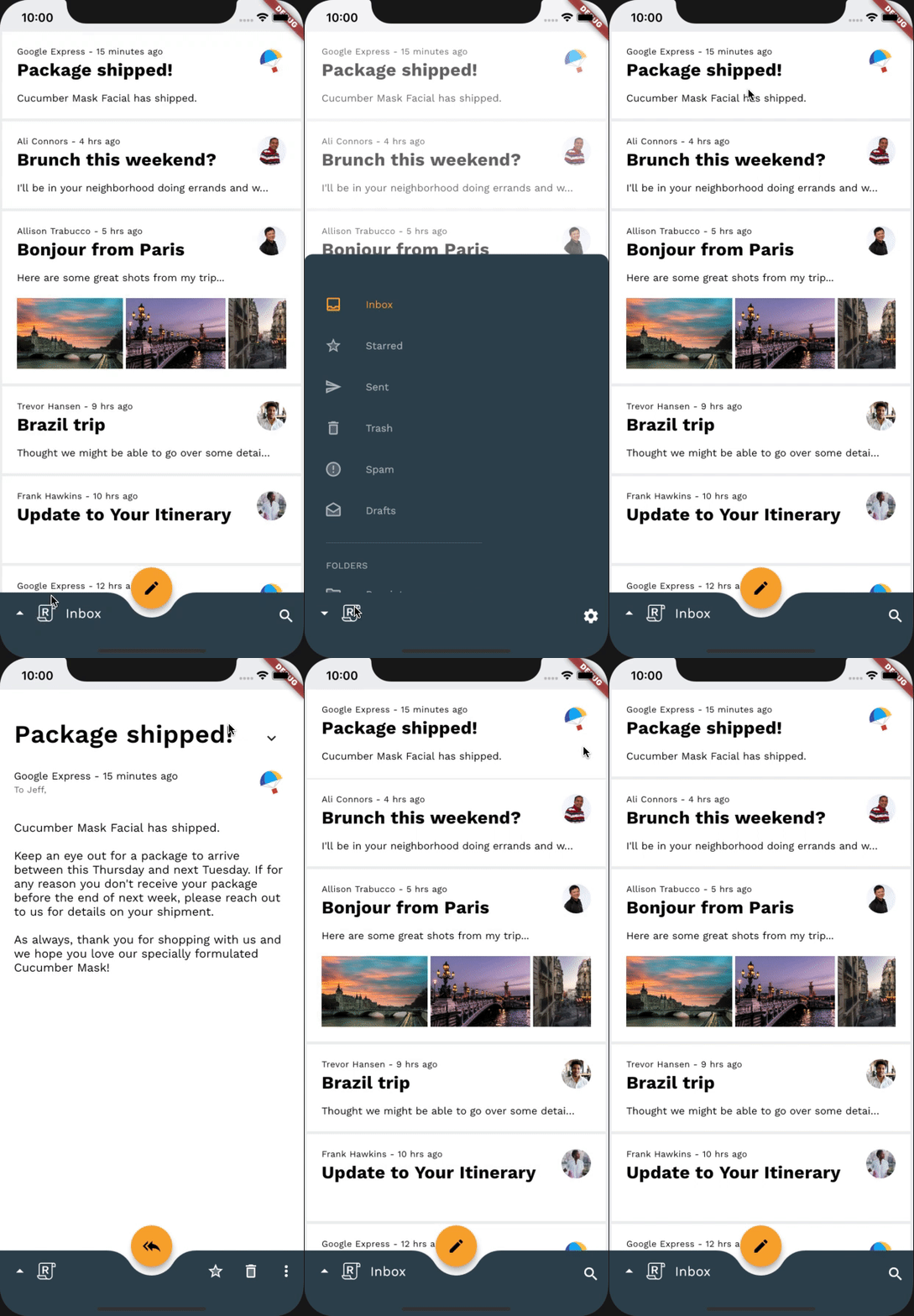
In this step, we'll add a fade through transition, to fade through the bottom app bar actions based on the applications context. Since we don't want to emphasize a spatial or hierarchical relationship, we'll use a fade through to perform a simple "swap" between the bottom app bar actions when the app is on the HomePage, when the bottom drawer is visible, and when we are on the email view.
Before adding any additional code, try running the app, tapping on an email and opening up the email view. You can also try tapping the Reply logo. The bottom app bar actions should change without a transition.
Before
Similar to the last step, we will be utilizing our _FadeThroughTransitionSwitcher again. To achieve the desired transition go to our _BottomAppBarActionItems class definition and wrap the return widget of our build() function with a _FadeThroughTransitionSwitcher:
home.dart
// TODO: Add Fade through transition between bottom app bar actions (Motion)
return _FadeThroughTransitionSwitcher(
 fillColor: Colors.transparent,
 child: drawerVisible
     ? Align(
         key: UniqueKey(),
         alignment: AlignmentDirectional.bottomEnd,
         child: IconButton(
           icon: const Icon(Icons.settings),
           color: ReplyColors.white50,
           onPressed: () async {
             drawerController.reverse();
             showModalBottomSheet(
               context: context,
               shape: RoundedRectangleBorder(
                 borderRadius: modalBorder,
               ),
               builder: (context) => const SettingsBottomSheet(),
             );
           },
         ),
       )
     : onMailView
...
Now let's try it! When you open up an email and are taken to the email view, the old bottom app bar actions should fade and scale out while the new actions fade and scale in. Well done!
After

12. Congratulations!
Using fewer than 100 lines of Dart code, the animations package has helped you create beautiful transitions in an existing app that conforms to the Material Design guidelines, and also looks and behaves consistently across all devices.
Next steps
For more information on the Material motion system, be sure to check out the guidelines and full developer documentation, and try adding some Material transitions to your app!
Thanks for trying Material motion. We hope you enjoyed this codelab!
I was able to complete this codelab with a reasonable amount of time and effort
I would like to continue using the Material motion system in the future
Check out the Flutter Gallery
| For more demos on how to use widgets provided by the Material Flutter library, as well the Flutter framework make sure to visit the Flutter Gallery. |
