Tabs organize content across different screens, data sets, and interactions. Tabs can be used to switch between views of distinct and related groups of information.

Resources
| Type | Link | Status |
|---|---|---|
| Design | Design source (Figma) | Available |
| Implementation | Jetpack Compose | Available |
Highlights
- Tabs can scroll horizontally. A UI can have as many tabs as needed.
- Tabs organize content into categories to help users find different types of information quickly.
- Tabs are displayed next to each other as peers, in categories of equal importance.
Variants
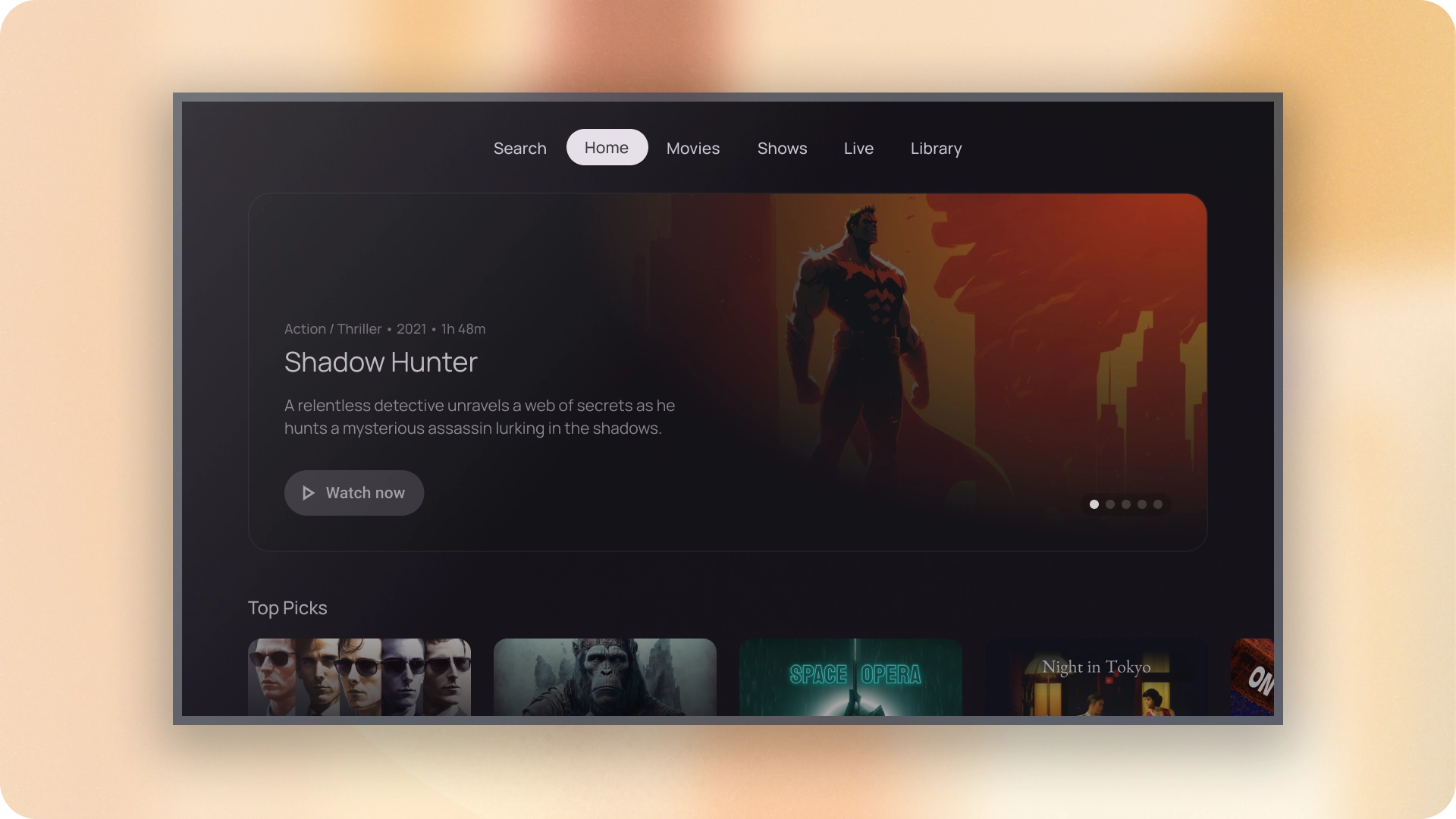
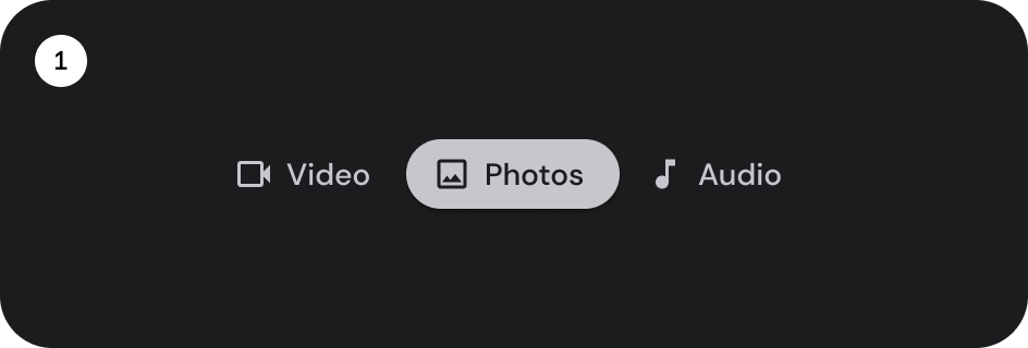
There are two types of tab indicators:


- Pill indicator
- Bar indicator
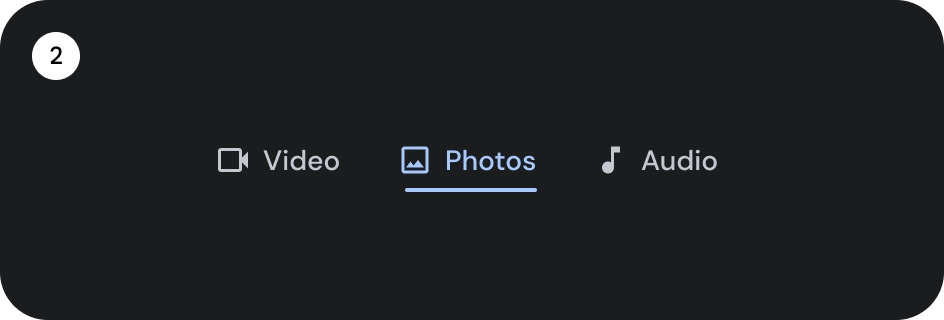
Choose the right type according to emphasis. Pill indicator tabs are recommended for organizing full pages. They display the main content destinations. Bar indicator tabs are used within a content area to further separate related content and establish hierarchy.
Anatomy

- Icon (optional)
- Label
- Active indicator
- Pill
- Bar
- Container
States

- Default
- Focused
- Selected
Specs

Behavior
When moving from one tab to the next the content below also slides left or right based on the tab movement.
