
Wenn du ein View-basiertes Layout verwendest, gibt es drei Hauptauswahlmöglichkeiten für
mit Ein-/Aus-Schaltflächen. Wir empfehlen die Verwendung des
SwitchMaterial-Komponente
aus dem Material
Komponenten:
<androidx.constraintlayout.widget.ConstraintLayout xmlns:android="http://schemas.android.com/apk/res/android"
    xmlns:app="http://schemas.android.com/apk/res-auto"
    android:layout_width="match_parent"
    android:layout_height="match_parent"
    android:padding="16dp">

    <com.google.android.material.switchmaterial.SwitchMaterial
        android:id="@+id/material_switch"
        android:layout_width="wrap_content"
        android:layout_height="wrap_content"
        android:text="@string/material_switch"
        app:layout_constraintEnd_toEndOf="parent"
        app:layout_constraintStart_toStartOf="parent"
        app:layout_constraintTop_toTopOf="parent" />

</androidx.constraintlayout.widget.ConstraintLayout>
Alte Apps verwenden möglicherweise weiterhin die ältere Version
SwitchCompat AppCompat
wie im folgenden Beispiel gezeigt:
<androidx.constraintlayout.widget.ConstraintLayout xmlns:android="http://schemas.android.com/apk/res/android"
    xmlns:app="http://schemas.android.com/apk/res-auto"
    android:layout_width="match_parent"
    android:layout_height="match_parent"
    android:padding="16dp">

    <androidx.appcompat.widget.SwitchCompat
        android:id="@+id/switchcompat"
        android:layout_width="wrap_content"
        android:layout_height="wrap_content"
        android:text="@string/switchcompat"
        app:layout_constraintEnd_toEndOf="parent"
        app:layout_constraintStart_toStartOf="parent"
        app:layout_constraintTop_toTopOf="parent" />

</androidx.constraintlayout.widget.ConstraintLayout>
Im folgenden Beispiel sehen Sie,
AppCompatToggleButton,
Dies ist eine weitere Legacy-Komponente mit einer deutlich anderen Benutzeroberfläche:
<androidx.constraintlayout.widget.ConstraintLayout xmlns:android="http://schemas.android.com/apk/res/android"
    xmlns:app="http://schemas.android.com/apk/res-auto"
    android:layout_width="match_parent"
    android:layout_height="match_parent"
    android:padding="16dp">

    <TextView
        android:id="@+id/toggle_button_label"
        android:layout_width="wrap_content"
        android:layout_height="wrap_content"
        app:layout_constraintStart_toStartOf="parent"
        app:layout_constraintEnd_toStartOf="@id/toggle"
        app:layout_constraintHorizontal_chainStyle="packed"
        app:layout_constraintBaseline_toBaselineOf="@id/toggle"
        android:text="@string/toggle_button" />

    <androidx.appcompat.widget.AppCompatToggleButton
        android:id="@+id/toggle"
        android:layout_width="wrap_content"
        android:layout_height="wrap_content"
        app:layout_constraintEnd_toEndOf="parent"
        app:layout_constraintStart_toEndOf="@id/toggle_button_label"
        app:layout_constraintTop_toTopOf="parent"
        app:layout_constraintBottom_toBottomOf="parent"/>

</androidx.constraintlayout.widget.ConstraintLayout>
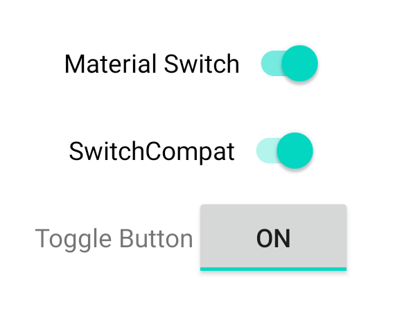
Diese drei Komponenten verhalten sich gleich, sehen aber unterschiedlich aus. Die
Unterschiede zwischen SwitchMaterial und SwitchCompat sind subtil, aber
AppCompatToggleButton unterscheidet sich deutlich:
Statusänderungen verarbeiten
SwitchMaterial, SwitchCompat und AppCompatToggleButton sind abgeleitete Klassen
von CompoundButton, die
gibt ihnen einen gemeinsamen Mechanismus für
den Umgang mit überprüften Statusänderungen. Sie implementieren
eine Instanz von
CompoundButton.OnCheckedChangeListener
und fügen es der Schaltfläche hinzu, wie im folgenden Beispiel gezeigt:
Kotlin
class MainActivity : AppCompatActivity() {
    override fun onCreate(savedInstanceState: Bundle?) {
        super.onCreate(savedInstanceState)

        val binding: SwitchLayoutBinding = SwitchLayoutBinding.inflate(layoutInflater)
        setContentView(binding.root)

        binding.materialSwitch.setOnCheckedChangeListener { _, isChecked ->
            if (isChecked) {
                // The switch is checked.
            } else {
                // The switch isn't checked.
            }
        }
    }
}
Java
public class MainActivity extends AppCompatActivity {

    @Override
    protected void onCreate(Bundle savedInstanceState) {
        super.onCreate(savedInstanceState);

        SwitchLayoutBinding binding = SwitchLayoutBinding.inflate(getLayoutInflater());
        setContentView(binding.getRoot());

        binding.materialSwitch.setOnCheckedChangeListener((buttonView, isChecked) -> {
            if (isChecked) {
                // The switch is checked.
            } else {
                // The switch isn't checked.
            }
        });
    }
}
CompoundButton.OnCheckedChangeListener ist eine einzelne abstrakte Methodenschnittstelle.
(oder SAM-Schnittstelle), sodass Sie sie als Lambda implementieren können. Das Lambda heißt
wenn sich der geprüfte Status ändert, und der Wert des booleschen Werts isChecked
die an die Lambda-Funktion übergeben wird,
zeigt den neuen Status „geprüft“ an.