User experience best practices

You want to make sure your users have a great experience using your extension—when you do, the good reviews and ratings will follow on addons.mozilla.org (AMO)

If you are new to the subject of making software usable, a good place to start is Jakob Nielsen’s Usability Heuristics. We recommend all developers use Nielsen’s Heuristics as a checklist when building and testing your user experience (UX).

Here we lay out the six steps to creating specific Firefox and extension UX features so that you can build an extension that entices, informs, delights, and retains your users.

In addition to the steps described here, your extension should follow Add-on Policies, which include being transparent with users about user security, privacy and control.

1. Keep it focused

The best Firefox extensions provide users with a new feature or capability that addresses a need—be it smarter, more efficient, or more enjoyable browsing. Ideally, your extension saves the user time, money, or frustration.

An extension is best when it is centered around one main use case, and addresses that use case as well as possible for the target audience:

  • It should add one function or set of closely related functions to the browser, modify a function of the browser, or modify web pages.
  • Determine if you have achieved this by asking whether you can easily communicate the features and purpose of the extension in three (short) sentences or less.

2. Give users what they need, where they need it

Choosing the right way, or combination of ways, to make your extension's functionality available to the user can have a significant effect on usability. Asking a few simple questions about your extension’s functionality can quickly guide you to the right choices:

Does my extension work on most websites and web pages?

If your extension provides the user with features they can use on almost every website or page, give the user access to it from a toolbar button using the browser action.

  • This might include providing access to your image editor or opening a page from your website.
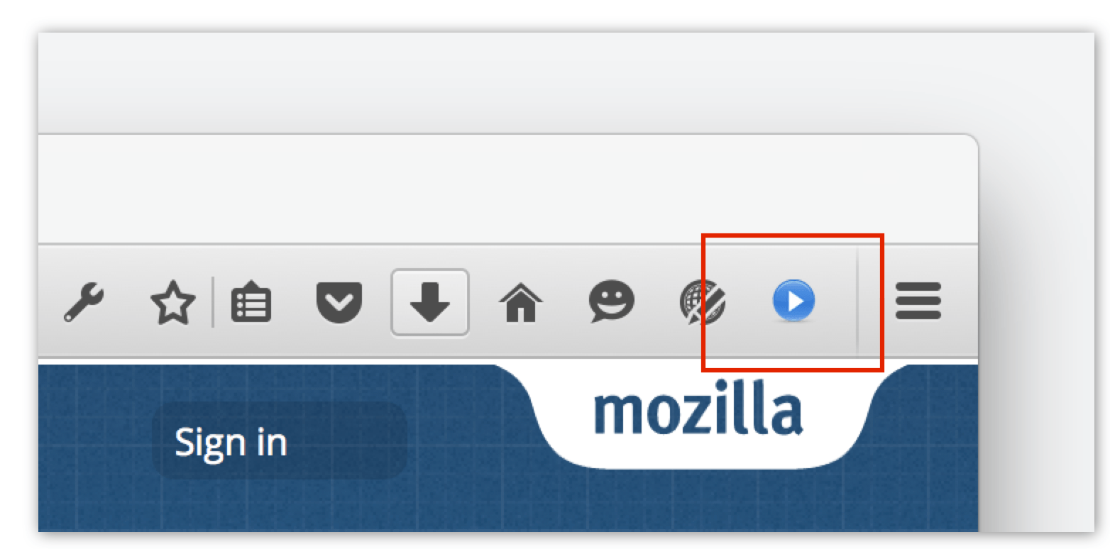
Where you have several features you want to give the user access, you can add a popup to the button (a popup appears like a door hanger that opens when the user selects the browser action button).

Does my extension work for only some web sites and pages?

If your extension offers a feature for a type of web page or specific domains, give the user access to it from an address bar button using a page action.

  • This might include providing access to your RSS reader on pages with RSS feeds or providing an extended feature to pages on your website.

Where you have several features you want to give the user access, you can add a popup to the button.

Does my extension need to show information or offer actions in parallel with web pages?

If your extension includes information or actions that a user would want immediate access to while viewing any web page, use a sidebar.

  • This might include notes the user can make about a page’s content or a feature offering various font substitutions to improve readability.
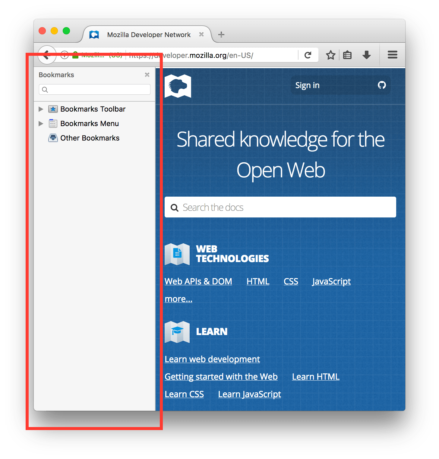
Does my extension offer functionality specific to page content or other browser features?

If your extension offers features the user might want to access in context, add them to an appropriate context menu.

  • This might include offering access to an image editor on the image context menu or offering extended copy features on the context menu for selected page content.
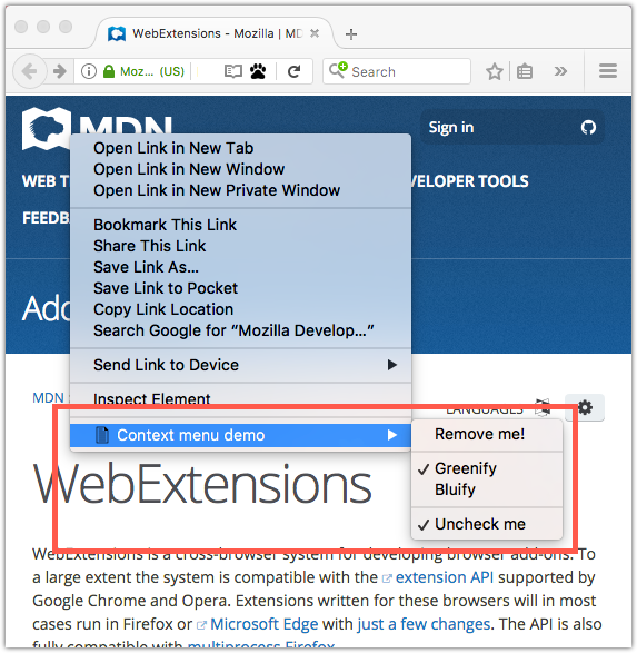
Example of content menu items added by a WebExtension, from the context-menu-demo example

Does my extension have settings the user can adjust?

If your extension enables the user to change and save settings that affect the behavior of the extension, use an options page to provide a standard Preferences link to settings from the Add-on Manager.

Typical preferences button, to access an extension's settings, from the Add-on Manager

In the Windows operating system, the “Preferences” button is labeled “Options”.

Does my extension need to gather a lot of information or display content in addition to the current tabs?

Where your extension needs to gather or display significant amounts of information (more than is suitable for an alert or would benefit from additional formatting) use bundled web pages to deliver forms and similar content.
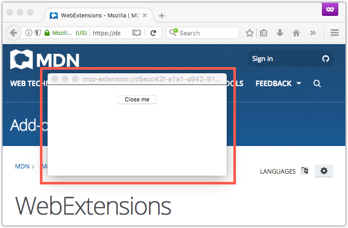
Example of a simple bundled page displayed as a detached panel.

Does my extension try to help the user find web pages or content?

If your extension includes functionality to locate web pages or content, such as offering a site-specific search, use address bar suggestions to deliver those recommendations.
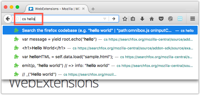
Example showing the result of the  WebExtension's customization of the address bar suggestions.

Does my extension offer tools for developers?

If you are providing tools for developers, add them to the Firefox developer tools using developer tools panels.

3. Keep the user informed

Ensuring the user knows what will happen, is happening, and has happened in your extension is an essential part of building trust and ensuring a happy user.

Tell the user what will happen, before it happens

Users should understand what will happen when they click a button:

  • Do provide a meaningful, descriptive button label.
  • Do provide tooltips that describe the action that the button will perform.
  • Do not put the name of the extension alone in the tooltip, unless it is descriptive of the action the button will perform.
  • Do not use the tooltip for any other types of information such as elaborate statistics about your extension. Keep the tooltip content simple and focused on what will happen when the user clicks the button.

If something is really important and the user may not be aware, notify them

If your extension has completed a critical, long running background task, use the operating system’s native notifications to update the user when the task completes. This can be useful where the user may not be focusing on the extension or the browser, when the task finishes.

However, use notifications sparingly. If it is sufficient for the user to discover that a process has completed when they return to the browser or extension, do not use notifications.

Use browserAction badges sparingly

To inform users of important events, you can add a badge over the toolbar icon of a browserAction. Do so sparingly—do not use badges to provide regular or persistent status updates.

When it comes to coloring a badge, using one of four colors for notifications of different severity is recommended:

  • Casual: blue
  • Success: green
  • Warning: yellow
  • Error: red

Use of Firefox colors is suggested, for more details see Firefox Colors. However, for purposes of Chrome and Opera compatibility, we support any color you wish to use.

4. Be Firefoxy in look and feel

Your users have chosen Firefox for a reason, possibly several reasons, so match your extension’s look and feel to that of Firefox using the Firefox Photon Design System.

Following Photon will ensure that your extension integrates with the Firefox experience and will make it easier for people to use.

5. Great onboarding experience

The first few minutes after someone installs your extension can be critical to its success. Your new user needs to know where to start and how to use the features of your browser extension.

Provide an onboarding page that gives users the essential information they need to get started. Keep the information brief and to the point, and provide simple configuration options if applicable. For more information on creating an onboarding page, see Best practices for onboarding, upboarding, and offboarding users.

In case the user skips the onboarding page, ensure that your extension is ready to be used immediately after installation. It should be optimized for its main use case, and work as expected for most users without the need for customization.

6. Test, test, and then test again

Testing is a vital part of creating an outstanding UX for your extension. There are two key aspects of testing your UX:

  1. Test across devices and platforms to ensure your extension works and performs well in as many places as possible. This includes considering factors such as the user’s screen size and resolution—just because your extension looks good and is easy to use on your desktop monitor does not mean it looks as good and works as well on a smaller laptop screen, or, indeed, vice versa.
  2. Test with as many users as possible. Do not assume that you know your audience, as people’s backgrounds and experience can make a huge difference to how they interact with your extension. So, allow for user testing as part of your extension’s development.

Testing tips:

  • In AMO you have the option to identify your extension as "experimental" or publish a beta or other non-final release.
    • If you flag your extension as experimental it is listed in AMO, but with a lower profile. When the extension is ready for a wider audience, you can turn off the experimental flag in AMO.
    • If you have a published extension, you can use the Development channel to offer an alpha or beta version for testing. You will need to direct your testers to the Development Channel of your extension’s listing or let your testers know the link to use to install your extension.
      The development channel section of an extension's listing page, offering access to alpha and beta versions for testing.
      When you are happy with your update, you can publish it as the new release version of your extension.
  • If you want to distribute your extension to users outside AMO, you can find the instructions for doing so, and the installation instructions you need to provide users, in the article on Sideloading add-ons. Remember that, unlike distribution through AMO, you will need to send users any updated versions of your extension as you make improvements.
  • Use the Responsive Design Mode to test your extension for its behavior on other screen sizes and device types.

Creating a great extension is an iterative process. While we’ve laid out the six steps here, you’ll likely revisit these as you learn what works and what doesn’t through user feedback, testing, and time.