Screen Readers 101 For Front-End Developers (Windows)
This post was born when, while writing another post, I found myself repeatedly trying to explain and demonstrate how the examples I’ve showed will affect screen reader users. It made me realize that many front-end developers have a blind spot of an entire aspect of the interface they are working on. To some extent, it is like developing a user interface without looking at the screen. Today’s screen readers are available for all operating systems, and most (if not all) of modern OSs have a built-in screen reader. Therefore, I thought it would be a good idea to compile a short guide to essential screen reader usage to help front end developers adding it as an additional item in their self-test tool belt.
In this post, I will refer to NV Access’s NVDA (NonVisual Desktop Access). If you are a Mac user, check out the Mac version of this post here.
This post is by no means intended to be a comprehensive user guide or for making you screen-readers experts, but merely to give you a tool that lets you peek into another layer of the UI you are delivering. It may affect many users’ user experience.
We will cover in a nutshell what screen readers are and how they work, as well as a few basic concepts for using them, mainly how to check that assistive technologies are conveying all the interface components as intended.
What are screen readers and how do they work?
A screen reader is a form of assistive technology (usually a software) used mostly (but not only) by people with vision impairments.
Screen readers provide audio and braille output, and most of them also have visual indicators.
Screen readers use the operating system’s accessibility APIs to parse and read the UI to the user. The problem is that each OS provides its specific accessibility API, and sure enough, you can’t find a cross-OS screen reader.
When it comes to the web, things are more complicated, since every browser has its own accessibility API that screen readers use to read the web page alongside the OS’s accessibility API. This assortment of APIs causes inconsistency and different ways how screen readers read the web page and support the WAI-ARIA attributes on different browsers. Therefore, each screen reader has its recommended browser for maximum compatibility. As mentioned, in this post, we will discuss NV Access’s NVDA. Firefox is its recommended browser, so therefore I’ll use this browser for the examples in this post.
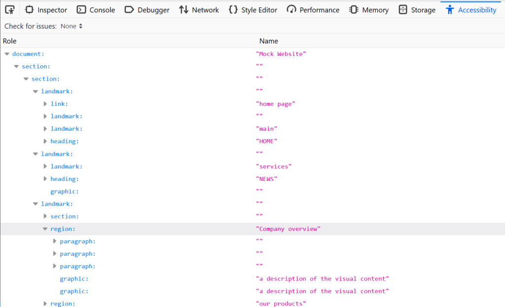
For reading web pages and web applications, screen readers use the “accessibility tree”, which is somewhat parallel to the DOM tree with the addition of accessibility features such as the definition of accessible-names and mapping of widgets states.
Now that we understand what screen readers are, and some of the challenges it brings with it, let’s start working with it and see how it works.
Basic Terminology
Before we install NVDA, I would like to introduce a few essential terms that NVDA uses. Some appear on first initiation so that we can be aligned:
NVDA modifier key
NVDA uses the modifier key to take over the keyboard events, so most NVDA commands require the modifier key to be pressed. By default, the Insert key is the modifier key, but NVDA gives an easy way to enable the Caps-lock key as a modifier as well, so you don’t need to keep one key pressed while you are working. Since a few keys can be used as a modifier key, it is often referred to as merely NVDA. I will use italic characters to emphasize that I am referring to the modifier key.
Focus highlight
Since screen readers are used not only by people with vision impairments, besides the auditory output, NVDA also has a visual indicator(s), called the focus highlight. There are three types of focus highlights, and each one corresponds to a different navigation method. The focus highlights are usually switched off by default, so in the next section, we will look at how to switch them on, and we will discuss each type’s role in more depth.
The Elements List
The elements list provides quick access to a list of various types of elements in the document, such as links, landmarks, heading, and more. For us as front end developers, the elements list provides a window to see what information a screen reader user has to build for himself to have a mental image of the UI. It can give us an idea of how each element is read and how the UI is structured. The elements list is the primary tool I will show on this post, which is for two reasons. The first one mentioned above gives you a good overview of some (though essential) accessibility aspects. Secondly, it provides essential insights for our needs as front end developers – even before going through the learning curve of actually working with NVDA. We will examine the elements list and see what we can learn from it about different elements’ accessibility.
In the next section we will see how to install and configure NVDA.
Installation and settings
First, I will mention that Windows OS, since “Windows 2000”, includes a built-in screen reader called Narrator. The reason why I chose for you to install NVDA is that it is the most popular screen reader for desktop and laptop machines nowadays. Since there are sometimes significant differences between screen readers, I chose the one that may affect the largest number of users.
Let’s start by downloading NVDA from the NV Access website. You can download it here (you will have to scroll the page a little to get to the download button).
Save and run the .exe file. You don’t need to change anything in the wizard.
After installing and launching NVDA, you will get a welcome screen with a few explanations about the modifier key and a few basic configuration options.
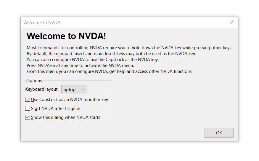
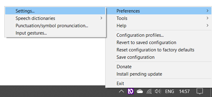
You can close this window. Now, let’s open NVDA’s settings. You can do that by pressing NVDA + n, or alternatively you can open it from the NVDA icon on the Windows taskbar.
Speech rate
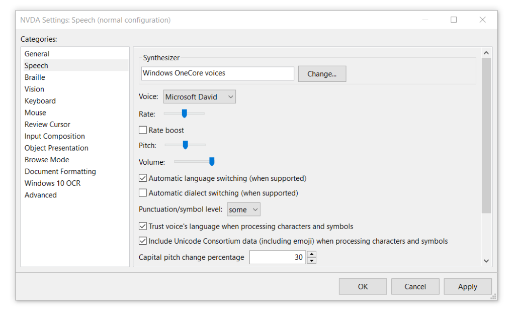
When I first opened a screen reader, it was somewhat overwhelming. In retrospect, I can say that one of the reasons for this was the screen reader’s speech rate, which was a bit fast for me, and I felt that I was missing important information. Having said that, in my opinion, NVDA’s default speech rate is very convenient – even to the novice user. However, our first goal is to make you feel comfortable using NVDA, so if you would like to adjust the speech rate, click the “speech” option on the categories pane of the settings window, where you can adjust the speech rate and some other speech related features.
Focus Highlights
As a user accustomed to relying on the visual interface, I find tracking an auditory interface to be rather challenging. Therefore, in my opinion, the focus highlight is an essential feature to make our accessibility tests easier and more intuitive.
The focus highlights are off by default; you can enable it on the settings window as well. To do that, click the “vision” option on the categories pane.
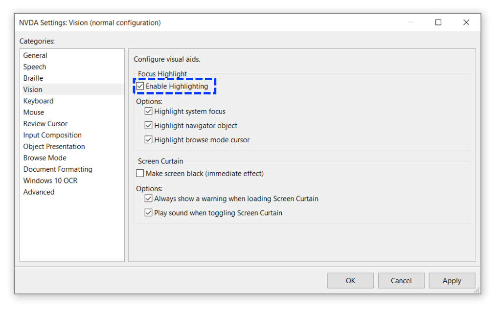
As you can see, if you check the “Enable Highlights” checkbox, it will automatically highlight the three options below it; you can check any combination of options that you prefer. Let’s look at the meaning of each option.
System focus
The system focus, also known simply as the focus (e.g., document.activeElement), is marked with a dashed blue frame. The system focus is applied solely to elements that can receive input from the user, such as links, buttons, text inputs, and other form controls. An element needs to be focused by a system focus for the user to be able to interact with it. You can navigate the page with the system focus by pressing Tab to go forward and Shift + Tab to go backward.

Navigator Object
The navigator object allows the user to explore the UI without moving the system focus, and also to explore elements that can’t be accessed normally using the keyboard, such as paragraphs (<p>) and <div>s, for example.
A solid pink frame marks the navigator object.
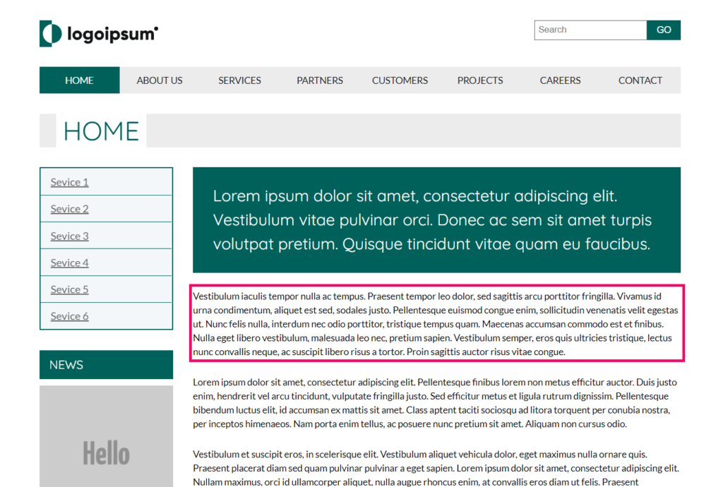
Note that the navigator object does not make elements active. Even if it is set on an interactable element, the active element stays the one in which the system focus is set on. You can move the navigator to the next element by pressing NVDA + shift + right arrow, and move to the previous element by pressing NVDA + shift + left arrow. You can also drill down to child elements by pressing NVDA + shift + down arrow and go back to the containing element by pressing NVDA + shift + up arrow (on a desktop keyboard layout, use the numpad arrows).
Browse Mode
Browse mode is a combination of the system focus and navigator object. The browse mode is for navigating complex documents that combine content and interactable elements, such as web pages. The browse mode allows the user to explore non-focusable elements as the Navigator object does. However, unlike this, when it gets to a focusable element, it will move the system focus to it as well, making it active. The Browse Mode’s active objects are marked with a solid yellow frame around the first letter of the line it reads, or around the graphics if there is no available text.Navigating in Browse mode is done with Down Arrow (next element) and the Up Arrow (previous element). Note that navigating in Browse mode does not require the NVDA key.

Now one could say, “we are discussing front end development of web pages and applications; all we care about is Browse mode,” and this is correct. We reviewed all the highlight types because highlighting the system focus and Navigator object is more clear and significant and, therefore, easier to work with.
There is a fourth type of highlighting. When all the cursors (highlight types) are combined, the highlight turns into a solid blue frame.
Now that we are aligned on the basic terminology and understand how to navigate pages using NVDA, let’s see how we can learn about the initial experience screen reader users get using our UI.
Quick Accessibility Overview with NVDA
As I mentioned above, the elements list classifies elements on the page by their type (links, buttons, form controls etc.). It also provides quick access to them without requiring the user to go linearly through all the objects until they get to it. Since the elements list classifies and presents how NVDA is going to the elements, for us as developers, it gives an overview of how screen reader users may experience the UI.
Let’s start by opening the elements list. To do that, press NVDA + f7
For those of you who would like to follow along, the examples I have added in the bottom of each section links to the pages that are used on each example.
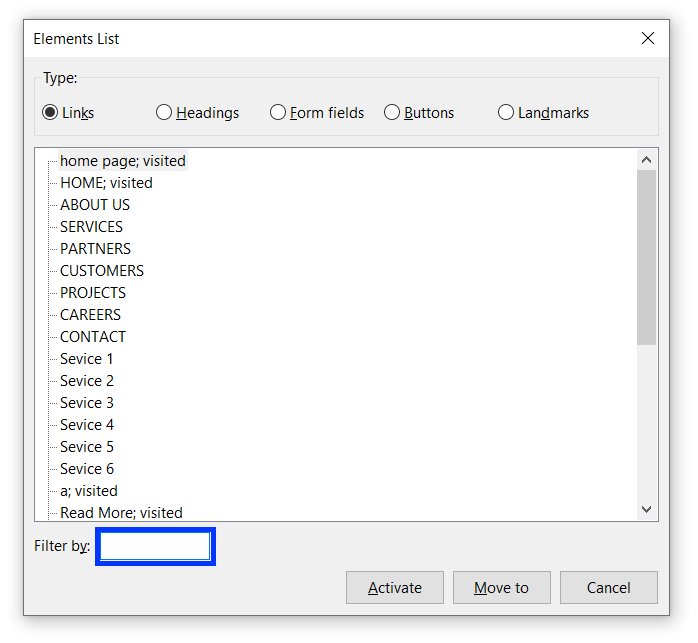
The elements list is divided into 5 categories by the types of the elements. On the bottom of the window, you will find a text input where you can filter the elements on each list by their accessible name (the text that is read by screen readers. You can learn more about accessible names in the Evinced knowledge base) or by their type (Form fields and Landmarks lists) and level (headings list). Let’s explore each list and see which accessibility insights we can produce from each one.
Links
The links list shows a list of the links on the page, ordered by their order in the DOM. Let’s see what we can learn from this list.
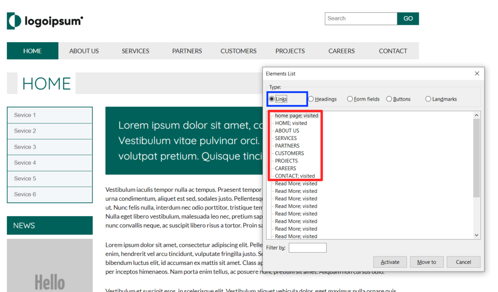
As you can see, the first nine links on the list are coming from the header logo and the main navigation. They all have a unique name, and the purpose of each of them is clear. So far, so good. Right after the navigation links, you will see a bunch of links that all have the same name, “Read More“, as you can see, they are coming from the items on the main section. In this case, the words “Read More” are meaningless when disconnected from their context. Links must have unique names, so their context and purpose are clear to all users. If you have to use a generic text on a list of link elements due to UI design constraints, you can add to them an “aria-label” attribute for invisible labeling. Note that different links can have an identical name, provided they have the same URL address.
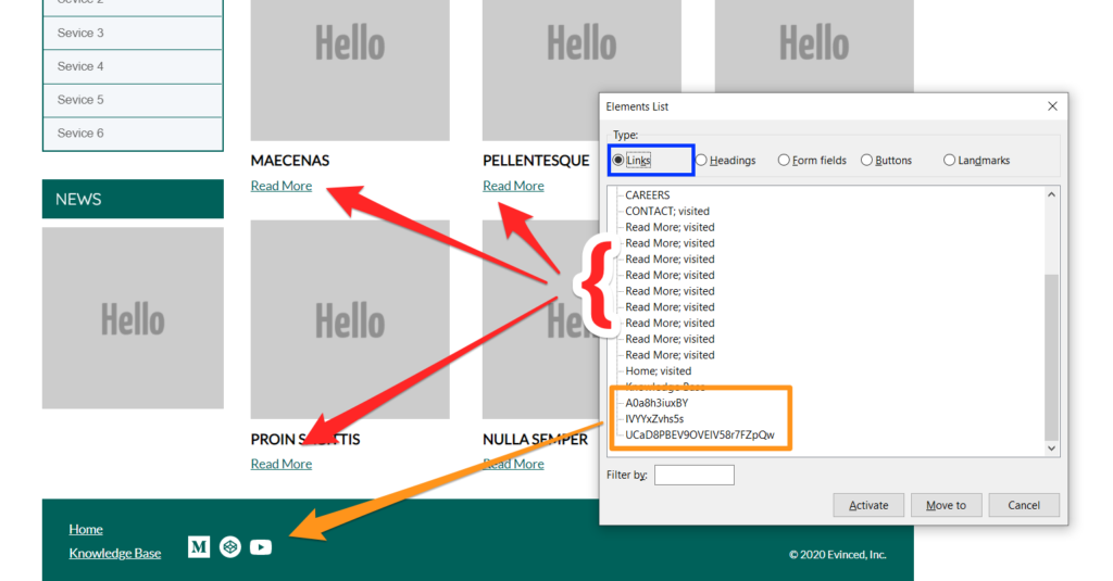
Let’s now discuss the last three items on the links list. They show the three icon links on the footer. These links have no accessible name, so NVDA is doing its best to provide the user with some names. In such cases, NVDA uses the last part of the link’s URL, but since URLs often have a query string attached to them, or when the URL name is based on the page ID, the name that’s eventually read to the user is not descriptive, nor does it have meaning for the user.
Signs to possible links related a11y issues
- The same link name is repeated multiple times.
- Links names are not meaningful, or not describing the link’s destination correctly.
Headings
Let’s start by looking at the headings list, and see what we can learn from it.
The headings structure and hierarchy in a web page should act as its table of contents; thus, the user can always understand the context of the content piece the screen reader is currently reading. It also allows quick access to the exact part of the content that the user is interested in, without making them go linearly through all the content on a page until they get to where they want to be.
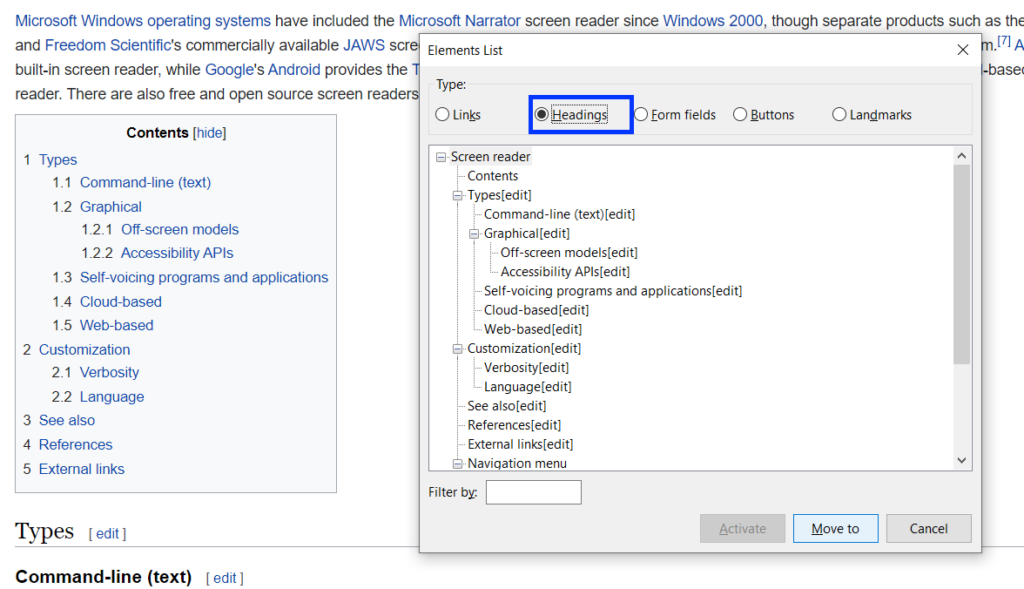
The example above shows the headings hierarchy of a Wikipedia page. It shows the headings ordered by their position on the DOM. The heading levels are ordered in a tree view, and each level represents a sub topic of the heading above it, and sure enough, you can see that the headings hierarchy and order on the elements list match the table of contents of the page This is a good example of a good headings hierarchy, which allows the user to get a good mental image of the page’s content hierarchy. You can filter the headings by their level by typing a number between 1-6, or by their content by typing their internal text.
Signs to possible headings related a11y issues
- The headings list is empty: Headings are essential for screen reader users to get acquainted with the page and understand its overall and each part’s context. If the headings list is empty, ask yourself if a user, who cannot see, has the information available to get acquainted with the UI and is able to get a full mental image of it.
- Headings levels are inconsistent or the tree view looks broken: Inconsistent use of headings levels causes a lack of clarity of the UI structure and fails to imply the importance of each of the different content pieces for screen reader users.
Form fields
The form fields list is a critical one. It displays the type of elements that requires user input, such as <button />s, <input /> elements, and <textarea />s. Problems found in this list may therefore indicate that some users are unable to perform basic operations on the site.
Let’s look at two necessary conditions for a user to be able to interact properly with UI widgets.
- How to use it: The users must understand how they should interact with it and therefore they must understand what the element’s type is. Different input elements may require different types of interaction (typing or clicking, for example).
- The outcome: The second condition that must be met is that the user will be able to assess the result of interacting with the element. The information that is supposed to imply this to the user is the element’s accessible name; therefore, this type of element must be labeled correctly.
Let’s see how this is reflected in the form fields list to get an idea of how screen reader users are affected by it.
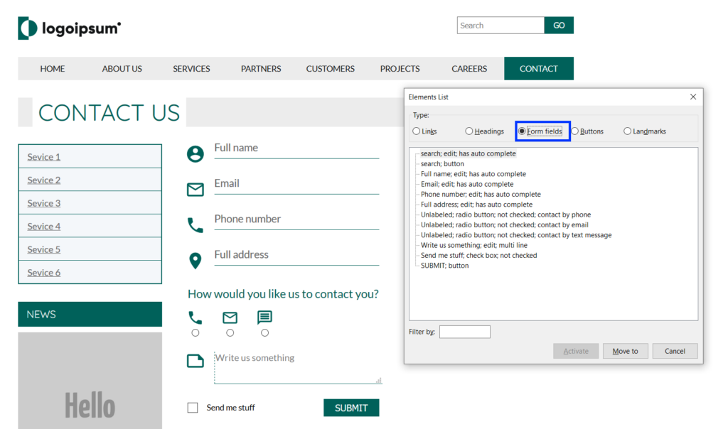
The image above shows you how an ideal page looks. On the elements list window, you can see how each of the elements on the list has an explicit type and name (even though, for some reason, the radio buttons and checkbox appearance on the list start with the word “unlabeled”, they end with the correct name and NVDA is reading it properly). The user therefore has enough information to quickly understand how they should interact with each element, and what its purpose is.
I’ve made some changes to the page that the average user will not notice, since the page’s functionality has allegedly not changed. However, for screen reader users, the form on the page has become unusable. I have replaced the form’s <label /> tags with <span />s and the <button /> tag of the “submit button” is replaced with an <a /> tag. Let’s see how the form controls list looks now.
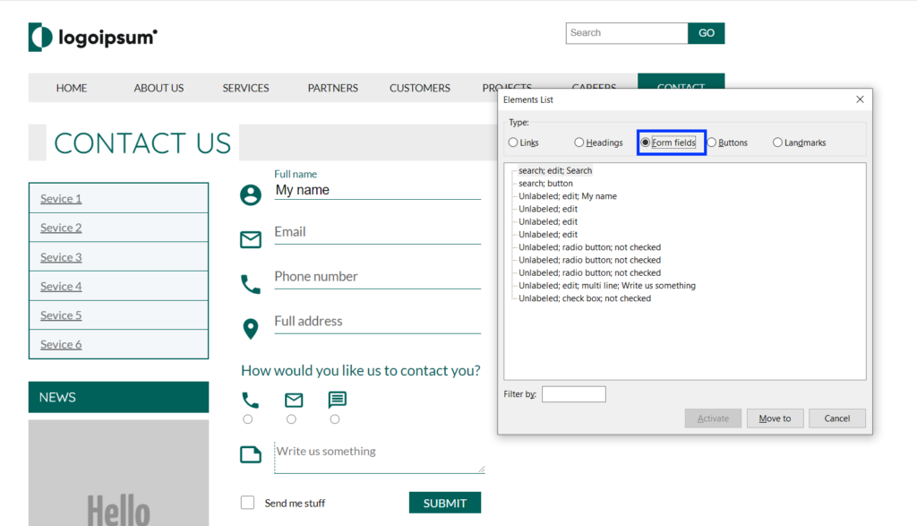
The first two items are the search input and button from the page header, and these stay unchanged.
The next item on the list looks like it has a name: “My name”, but if you will look at the image, you can see that this is actually the input value. I put it there to emphasize that the text on each field, which looks like a placeholder, is actually the label element (and on this example span).
Right below it, the next three empty inputs show as “Unlabeled: edit” and the same goes for the three radio buttons. Note that they don’t have a name ending each line now. You can see how a screen reader user just can’t know what kind of data they should type to each input or what the purpose of the radio buttons is.
Next, we have a <textarea> element, which also starts with the word “Unlabeled” and ends with: “Write us something”. It also looks that, unlike the name input, it doesn’t have any value typed into it, so where does it get its accessible name from? Something that the <textarea> has on this example, and which the other <input /> element doesn’t, is a “placeholder” attribute. I use this example because not all screen readers support this attribute as an accessible name, so even though it works perfectly with NVDA, it is not recommended to rely on it as an alternative to other labeling methods.
Next, is the checkbox that has the same issue as the radio buttons, and last, the submit button is missing. You will remember that the button was replaced with an anchor tag, all its functionality stayed the same and the same event listener is attached to it and still the NVDA is not classifying it as a button. From this we can learn that when the semantic role of elements is incorrect the user may have difficulty finding them in the places he expects and to interact with them correctly.
Signs to possible form fields related a11y issues
- Form fields names start with the word Unlabeled (sometimes the name on the list ends with a proper name. If it is not coming from a value that was typed by the user or a placeholder attribute you can consider it labeled).
- Elements you expect to find on the list are missing from it.
Buttons
The buttons list probably shows all the buttons on the page. We will not delve into this list since button elements are also displayed in the form fields list, the same principles we discussed in the previous section apply here. This list is useful when we want to test the accessibility of buttons outside the form’s context.
Landmarks
Landmark elements are HTML elements that have an explicit role in the UI structure, such as <nav />, <main />, <header />, and <footer />. The landmarks list should represent the different components of the UI’s layout. For a better understanding about the usage of these elements on the screen reader users’ experience, let’s look at an example on how landmarks are reflected on the elements list.
First let’s look at a page that represents the ideal DOM structure Tt is built with semantic landmark elements and each of the landmarks is properly labelled.
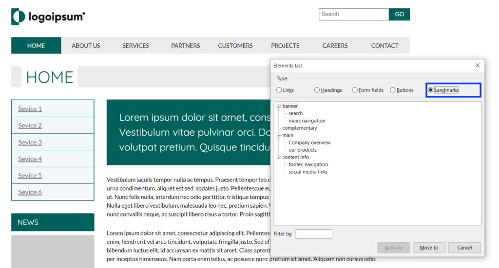
In the image above, you can see the list of the landmark elements in a tree view. If referred to the headings list as the table of contents of the page, we can refer to the landmarks list as the page’s blueprint. The landmarks’ treeview should reflect the page’s structure and the role of each part. You can see how the elements of the first level are not labeled since they are unique and therefore do not require unique names. I am referring to the banner (<header/>), complimentary (<aside/>), main, and content info (<footer/>). On the next levels, non-unique elements such as navigation widgets and sections are labeled with an accessible name so that the user can understand their context and purpose. The elements that only have names without a type specification, are <section/> elements. Their type is not specified since their semantic meaning is dependent on their label, otherwise they are acting simply as <div>s.
A note about nesting landmarks: I am not sure if it is a bug or by design, but when a landmark element is the first child of another landmark element, it does not show on the treeview. For example, the services list on the sidebar is actually a <nav> element, and it also has a unique label, and yet, it is not shown in the treeview. However, NVDA is still reading it to the user as it should, but I am pointing it out since it may be confusing.
Now, let’s look at the same page with a slight change. I have removed the accessible names from the non-unique elements, so let’s see how it affects the screen reader users’ user experience.
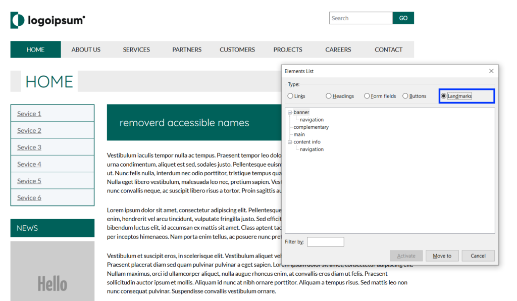
The image above shows how the landmarks list looks when the landmark elements are not labeled.
First, you can see that we still have the two navigation elements, but now we can’t tell or conclude the purpose of each of them.
Second, all the <section /> elements are not there anymore. This is because, as mentioned above, when a <section /> element is not labeled, it is considered by NVDA as a generic container, just like a <div /> element. Therefore, it omits it from the landmark menu. Nevertheless, <section /> elements will still be registered by accessibility APIs to the accessibility tree with their semantic role.
I think this example clearly illustrates the vast difference in user experience when elements are labeled with an accessible name to hint the element’s content and purpose. Let’s take it one step feather and see what the landmarks list displays if we choose to use only <div />s for our UI.
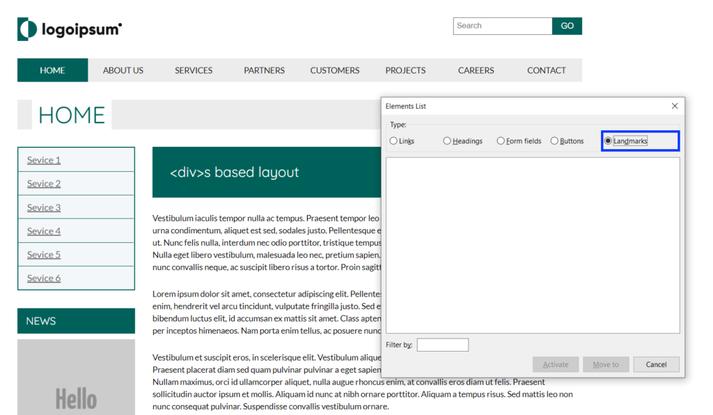
Now, we do not even have the option to navigate to a <nav /> element quickly and hope that this is the element we are looking for. As you can see, the Landmarks list is now empty, and as screen reader users, we don’t get any information on the page’s structure and layout.
We can see that, just as the visual layout helps the average user to find their way in the interface and understand its purpose, the semantics of the elements that make up the interface should reflect the UI’s different components’ roles for the benefit of screen reader users.
Signs to possible landmarks related a11y issues
- The landmarks menu is empty.
- Items on the landmarks menus have no accessible names (not labeled).
- The layout is ordered in a way that does not make sense (header that appears before or nesting inside a footer for example).
Summary
The examples I have given here in no way represent a complete accessibility test. Still, they indeed show how you can get a good idea of what the initial experience of screen reader users from the interface will be at a glance.
To summarize, I hope you find this guide useful and that it will help you make screen readers an additional tool in your tool belt and the efforts for a more inclusive web.
If you wish to learn about NVDA in more depth, check out NV Access’s online user guide or you can support NVDA (which is an open source project BTW) by purchasing their comprehensive training books.
Thank you for reading!
