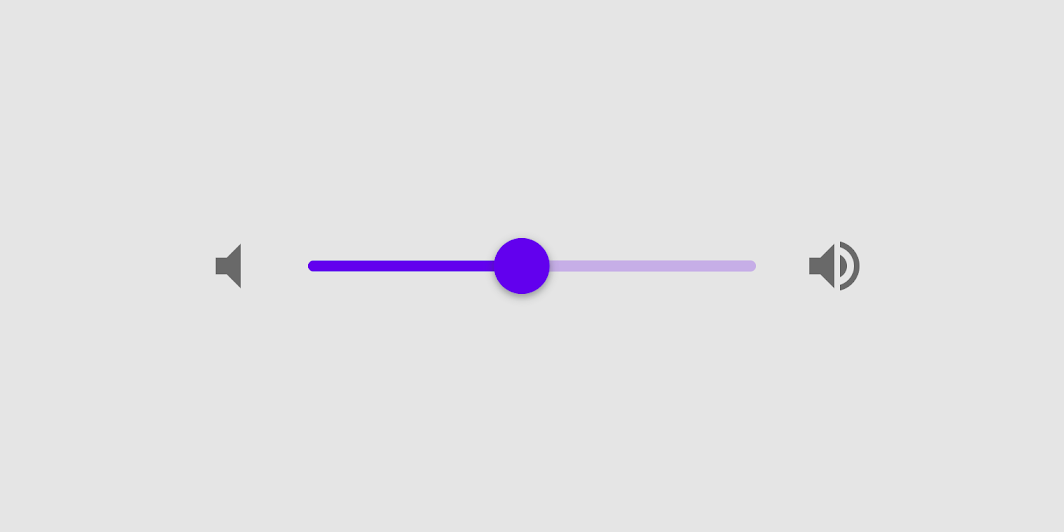
Sliders allow users to make selections from a range of values.
Contents
Sliders reflect a range of values along a bar, from which users may select a single value. They are ideal for adjusting settings such as volume, brightness, or applying image filters.
In order to install with Cocoapods first add the component to your Podfile:
pod 'MaterialComponents/Slider'Then run the installer:
pod installThen import the Slider target:
import MaterialComponents.MaterialSlider#import "MaterialSlider.h"MDCSlider can be be used like a standard UIControl.
override func viewDidLoad() {
  super.viewDidLoad()

  let slider = MDCSlider(frame: CGRect(x: 50, y: 50, width: 100, height: 27))
  slider.addTarget(self,
                   action: #selector(didChangeSliderValue(senderSlider:)),
                   for: .valueChanged)
  view.addSubview(slider)
}

func didChangeSliderValue(senderSlider:MDCSlider) {
  print("Did change slider value to: \(senderSlider.value)")
}- (void)viewDidLoad {
MDCSlider *slider = [[MDCSlider alloc] initWithFrame:CGRectMake(50, 50, 100, 27)];
[slider addTarget:self
action:@selector(didChangeSliderValue:)
forControlEvents:UIControlEventValueChanged];
[self.view addSubview:slider];
}
- (void)didChangeSliderValue:(MDCSlider *)slider {
NSLog(@"did change %@ value: %f", NSStringFromClass([slider class]), slider.value);
}MDCSlider exposes stateful APIs to customize the colors for different control states. In order to use this API you must enable statefulAPIEnabled on your MDCSlider instances.
 let slider = MDCSlider()
 slider.isStatefulAPIEnabled = true

 // Setting a thumb color for selected state.
slider.setThumbColor(.red, for: .selected) MDCSlider *slider = [[MDCSlider alloc] init];
slider.statefulAPIEnabled = YES;
// Setting a thumb color for selected state.
[slider setThumbColor:[UIColor redColor] forState:UIControlStateSelected];To help ensure your slider is accessible to as many users as possible, please be sure to review the following recommendations:
Set an appropriate accessibilityLabel value for your slider. This should reflect what the slider affects.
slider.accessibilityLabel = "Volume level"slider.accessibilityLabel = @"Volume level";Sliders currently respect the minimum touch size recomended by the Material spec touch areas should be at least 44 points high and 44 wide. The height of the slider is set to 27 points so make sure there is sufficient space so that touches don't affect other elements.
Types
There are two types of sliders: 1. Continuous slider and 2. Discrete slider
A slider with one thumb is called a single point slider, and a slider with two thumbs is called a range slider.
Note: Range sliders are not supported on iOS.
A slider has a track, one or two thumbs, and optional value label. A discrete slider also has tick marks.
- Track
- Thumb
- Value label (optional)
- Tick mark (discrete sliders)
| Attribute | Related method(s) | Default value | |
|---|---|---|---|
| Min value | minimumValue |
-setMinimumValue:-minimumValue |
0 |
| Max value | maximumValue |
-setMaximumValue:-maximumValue |
1 |
| Number of discrete values | numberOfDiscreteValues |
-setNumberOfDiscreteValues:-numberOfDiscreteValues |
N/A |
| Is discrete | discrete |
-setIsDiscrete:-isDiscrete |
NO |
| Height | trackHeight |
-setTrackHeight:-trackHeight |
2 |
| Track background color | NA | -setTrackBackgroundColor:forState: -trackBackgroundColorForState: |
Black at 26% opacity |
| Track fill color | NA | -setTrackFillColor:forState:-trackFillColorForState: |
Primary color |
| Attribute | Related method(s) | Default value | |
|---|---|---|---|
| Thumb color | NA | -setThumbColor:forState: -thumbColorForState: |
Primary color |
| Radius | thumbRadius |
-setThumbRadius:-thumbRadius |
6 |
| Elevation | thumbElevation |
-setThumbElevation:thumbElevation |
0 |
| Ripple color | rippleColor |
-setRippleColor:-rippleColor |
nil |
| Ripple radius | thumbRippleMaximumRadius |
-setThumbRippleMaximumRadius:-thumbRippleMaximumRadius |
0 |
| Attribute | Related method(s) | Default value | |
|---|---|---|---|
| Background color | valueLabelBackgroundColor |
-setValueLabelBackgroundColor: -valueLabelBackgroundColor |
Blue |
| Text color | valueLabelTextColor |
-valueLabelTextColor:valueLabelTextColor |
White |
| Font | discreteValueLabelFont |
-setDiscreteValueLabelFont:-discreteValueLabelFont |
N/A |
| Attribute | Related method(s) | Default value | |
|---|---|---|---|
| Background tick color | N/A | -setBackgroundTrackTickColor:forState:-backgroundTrackTickColorForState: |
Black |
| Filled tick color | N/A | -setFilledTrackTickColor:forState:-filledTrackTickColorForState: |
Black |
Continuous sliders allow users to make meaningful selections that don’t require a specific value.
Source code:
MDCSlider
let slider = MDCSlider()
slider.minimumValue = 0
slider.maximumValue = 100
slider.value = 70MDCSlider *slider = [[MDCSlider alloc] init];
slider.minimumValue = 0.0f;
slider.maximumValue = 100.0f;
slider.value = 70.0f;Source code:
MDCSlider
let slider = MDCSlider()
slider.minimumValue = 0
slider.maximumValue = 100
slider.value = 70
slider.discrete = true
slider.numberOfDiscreteValues = 10
slider.shouldDisplayDiscreteValueLabel = falseMDCSlider *slider = [[MDCSlider alloc] init];
slider.minimumValue = 0.0f;
slider.maximumValue = 100.0f;
slider.value = 70.0f;
slider.discrete = YES;
slider.numberOfDiscreteValues = 10;
slider.shouldDisplayDiscreteValueLabel = NO;MDCSlider has no recommended theming mechanism. Configure colors using the properties and stateful APIs exposed on the slider.
- Setting the left/right icons via
minimumValueImageandmaximumValueImage. - Setting the thumb image via
setThumbImage:forState:. - Setting the right/left track images (for a custom track) via
setMinimumTrackImage:forState:andsetMaximumTrackImage:forState:.
- The UISlider API
minimumTrackTintColorhas an equivalent APIsetTrackFillColor:forState:in MDCSlider. This API must first be enabled by settingstatefulAPIEnabledtoYES. - The UISlider API
maximumTrackTintColorhas an equivalent APIsetTrackBackgroundColor:forState:in MDCSlider. This API must first be enabled by settingstatefulAPIEnabled = YES. - The UISlider API
thumbTintColorhas an equivalent APIsetThumbColor:forState:in MDCSlider. This API must first be enabled by settingstatefulAPIEnabled = YES.
- MDCSlider can behave as a Material Discrete Slider by setting
discrete = YESandnumberOfDiscreteValuesto a value greater than or equal to 2. Discrete sliders only allow their calculated discrete values to be selected as the Slider's value. IfnumberOfDiscreteValuesis less than 2, then the Slider will behave as a Material Continuous Slider. - For Discrete Sliders, the track tick color is configured with the
setFilledTrackTickColor:forState:andsetBackgroundTrackTickColor:forState:APIs. The filled track ticks are those overlapping the filled/active part of the Slider. The background track ticks are found in any other portions of the track. These APIs must first be enabled by settingstatefulAPIEnabled = YES. - Track tick marks can be made shown always, never, or only when dragging via the
trackTickVisibilityAPI. IfnumberOfDiscreteValuesis less than 2, then tick marks will never be shown. - An anchor point can be set via
filledTrackAnchorValueto control the starting position of the filled track. - The track can be made taller (or shorter) by setting the value of
trackHeight.
MDCSlider's behavior is very similar to that of UISlider, but it's not exactly the same. On an
accessibilityActivate event, the value moves one sixth of the amount between the current value and the
midpoint value.


