Page MenuHomePhabricator

Category suggestions too narrow / not usable
Closed, ResolvedPublic8 Estimated Story Points

Description

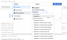
The shortening of suggestions is from the end instead of the middle, thus making a long list of similar suggestions unusable.

While a tooltip is not an adequate solution for most users (mainly power users), there is also no tooltip, and no anchor link or bottom-status-bar trigger. So there is no way to identify which category is being inserted upon click.

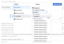
Screen Shot 2016-07-01 at 18.35.36.png (834×608 px, 95 KB)

Event Timeline

Restricted Application added subscribers: Zppix, Aklapper. · View Herald Transcript

Change 299084 had a related patch set uploaded (by Alex Monk):
Add titles to category input menu's items

https://gerrit.wikimedia.org/r/299084

Jdforrester-WMF added a project: Design.
Jdforrester-WMF set the point value for this task to 8.
Jdforrester-WMF moved this task from To Triage to TR0: Interrupt on the VisualEditor board.

Change 299084 merged by jenkins-bot:
Add titles to category input menu's items

https://gerrit.wikimedia.org/r/299084

Krinkle claimed this task.