Page MenuHomePhabricator

Checkmark can look gray
Closed, ResolvedPublic3 Estimated Story Points

Description

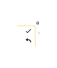
The line width of the checkmark-icon is smaller than the line width of the cancle button. Due to Antialiasing on some monitors this brings the impression that while the cancle-icon is black the checkmark-icon seems gray. Gray color of icons is usually a code for disabled icons. This left me puzzle why the icon is disabled.

safsd.png (82×69 px, 1 KB)

Tested on Vector & latest Chromium

Event Timeline

Restricted Application added a subscriber: Aklapper. · View Herald Transcript

Can one of the engineers please check if we chose the OOUI icons here and if they both have the same color? @WMDE-Fisch @awight @thiemowmde

The Two-Column-Edit-Conflict-Merge interface uses unmodified OOUI elements, showing unmodified OOUI icons. The color is untouched, as the OOUI widget gives it to us. It uses some opacity and appears dark gray because of this. As far as I'm aware of this is intentional.

To me, the icons in the current Two-Column-Edit-Conflict-Merge interface look identical to the ones at https://doc.wikimedia.org/oojs-ui/master/demos/?page=icons&theme=wikimediaui&direction=ltr&platform=desktop. This includes the minor difference in line width.

Sounds like we need to close this as invalid. Or report it upstream to the OOUI team?

Thanks for the investigation @thiemowmde . I believe there has been some concious decision made for choosing the arrow over the "x". But as the feature behaves now having the pop up warning that everything will be set back to the state when the edit conflict happened does actually allow to replace the arrow by an "x" to indicate a closing of this edit box.

Long sentence short: I suggest to replace the arrow by using the "close" icon from the OOUI icon collection. This should solve the stated issue.

WMDE-Fisch set the point value for this task to 3.Feb 10 2020, 11:05 AM

@Hanna_Petruschat_WMDE So just to get some confusion about this ticket out of my head:

We will solve the "Checkmark can look gray" issue by replacing the undo arrow with the x so that the checkmark does not look gray in comparison to the undo arrow anymore? :-)

Change 571704 had a related patch set uploaded (by WMDE-Fisch; owner: WMDE-Fisch):
[mediawiki/extensions/TwoColConflict@master] Use close icon instead of undo

https://gerrit.wikimedia.org/r/571704

Change 571704 merged by jenkins-bot:
[mediawiki/extensions/TwoColConflict@master] Use close icon instead of undo

https://gerrit.wikimedia.org/r/571704

thiemowmde moved this task from Demo to Done on the WMDE-QWERTY-Sprint-2020-02-04 board.