Page MenuHomePhabricator

OOUI Popover component padding fixes [timexboxed to 1 day for proposing a fix via OOUI]
Closed, ResolvedPublicBUG REPORT

Description

Problems

When reusing the OOUI popover component in Wikidata, we detected a couple of issues:

  1. The close (X) button in the top right corner of the popup overlaps with the header (element label) content:

Screenshot 2024-01-12 at 15.48.27.png (404×1 px, 71 KB)

  1. The bottom padding is reduced to 5px (insufficient) when a checkbox element is included in the popover's body:

Screenshot 2024-01-18 at 14.18.45.png (636×1 px, 227 KB)

Expected outcome
  1. The popover label should preserve its end spacing (currently a 12px margin) and not overlap with the close button. The label should therefore wrap if necessary.
  1. The 8px margin that exists between the popover text and the bottom border should be preserved in case other elements are included in the popover's body (a checkbox, in this case).
Check the OOUI demo for reference
Acceptance criteria
  • The close button, used to dismiss the popover, doesn't overlap with the text included in the popover's heading
  • There's sufficient spacing between the "Don't show this again" popover checkbox and the component's bottom margin
Open questions

WMDE needs a recommendation on the best way to proceed: wait for a fix in OOUI, apply local adjustments (or any other alternative?).

Event Timeline

Tagging OOUI, to me that overflow looks like an OOUI bug – I don’t think we’re doing anything that special with the PopupWidget. (Though I haven’t looked very far into this yet, and don’t plan on doing so either before this is prioritized on our end. If anyone’s curious, our code for this is in view/resources/jquery/wikibase/jquery.wikibase.entitytermsforlanguagelistview.js in Wikibase.)

Sarai-WMDE renamed this task from MUL – Onboarding popover padding fixes to Popover component padding fixes.Jan 18 2024, 1:28 PM
Sarai-WMDE renamed this task from Popover component padding fixes to OOUI Popover component padding fixes.
Sarai-WMDE updated the task description. (Show Details)
CCiufo-WMF subscribed.

I think it would be helpful if someone on Wikidata could dig in a bit further to confirm (or rule out) that this is an OOUI bug. Given that it's working in the demos and hasn't been reported elsewhere, it'll be challenging for us to investigate as well without the domain knowledge of the product area.

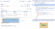
I can reproduce an overflow / overlap of the “close” button with the head label on https://en.wikipedia.org/wiki/Special:BlankPage with:

await mw.loader.using( 'oojs-ui-core' );
const popup = new OO.ui.PopupWidget( {
  head: true,
  label: 'New! Add default labels and aliases for multiple languages (mul)',
} );
$( document.body ).append( popup.$element );
popup.toggle();
Manuel renamed this task from OOUI Popover component padding fixes to OOUI Popover component padding fixes (timexboxed to 1 day for proposing fix via OOUI).Jan 31 2024, 10:21 AM
Manuel renamed this task from OOUI Popover component padding fixes (timexboxed to 1 day for proposing fix via OOUI) to OOUI Popover component padding fixes [timexboxed to 1 day for proposing a fix via OOUI].Jan 31 2024, 4:42 PM

@Manuel I see you triaged this task so checking to confirm that someone at WMDE plans on timeboxing an upstream fix to OOUI (which Design-System-Team can do a release for) or if you were expecting us to investigate a fix.

CCiufo-WMF changed the subtype of this task from "Task" to "Bug Report".Feb 27 2024, 4:20 PM

@CCiufo-WMF: Yes, I timeboxed the investigation for WMDE's Wikidata team. Once they're finished, we'll reach out to you with an update.

Thanks! I'm going to move it to our tracking column for now, but if/when you need our help just follow up here.

Change 1010878 had a related patch set uploaded (by Arthur taylor; author: Arthur taylor):

[oojs/ui@master] Increase right margin for Popup label to account for close button

https://gerrit.wikimedia.org/r/1010878

I've added a patch / proposed a fix for issue 1. Issue 2 I think is not a real problem with the OOUI styles.

In the OOUI demo, the margin around the text is normally 5px:

ooui-popup-1.png (546×1 px, 129 KB)

In the example pop-ups, there is an additional bottom-margin of 8px, which the ticket asks that we preserve.

ooui-popup-2.png (513×1 px, 111 KB)

But on closer inspection, this 8px margin comes from the demo stylesheet (demo.css), and I'm not sure we should consider that canonical (or we need to add that ourselves to our dialogs):

ooui-popup-3.png (495×1 px, 126 KB)

The expected 5px margin is present in the pop-up as it appears currently in production. The spacing looks a bit narrow because the checkbox occupies the entire line height, but there are 5 pixels between the bottom of the checkbox and the border of the pop-up:

ooui-popup-4.png (692×1 px, 178 KB)

Did I understand correctly, that parts of the problem only seems to be there (due to a non-cannonical context in our Test and Beta test environments)? In this case, this could be a good opportunity to make test.wikidata.org more cannonical. Also looping in @Sarai-WMDE here.

I'm saying that I don't know where the expectation of the 8px margin comes from, except the OOUI demo pages. And the OOUI demo pages have "hacked" the margin in there rather than including it in the library. Should we try and reproduce the 8px margin despite the fact that it isn't strictly-speaking part of the library?

@ArthurTaylor thanks for the fix and for sharing the clear findings! That's totally right, the actual default margin of the OOUI popover is 5px. I would consider 8px to be more canonical, given that the base spacing unit of our systems (both OOUI and Codex) are 8/16px. My assumption is that a smaller margin was applied to avoid excessive spacing in certain situations? In the wild, these popovers have generally a compounded spacing that's greater than 5px. Here are a couple of examples from the Wikipedia's visual editor:

Screenshot 2024-03-19 at 12.49.00.png (598×1 px, 198 KB)
Screenshot 2024-03-19 at 13.10.02.png (1×622 px, 138 KB)

So based on those examples, and the fact that the 5px margin looks quite narrow in our particular case due to the presence of the checkbox, I would encourage us to do whatever sounds easier: either use a 8px bottom margin, or apply an extra 0.25em bottom padding to the checkbox (the final exact value is not as important as creating visual balance around the content). The latter might be a better idea, but let me know if that sounds good!

Change 1012671 had a related patch set uploaded (by Arthur taylor; author: Arthur taylor):

[mediawiki/extensions/Wikibase@master] Add extra padding to bottom of mul pop-up

https://gerrit.wikimedia.org/r/1012671

Okay. I added an extra bottom margin to the oo-ui-fieldLayout-body class, but only for the wikibase-entityterms-languagelistview-mul-popup. This makes the pop-up look balanced without requiring changes to OOUI - we get 8px from the bottom of the checkbox to the edge of the pop-up.

2024-03-19-143007_427x202_scrot.png (202×427 px, 22 KB)

Perfect! Looking great. Thanks again for the fix!

Change #1012671 merged by jenkins-bot:

[mediawiki/extensions/Wikibase@master] Add extra padding to bottom of mul pop-up

https://gerrit.wikimedia.org/r/1012671

Hi @CCiufo-WMF ,

I prepared this patch https://gerrit.wikimedia.org/r/1010878 to adjust the right margin on the pop-up label. Can you take a look and see if that's something you could imagine to include in ooui-js?

Hi @CCiufo-WMF ,

I prepared this patch https://gerrit.wikimedia.org/r/1010878 to adjust the right margin on the pop-up label. Can you take a look and see if that's something you could imagine to include in ooui-js?

Thanks for proposing a fix! We will prioritize code review for this patch in our upcoming 2-week sprint (which starts today).

Change #1010878 merged by jenkins-bot:

[oojs/ui@master] WikimediaUI theme: Increase margin for PopupWidget label to account for close button

https://gerrit.wikimedia.org/r/1010878

Production will be fixed once T361490: Release OOUI v0.49.1 happens, I guess. It looks like it’s already scheduled, so I think we (Wikidata Dev Team) can wait for the end of DST’s current sprint :)

Production will be fixed once T361490: Release OOUI v0.49.1 happens, I guess. It looks like it’s already scheduled, so I think we (Wikidata Dev Team) can wait for the end of DST’s current sprint :)

Yes this is correct! I believe the plan is to release v0.49.1 today, so hopefully you don't have to wait until the end of our sprint.

Change #1017120 had a related patch set uploaded (by Catrope; author: Catrope):

[mediawiki/core@master] Update OOUI to v1.2.34

https://gerrit.wikimedia.org/r/1017120

Change #1017120 merged by jenkins-bot:

[mediawiki/core@master] Update OOUI to v0.49.1

https://gerrit.wikimedia.org/r/1017120

Volker_E updated the task description. (Show Details)