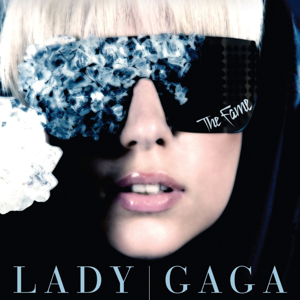

Since Lady Gaga first officially fell to earth in late 2008, she’s done enough shape-shifting in eight years to span several careers. The artist born Stefani Germanotta has changed her look and sound so regularly (and with such extremity) that it can be difficult to remember where she just evolved from, let alone predict who she’ll be next. Luckily, we have her album covers — five studio LPs, counting the upcoming Joanne, as well as a handful of notable EPs and remix albums — to provide snapshots (literal or otherwise) of where she’s at during various stages of her pop life.
Take a look through Gaga’s album art over the years for a visual primer on her journey to Joanne.
The Fame (2008)
Trending on Billboard

Gaga’s first album demonstrates what we knew about her during her opening march through pop culture: not much. Her identity, her personality, even her face were all obscured, mysterious. The only thing we could tell about her was that she seemed, well, cool — cool enough to appear seemingly from nowhere with an already larger-than-life sound and persona and instantly seem like the biggest thing in ’00s pop. An album cover that’s all sunglasses, smoke and the ineffable magnetism of its unknowable lead gets that idea across pretty well.
The Fame Monster (2009)

Technically just a stopgap between full-lengths, the Fame Monster EP nonetheless cemented Gaga’s superstardom, and did so by doubling down on the artier instincts only really teased at in her first LP. Thus, another pose with her face partially hidden — this time the lower half — but one much starker and more angular in its Hedi Slimane-shot visuals than the party-diva framing of her debut. It’s still very sleek, but there’s a danger in Gaga’s eyes this time out, and the feeling of greater depth in its austerity: A star, but one with a lot to say.
The Remix (2010)

The true debut of High-Concept Gaga in her album art, as she poses nude with only sensationalized headline clippings to cover her, like she was the booted fourth Dixie Chick. (This was the original Japanese art; the U.S. version released several months later featured a less attention-grabbing image of a pink-haired gaga with her face partially covered in lace.) It was especially fitting for this notably flamboyant period of Gaga’s career — The Remix first debuted in Japan in March 2010, the same month that her block-busting, Tarantino-miming (and similarly nudity-featuring) video for Beyonce collab “Telephone” premiered to worldwide acclaim.
Born This Way (2011)

A somewhat confusing image featuring Gaga’s head attached in black-and-white to the body of a motorcycle, the Born This Way cover was nonetheless appropriate in its reflection of what could be referred to as Gaga’s Meat Loaf period: Where no concept was too gaudy, no pronouncement was too dramatic, and no song was too big. (It’s a fitting cover for an album with a song called “Highway Unicorn (Road to Love)” in its track list, no doubt.) The album was better-received than its lead image, at least at first, as Born sold over a million copies in its first week, per Nielsen, but Gaga’s oversized artistic ambitions were starting to grate on the public a little, and in 2012, the LP topped the NME‘s list of The 10 Most Pretentious Album Ever.
A Very Gaga Holiday (2011)

An unadorned and formally garbed Gaga appeared on the cover to her Very Gaga Holiday EP, as if to assure fans that they didn’t have to be wary of the product inside being too outré. Indeed, it wasn’t: The four songs on Holiday, taken from her live ABC Thanksgiving special, featured stripped-down, jazzy and decidedly undisco arrangements of two Born hits and two holiday standards. It would’ve seemed Gaga was prepped to take a break from more obviously symbolism-laden imagery on her album covers, but she’d soon prove she wasn’t completely ready to break the habit yet.
Artpop (2013)
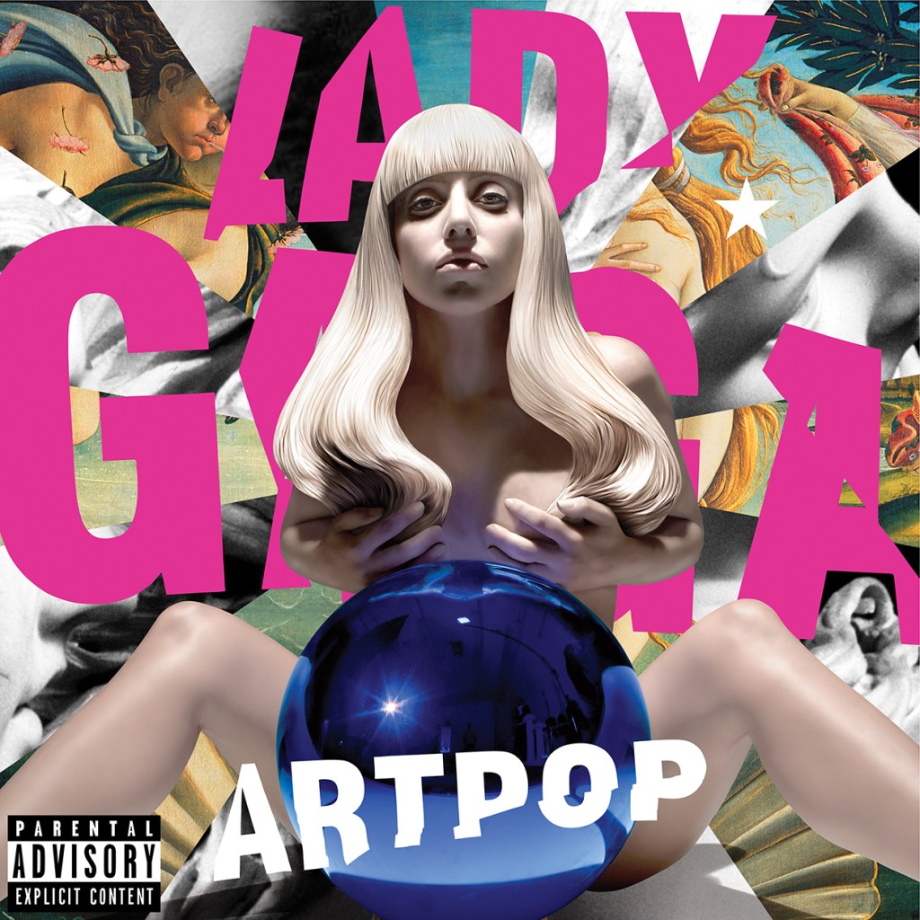
Possibly the most infamous cover art of her still relatively short career, the Jeff Koons-designed (and Boticelli-inspired) Artpop image featured a nude Gaga sculpture appearing to give birth to the world, in the form of a large blue orb, with other famed art works chopped up in the background. The album inside may not have been as high-minded as the cover — in fact, singles “Applause” and “Do What You Want” may have suffered on radio for the perception of being more difficult than they actually were — but certainly, the comparatively chilly reception the still-conceptual Artpop received was telling that perhaps the public was not willing to go as deep into the art side of Gaga’s world as she may have hoped.
Cheek to Cheek (2014)

Like the collaborative Tony Bennett LP it accompanied, the cover to Cheek to Cheek looked to appeal to fans a little older than those Gaga had courted with her first three albums. With her massive mop of curly black hair, Stefani looked like she could’ve opened for Cher in the early ’70s, and with the photo of her and Bennett slow dancing placed in a retro-styled front-page newspaper column, the image seemed openly wistful for a pre-Internet age of popular music. The gambit worked: Despite being ignored by pop radio, Cheek to Cheek debuted on top the Billboard 200 Albums Chart, and was ultimately certified gold.
Joanne (2016)
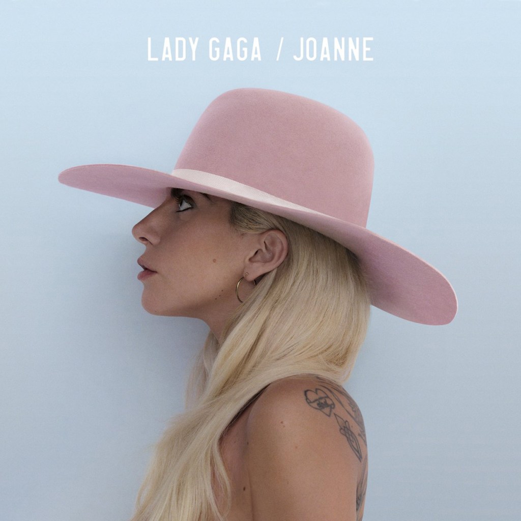
For Gaga’s back-to-basics comeback album, she’s understandably jettisoned the lofty art-history trappings of Artpop and the rock-opera-reminiscent imagery of Born This Way in favor of a striking and thoughtfully composed profile shot — possibly a topless one, but with its angling and Stefani’s long blonde hair making it inarguably tasteful. Whether the music inside will match remains to be seen, but based on the set’s early transmissions, it certainly seems likely Joanne will be as straightforward a This Is Me album as it cover would imply — and hopefully as arresting too.


