The various methods that businesses use to aid their decision making. These tools enable businesses to deal with their problems, issues or concerns in a systematic manner.
Fishbone Diagram
A graphical representation of the most likely causes and effects of an important decision. The base structure looks like this (for IB, replace Methods with Management:

Therefore the causes can be segregated into the following categories:
- Management (unsuitable style, miscommunication etc)
- Manpower (unskilled workers, lack of training etc)
- Machinery (technological failures, faulty equipment etc)
- Materials (poor quality, delayed deliveries etc)
Steps to Construct a Fishbone Diagram
- Problem or issue must be clearly stated
- Contributors must be concise and to the point
- For each ‘bone’, brainstorm the possible causes and place in the node.
- Consider combining nodes that are empty(ish), or remove altogether
- Consider separating overcrowded nodes
- Consider which root causes warrant further investigation and circle them
- Discuss how each circled item affects the issue being investigated.
Strengths:
- Easy to use and understand
- Allows decision making to be logical, systematic, and concise
- Facilitates a visual diagnosis of the problem
Drawbacks:
- Simplistic for real-world problems
- Has to be used along with other tools to be justifiable
- Can’t quantify the problem
Decision Trees
A quantitative decision making tool and a diagrammatic representation of the different options that are available to a business. It calculates the expected value of each decision so that one with higher benefits can be made.

How to Make a Decision Tree
- Decision nodes are shown as squares and show the main decision that has to be made.
- Chance Nodes are shown as circles, which show the different possible outcomes of a decision (usually follow pattern of ‘failure or success’)
- For each chance node there will be two or more routes (outcomes) which show the probability of the different outcomes. The probabilities must add up to 1.
- The actual values are then stated at the end of each branch, then the costs of each option must be deducted to calculate net figure of each outcome.
- Each unwanted branch of the decision tree is cut off/rejected, which is shown by two consecutive parallel lines, leaving only the best option.
Advantages
- They allow managers to set out problems in a clear and logical manner.
- All potential options can be seen at the same time, thereby speeding up decision-making.
- They consider the risks involved in decision-making, such as possible negative outcomes.
- They enable more scientific and objective decisions to be made as all likely costs of the decisions are considered.
- As a visual stimulus, they provide a tangible insight to a problem. They also make use of quantitative analysis.
Disadvantages
- The probabilities given in a decision tree are only estimates and can have forecasting errors.
- They are based on only quantitative data, thereby rendering qualitative issues useless and ignored.
- The technique does not necessarily reduce the amount of risk involved in decision making.
- Delays in the planning process can void the data by the time a decision is made.
- The task of assigning probabilities is rather subjective so results can be deliberately biased to justify the preference of the management.
Force Field Analysis
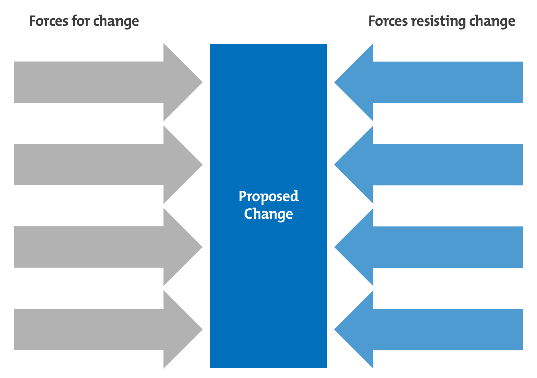
A simple tool that applies weight to forces that drive change and forces that restrain it.

The size of the arrows can vary if wanted, depending on the weight applied to it.
How to Make a Force Field Analysis
- List the driving forces for change and the restraining forces against it.
- Allocate a weight to each of these factors from 1-5, 1 being weak and 5 being strong,
- Draw the diagram as shown above, but apply the weights and labels to the arrows.
- Total the scores for the driving and restraining forces, decision can be made based on to which is higher.
This tool is very basic and depends on opinions and basic data to assign weights, and can be used only with other tools.
Gantt Charts
A visual representation of all the tasks in a particular project plotted against time scale. It is used to plan and schedule business projects, allowing easier supervision and sets deadlines.

How to Make A Gantt Chart
- Presented as a bar chart showing all scheduled tasks (vertical axis) over a given time scale ( horizontal axis).
- Each activity is shown by a separate rectangular bar, with the length depicting the duration required to complete it. Each bar shows start and end date, as well as the duration.
- Both critical and non-critical tasks are shown
- Predecessor-Successor relationships are shown.
The main goal of a this chart is to minimise the amount of time it would take to complete the projects, as well as set deadlines for the workers to abide by and give a sense of direction. However it is only an estimate and cannot accurately quantify the required time.
NOW ONTO SECTION TWO, GOOD LUCK!!


