How to paint vibrant creatures in Photoshop
Creature designer Bobby Chiu explains how he develops a pen drawing into a fully painted fantasy creature that has its roots in reality.
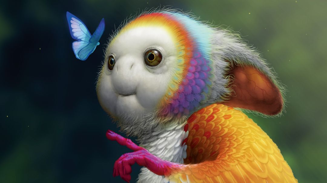
The word ‘fictional’ brings to mind something imaginative that doesn’t exist in real life. In contrast, ‘non-fiction’ suggests something that’s based in reality, whether it’s factual, historical and so on. However, to paint a realistic yet fictional character, I need elements from both camps. I must think about how to make something feel factual when it’s clearly not.
As a student, my favourite challenge was creating realistic but fictional feathered or furry creatures. My fascination with these types of creatures continued over my 15-plus years of designing creatures for films, television and games. This is a subject that I love, so it’s what I’ve chosen to cover in this workshop.
As with storytelling, believability depends on the details. If all the details add up and are consistent throughout, then that makes the story more believable. The same applies to painting fictional objects: believability is in the details, especially the subtle ones. If you get the details right then your efforts will be recognised by the viewer.
In this workshop, I’ll start off with inspiration and coming up with the initial idea. Next, I’ll do a step-by-step of my painting process, inspiration, structure and texture, with some helpful tips in between about painting in general. You can also see the full workshop video here.
Do you want to learn more about the fundamentals of creating strange critters? If so, make sure to check out our 15 in-depth tips for better creature design.
01. Create a pen drawing

This drawing is about curiosity. It tells of a butterfly and a winged creature as they focus on their similarities instead of their differences. I do the initial drawing with a regular ballpoint pen. I love drawing with pens but they can leave ink blots, so I have to remember to roll my pen every once in a while to remove any excess ink.
02. Paint the jungle background

I apply hue shifts into blue for the darker tones in the background. I plan on using blue in my shadows, so this will help tie it all together. After placing the big main shapes and colours, I add detail and texture. I also keep my line drawing visible so my background can help to support the creature compositionally.
03. Ensure you get the most from sketch painting

When you paint something multiple times, subsequent versions of that object should – in theory at least – improve with each new attempt. The purpose of sketch paintings is to take you through the process of painting something over and over again, but not be precious with any of the outcomes. Paint quick and rough just to get your ideas out and see if you like them.
04. Adjust the colours

I only start to think about colours once I’ve finished smoothing out the feathered areas. In addition to conventional colour theory and the types of emotion that I want to invoke in the viewer with my colour choices, I also want to take into consideration realistic colour combinations. I want to reflect the range of colours that are often seen in the natural world.
05. Take a deep dive into feathers
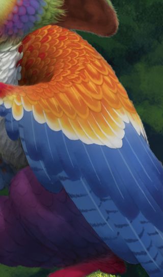
If you research feathers, you’ll soon find out how fascinating they can be! In addition to colouration – from the drab to the colourful – feathers also come in many shapes and sizes because they serve different purposes. Study the combinations of groups of feathers and how different feathers combine to create patterns. All of these factual details will help to create more believable feathers.
06. Capture reflections on the eyes

Because I want the focus to be on the two creatures looking at each other, it’s appropriate to pay extra attention to the eyes. The more reflective the material, the clearer the reflection will be. So if something is shiny but not as reflective like, say, a stainless steel skillet, the reflections wouldn’t be as clear when compared to the reflections on shiny eyeballs.
07. Subsurface scattering

The inner ear of my creature is in shadow, but it’s receiving a lot of light. It’s a good opportunity to create some subsurface scattering. This means that the light is strong enough to penetrate the ear’s surface and bounce around within the material of the ear, causing it to show the light coming through.
08. Illustrate veins within the ear

When light penetrates a material, the rays are deflected in many directions at once. This diffuses the light and creates a soft-edged glow. Subsurface scattering is also influenced by areas where the material changes, such as the veins inside the ear. Such subtle details all help to boost levels of believability within the artwork.
09. Drawing different levels of hair

When I begin, I think about hair in large masses so I use a bigger brush. As I start to detail, I’ll start using smaller brushes. Then, even when I think the hair looks good, I’ll still zoom in to see if I’d like to add more details to really enhance the feeling of fine hair or fur.
10. Observing material transitions

Looking at the hair and feathers on the creature’s head, I think about the transition from one to the other. This is always something to consider when you have different materials on the same object. Should it be a gradual transition, or a more immediate one? Where would such a transition be and how would it work?
11. Apply blur to the background

I love looking at how cameras focus in on certain objects and blur others to control focus and create depth. In this step, I blur the background by selecting Filter>Blur>Gaussian Blur. There are a few different blur options, but I like to use Gaussian Blur for the background because I can easily adjust how much I want to blur elements out.
12. Add iridescence to both creatures

One of the most beautiful effects found in nature is iridescence, which is when the colour of something changes hue depending on the angle of light hitting it. You can see this in certain types of bubbles, shells, butterflies and bird feathers. I thought it’d be nice for my two creatures to have iridescence in common.
13. A sense of atmosphere

When painting something believable, we often forget about atmosphere. We tend not to think about the atmosphere on a clear day – but it’s there, and the more of the world there is in our view, the more we’ll notice it. All things being equal, atmosphere tends to reduce contrast as we look into the distance. In this case, I add tiny particles in the air, which could be pollen or dust.
14. Recreating the effects of a camera lens

The second thing that can often be overlooked is the influence of the lens through which we see the world. I become much more aware of the lens when I’m using a camera. You’ll notice when light sometimes bleeds in or creates a lens flare in photos, so I finish this illustration by adding some of those subtle details.
This article originally appeared in ImagineFX. Subscribe to the magazine at Magazines Direct.
Get the Creative Bloq Newsletter
Daily design news, reviews, how-tos and more, as picked by the editors.

Thank you for reading 5 articles this month* Join now for unlimited access
Enjoy your first month for just £1 / $1 / €1
*Read 5 free articles per month without a subscription

Join now for unlimited access
Try first month for just £1 / $1 / €1
Bobby Chiu has been a professional artist for over twenty years, and is the founder and creative director at Imaginism Studios located in Toronto. He specializes in concept art and character design, and also teaches on Schoolism.com.
Related articles
-

-
-

-
