Microsoft Excel is a software that allows users to store or analyze the data in a proper systematic manner. It uses spreadsheets to organize numbers and data with formulas and functions. MS Excel has a collection of columns and rows that form a table. Generally, alphabetical letters are assigned to columns, and numbers are usually assigned to rows. The point where a column and a row meet is called a cell.
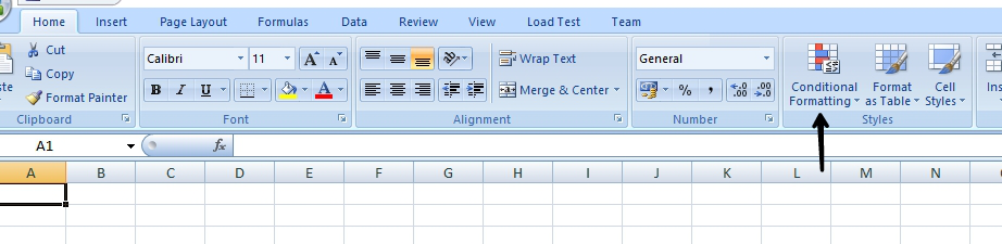
Conditional formatting is a feature in Excel that allows you to format/highlight few particular cells that meet the condition specified or selected by you. You can find it in the home tab under the Styles group.
Steps to use Conditional Formatting:
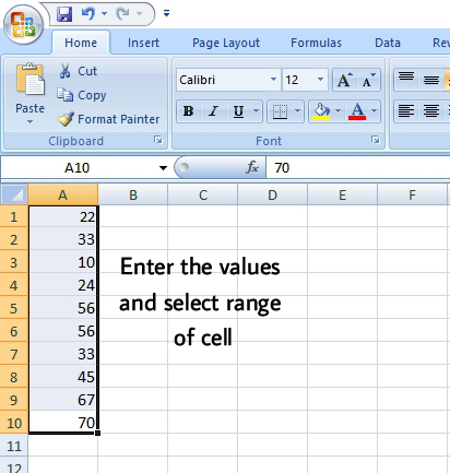
Step 1: Insert the data/values in the spreadsheet.
Step 2: Select the range of cells.
Step 3: Click on the Conditional formatting in the Home tab.
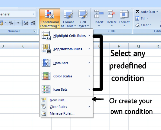
Step 4: Select any predefined condition or create your own condition(for this select New Rule).
For example, we need to:
- Highlight marks which are more than 70.
- Highlight marks which are between 50 and 80.
- Highlight marks that are below average.
- Set icons on the marks.
- Show data bars on the marks.
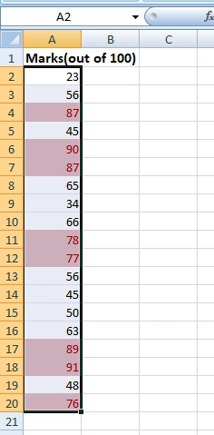
Steps to highlight marks that are more than 70
Step 1: Insert the data in the spreadsheet, we enter the marks in the spreadsheet.
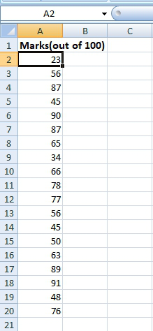
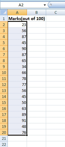
Step 2: Select the range of cells(A2:A20).
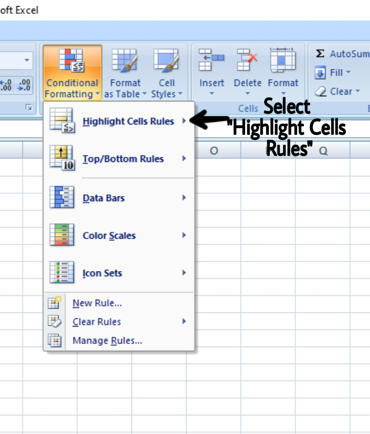
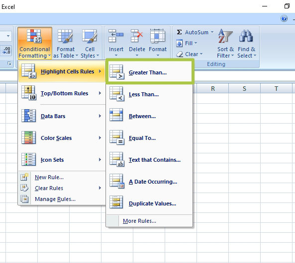
Step 3: Select the Conditional formatting in the Home tab, click Highlight Cells Rules.
Step 4: Click on the Greater Than option.
Step 5: Enter the value for which you need greater value, under the “Format cells that are GREATER THAN“, i.e. 70.
Step 6: You can select your desired color, we will go with the default color.
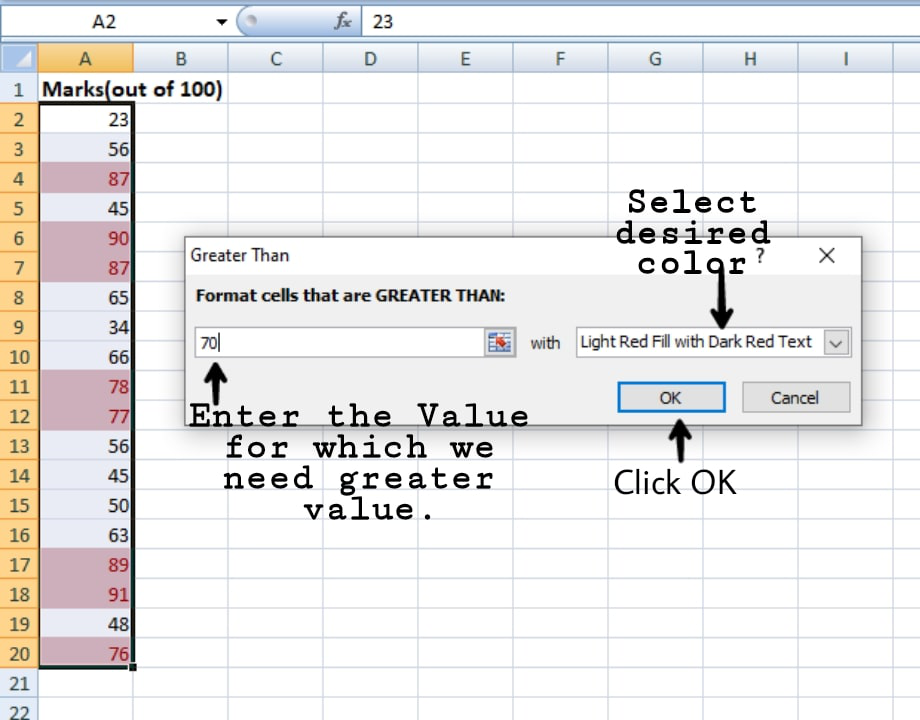
Step 7: Click OK.
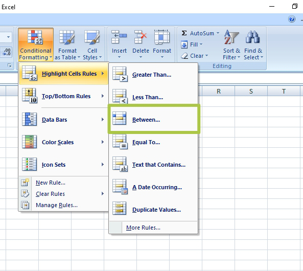
Steps to highlight marks that are between 50 and 80
Step 1: Insert the data in the spreadsheet, we enter the marks in the spreadsheet.
Step 2: Select the range of cells(A2:A20).
Step 3: Select the Conditional formatting in the Home tab.
Step 4: Click Highlight Cells Rules.
Step 5: Click on Between option.
Step 6: Enter the values between which the values have to be highlighted.
Step 7: You can select your desired color, we will go with the default color.
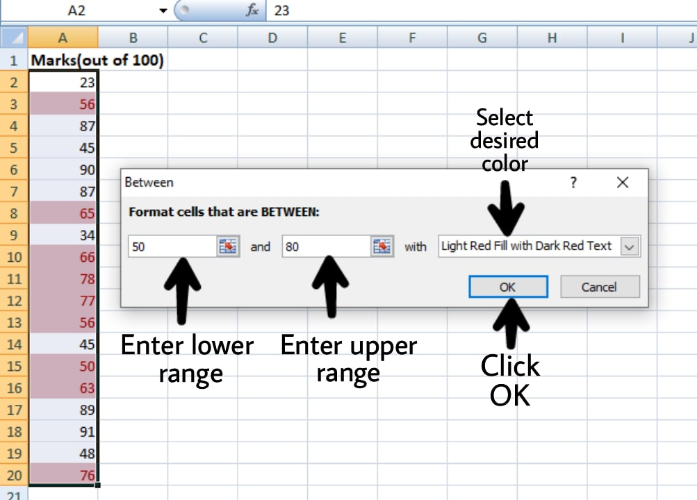
Step 8: Click OK.
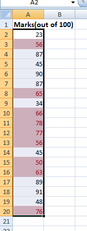
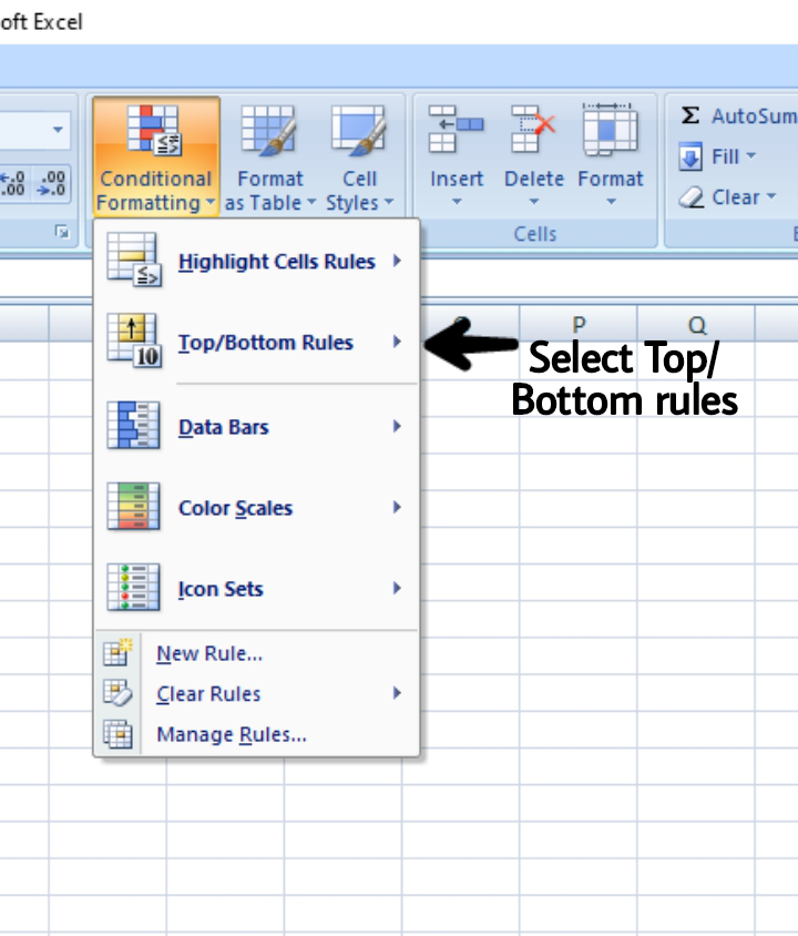
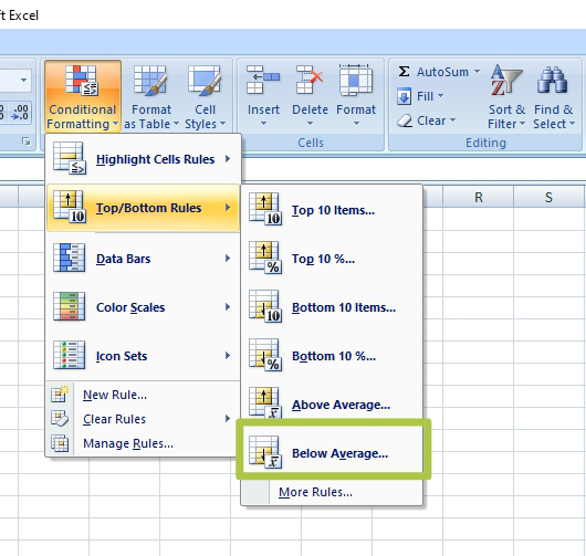
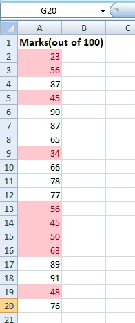
Steps to highlight marks that are below average
Step 1: Insert the data in the spreadsheet, we enter the marks in the spreadsheet.
Step 2: Select the range of cells(A2:A20).
Step 3: Select the Conditional formatting in the Home tab, click on Top/Bottom Rules.
Step 4: Click on Below average.
Step 5: Select your desired color, we will go with the default color.
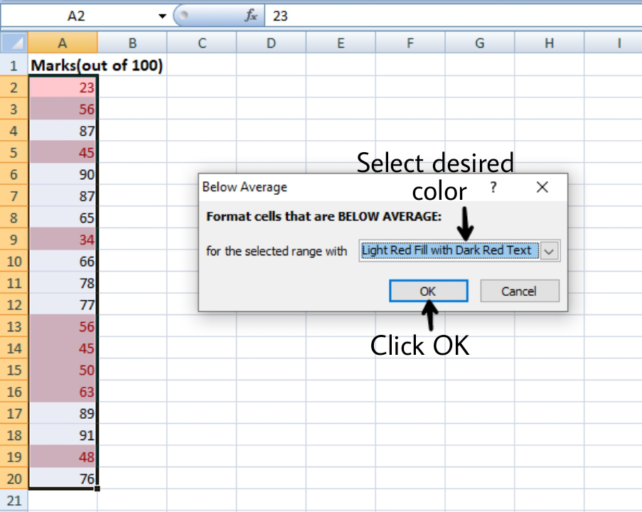
Step 6: Click OK.
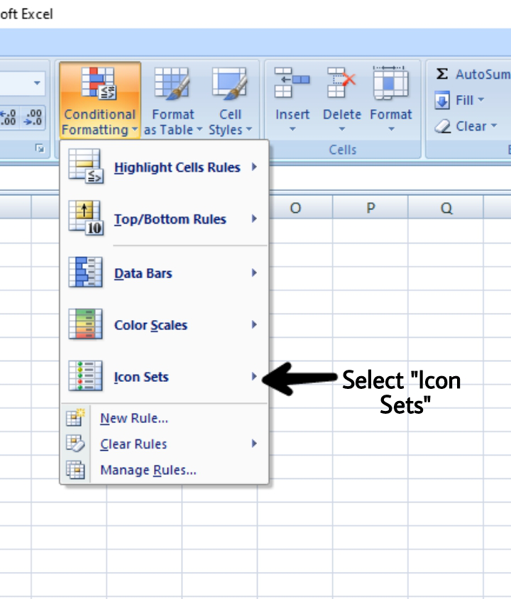
Steps to set icons on the marks
Step 1: Insert the data in the spreadsheet, we enter the marks in the spreadsheet.
Step 2: Select the range of cells(A2:A20).
Step 3: Select the Conditional formatting in the Home tab, click on Icon Sets.
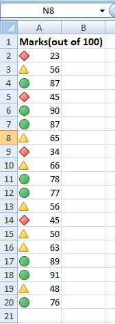
Step 4: Select your desired icon(green shows the above average values, yellow shows the average value, red shows the below-average values).
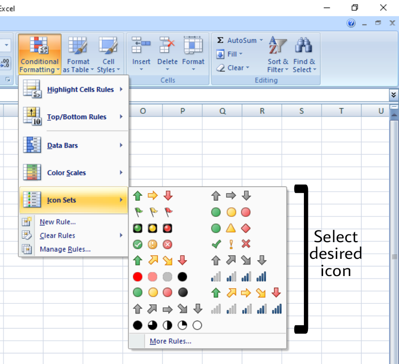
Step 5: You can also define your own rules.
- For example, we want a green symbol before the marks greater than 70, red before the marks less than 50, yellow before the marks between 50 and 70.
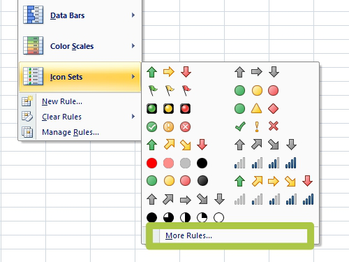
- Click on More Rules(here you can change Icon styles, Reverse icon order, Show icon only(i.e. the data(s) will not be displayed), etc).
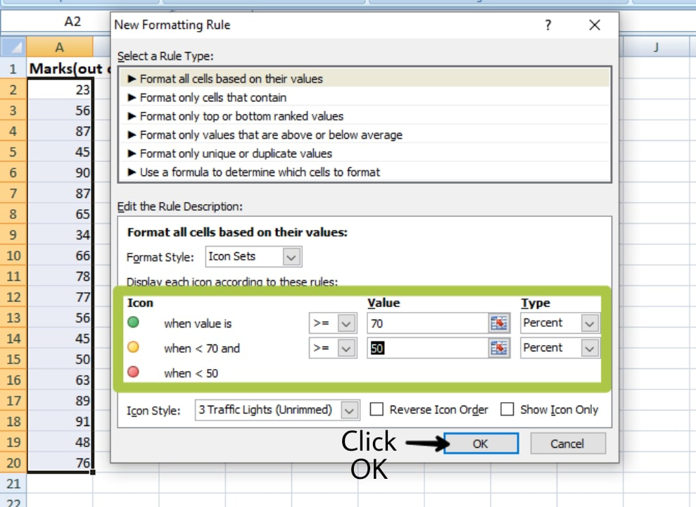
Step 6: Click OK.
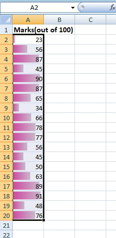
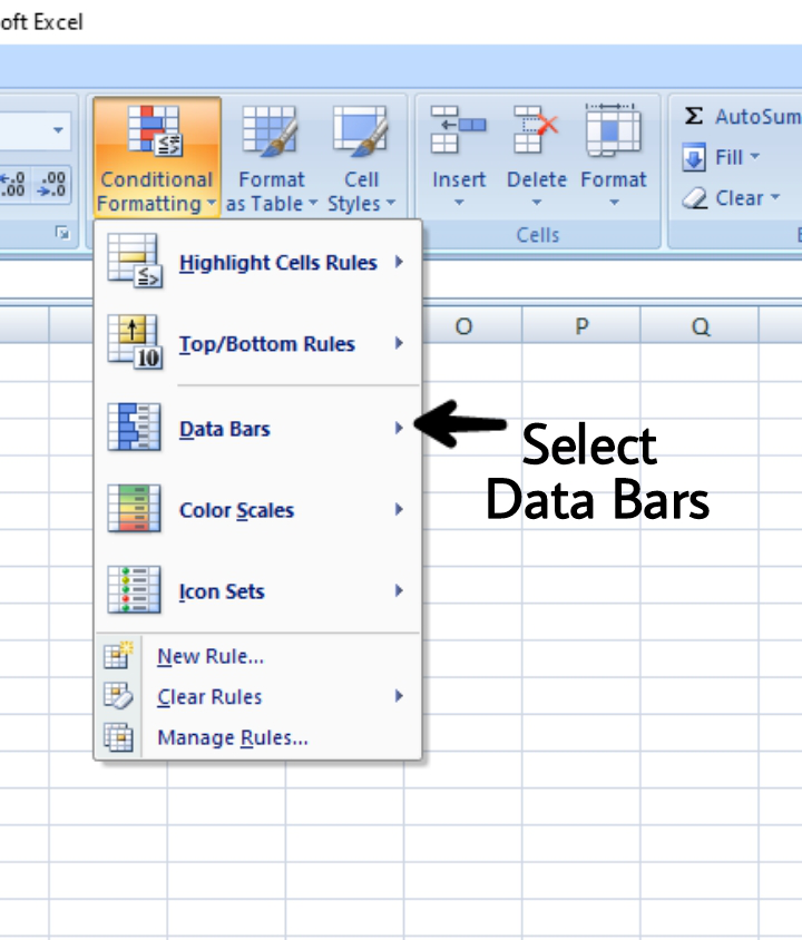
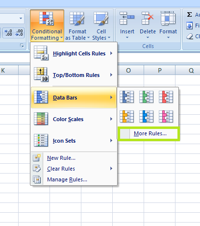
Steps to show data bars on the marks
Step 1: Insert the data in the spreadsheet, we enter the marks in the spreadsheet.
Step 2: Select the range of cells(A2:A20).
Step 3: Select the Conditional formatting in the Home tab, click on the Data bars.
Step 4: Select your desired color for the bars.
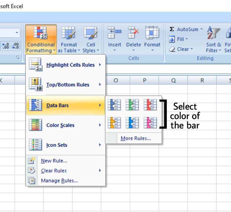
Step 5: You can also define your own rules.
- For example, we want the lowest bar on marks less than 30 and the longest bar on marks greater than 80.
- Click on More Rules(here you can change Icon styles, Reverse icon order, Show icon only(i.e. the data(s) will not be displayed), etc).
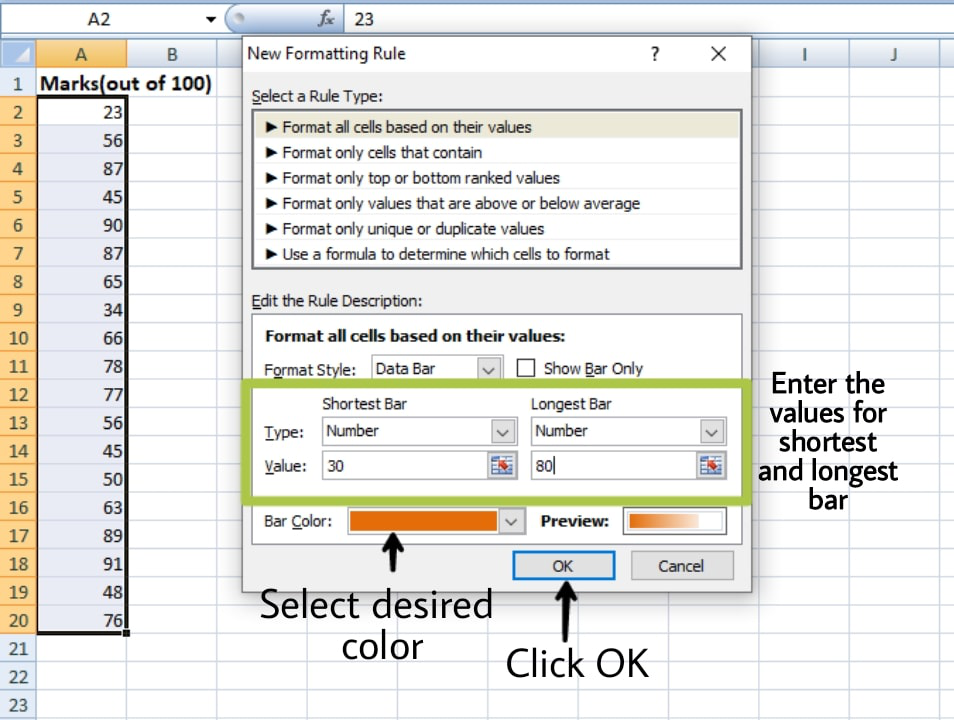
Step 6: Click OK.