Python – Data visualization tutorial

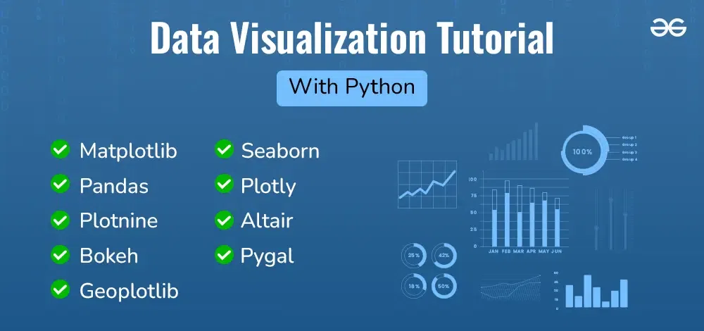
Data visualization is a crucial aspect of data analysis, helping to transform analyzed data into meaningful insights through graphical representations. This comprehensive tutorial will guide you through the fundamentals of data visualization using Python. We’ll explore various libraries, including Matplotlib, Seaborn, Pandas, Plotly, Plotnine, Altair, Bokeh, Pygal, and Geoplotlib. Each library offers unique features and advantages, catering to different visualization needs and preferences.
Data visualization tutorial
Introduction to Data Visualization
After analyzing data, it is important to visualize the data to uncover patterns, trends, outliers, and insights that may not be apparent in raw data using visual elements like charts, graphs, and maps. Choosing the right type of chart is crucial for effectively communicating your data. Different charts serve different purposes and can highlight various aspects of your data. For a deeper dive into selecting the best chart for your data, check out this comprehensive guide on:
- What is Data Visualization and Why is It Important?
- Types of Data Visualization Charts
- Choosing the Right Chart Type
Equally important is selecting the right colors for your visualizations. Proper color choices highlight key information, improve readability, and make visuals more engaging. For expert advice on choosing the best colors for your charts, visit How to select Colors for Data Visualizations?
Python Libraries for Data Visualization
Python offers numerous libraries for data visualization, each with unique features and advantages. Below are some of the most popular libraries:
Here are some of the most popular ones:
- Matplotlib
- Seaborn
- Pandas
- Plotly
- Plotnine
- Altair
- Bokeh
- Pygal
- Geoplotlib
Getting Started – Data Visualization with Matplotlib
Matplotlib is a great way to begin visualizing data in Python, essential for data visualization in data science. It is a versatile library that designed to help users visualize data in a variety of formats. Well-suited for creating a wide range of static, animated, and interactive plots.
- Introduction to Matplotlib
- Setting up Python Environment for installation
- Pyplot in Matplotlib
- Matplotlib – Axes Class
- Data Visualization With Matplotlib
Example: Plotting a Linear Relationship with Matplotlib
# importing the required libraries
import matplotlib.pyplot as plt
import numpy as np

# define data values
x = np.array([1, 2, 3, 4]) # X-axis points
y = x*2 # Y-axis points

plt.plot(x, y) # Plot the chart
plt.show() # display
Output:

Effective Data Visualization With Seaborn
Seaborn is a Python library that simplifies the creation of attractive and informative statistical graphics. It integrates seamlessly with Pandas DataFrames and offers a range of functions tailored for visualizing statistical relationships and distributions. This chapter will guide you through using Seaborn to create effective data visualizations.
- Data Visualization with Python Seaborn
- Data visualization with Seaborn Pairplot
- Data Visualization with FacetGrid in Seaborn
- Time Series Visualization with Seaborn : Line Plot
Example: Scatter Plot Analysis with Seaborn
import seaborn as sns
import matplotlib.pyplot as plt

# Load the 'tips' dataset
tips = sns.load_dataset('tips')

# Create a scatter plot
plt.figure(figsize=(6, 4))
sns.scatterplot(x='total_bill', y='tip', data=tips, hue='time', style='time')
plt.title('Total Bill vs Tip')
plt.xlabel('Total Bill')
plt.ylabel('Tip')
plt.show()
Output:

Data Visualization with Seaborn
Data Visualization with Pandas
Pandas is a powerful data manipulation library in Python that also offers some basic data visualization capabilities. While it may not be as feature-rich as dedicated visualization libraries like Matplotlib or Seaborn, Pandas’ built-in plotting is convenient for quick and simple visualizations.
- Data Visualization With Pandas
- Visualizing Time Series Data with pandas
- Plotting Geospatial Data using GeoPandas
Examples: Visualizing Spread and Outliers
Box plots are useful for visualizing the spread and outliers in your data. They provide a graphical summary of the data distribution, highlighting the median, quartiles, and potential outliers. Let’s create box plot with Pandas:
# Sample data
data = {
    'Category': ['A']*10 + ['B']*10,
    'Value': [1, 2, 3, 4, 5, 6, 7, 8, 9, 10, 2, 3, 4, 5, 6, 7, 8, 9, 10, 11]
}

df = pd.DataFrame(data)

# Box plot
df.boxplot(by='Category')
plt.title('Box Plot Example')
plt.suptitle('')
plt.xlabel('Category')
plt.ylabel('Value')
plt.show()
Output:

Box Plot
Data Visualization with Plotly
Plotly is a versatile library for creating interactive and aesthetically pleasing visualizations. This chapter will introduce you to Plotly and guide you through creating basic visualizations.
We’ll create a simple bar plot. For this example, we’ll use the same ‘tips’ dataset we used with Seaborn.
import plotly.express as px
import pandas as pd

tips = px.data.tips()
fig = px.bar(tips, x='day', y='total_bill', title='Average Total Bill per Day')
fig.show()
Output:

Bar Plot Plotly
Plotly allows for extensive customizations, including updating layouts, adding annotations, and incorporating dropdowns and sliders.
Data Visualization with Plotnine
Plotnine is a Python library that implements the Grammar of Graphics, inspired by R’s ggplot2. It provides a coherent and consistent way to create complex visualizations with minimal code.. This chapter will introduce you to Plotnine in Python, demonstrating how they can be used to create various types of plots.
Plotnine Example: Creating Line Plots
import pandas as pd
from plotnine import ggplot, aes, geom_line, geom_histogram, labs, theme_minimal
from plotnine.data import economics

# Load the 'economics' dataset available in Plotnine
# This dataset contains economic indicators including unemployment numbers

# Create a line plot to visualize the trend of unemployment rate over time
line_plot = (
    ggplot(economics, aes(x='date', y='unemploy'))
    + geom_line(color='blue')
    + labs(title='Unemployment Rate Over Time',
           x='Date', y='Number of Unemployed')
    + theme_minimal()
)

print(line_plot)
Output:

Line Plots
Data Visualizations with Altair
Altair is a declarative statistical visualization library for Python, designed to provide an intuitive way to create interactive and informative charts. Built on Vega and Vega-Lite, Altair allows users to build complex visualizations through simple and expressive syntax.
- Data Visualization with Altair
- Aggregating Data for Large Datasets
- Sharing and Publishing Visualizations with Altair
Altair Example: Creating Charts
# Import necessary libraries
import altair as alt
from vega_datasets import data

iris = data.iris()

# Create a scatter plot
scatter_plot = alt.Chart(iris).mark_point().encode(
    x='sepalLength',
    y='petalLength',
    color='species'
)
scatter_plot
Output:

Creating Charts
Interactive Data Visualization with Bokeh
Bokeh is a powerful Python library for creating interactive data visualization and highly customizable visualizations. It is designed for modern web browsers and allows for the creation of complex visualizations with ease. Bokeh supports a wide range of plot types and interactivity features, making it a popular choice for interactive data visualization.
- Introduction to Bokeh in Python
- Interactive Data Visualization with Bokeh
- Practical Examples for Mastering Data Visualization with Bokeh
Example : Basic Plotting with Bokeh- Adding Hover Tool
from bokeh.models import HoverTool
from bokeh.plotting import figure, show
from bokeh.io import output_notebook

output_notebook()
p = figure(title="Scatter Plot with Hover Tool",
           x_axis_label='X-Axis', y_axis_label='Y-Axis')

p.scatter(x=[1, 2, 3, 4, 5], y=[6, 7, 2, 4, 5],
          size=10, color="green", alpha=0.5)

# Add HoverTool
hover = HoverTool()
hover.tooltips = [("X", "@x"), ("Y", "@y")]
p.add_tools(hover)

# Show the plot
show(p)
Output:

Basic Plotting with Bokeh- Adding Hover Tool
Mastering Advanced Data Visualization with Pygal
In this final chapter, we will delve into advanced techniques for data visualization using Pygal. It is known for its ease of use and ability to create beautiful, interactive charts that can be embedded in web applications.
- Data Visualization with Pygal: With Pygal, you can create a wide range of charts including line charts, bar charts, pie charts, and more, all with interactive capabilities.
Example: Creating Advanced Charts with Pygal
Firstly, you’ll need to install pygal, you can install it using pip:
pip install pygalimport pygal
from pygal.style import Style
# Create a custom style
custom_style = Style(
background='transparent',
plot_background='transparent',
foreground='#000000',
foreground_strong='#000000',
foreground_subtle='#6e6e6e',
opacity='.6',
opacity_hover='.9',
transition='400ms',
colors=('#E80080', '#404040')
)
# Create a line chart
line_chart = pygal.Line(style=custom_style, show_legend=True,
x_title='Months', y_title='Values')
line_chart.title = 'Monthly Trends'
line_chart.add('Series 1', [1, 3, 5, 7, 9])
line_chart.add('Series 2', [2, 4, 6, 8, 10])
# Render the chart to a file
line_chart.render_to_file('line_chart.svg')
Output:

Advanced Line Charts with Pygal
Choosing the Right Data Visualization Library
| Library | Best For | Strengths | Limitations |
|---|---|---|---|
| Matplotlib | Static plots | Highly customizable | Steep learning curve |
| Seaborn | Statistical visualizations | Easy to use, visually appealing | Limited interactivity |
| Plotly | Interactive visualizations | Web integration, modern designs | Requires browser rendering |
| Bokeh | Web-based dashboards | Real-time interactivity | More complex setup |
| Altair | Declarative statistical plots | Concise syntax | Limited customization |
| Pygal | Scalable SVG charts | High-quality graphics | Less suited for complex datasets |
To create impactful and engaging data visualizations. Start by selecting the appropriate chart type—bar charts for comparisons, line charts for trends, and pie charts for proportions.
- Simplify your visualizations to focus on key insights.
- Use annotations to guide the viewer’s attention.
- Strategically use color to differentiate categories or highlight important data, but avoid overuse to prevent confusion.
For a more detailed exploration of these techniques consider below resources:
- 6 Tips for Creating Effective Data Visualizations
- Data Visualization in Infographics: Techniques and Examples
- 5 Best Practices for Effective and Good Data Visualizations
- Bad Data Visualization Examples Explained