Segregation as pointillism?
Using data gleaned from the 2010 U.S. Census, Dustin Cable at the University of Virginia’s Weldon Cooper Center for Public Service has created what might be the most comprehensive color-coded map of racial segregation in America. Made up of 308,745,538 colored dots representing five major ethnic groups, Cable's map is vivid, highly detailed and oddly beautiful. While it isn't the first map to show racial segregation, nor is it the first to map each citizen in the U.S. -- it is the first to do both, according to Wired.
For the purposes of his map, Cable chose blue dots to represent white people, green dots for African-Americans, red dots for Asians and orange dots for Latinos. All other race categories are denoted using a brown dot.
(Story continues below.)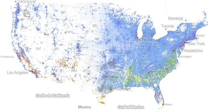
The United States of America.
In an interview with The Huffington Post, Cable said he hoped his map would prove accessible for the general public.
Built off code used by previous data visualization mappers, Cable's unique new map will hopefully "help place people in the context of their neighborhood" in terms of both ethnicity and geography, he said.
The unique map also has labels, making it relatively easy for users to zoom in on a specific city, neighborhood and even street. The differing levels of racial integration and segregation become apparent from both macro and micro perspectives.
The marked racial divide along either side of Detroit's 8 Mile Road, for example, illustrates the way segregation can be present along street lines.
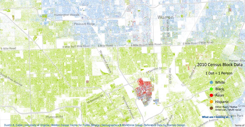
Detroit's 8 Mile Road.
An overview of the city of New York shows the ethnic complexity of the metropolitan area's many neighborhoods.
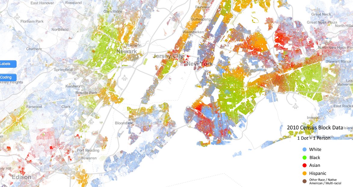
New York City.
So far, Cable said the responses to his map have been generally glowing, with people commenting on the map's potential in terms of America's ongoing conversation about race and segregation.
"I have had comments [in relation to] the 50th anniversary of the March on Washington [led by Martin Luther King Jr.]," Cable told HuffPost. He also said the map has sparked new "discussions of race and what it means today."
Here are a few more snapshots from Cable's map, with varying levels of specificity. You can also explore the entire project on the Weldon Cooper Center for Public Service's website.
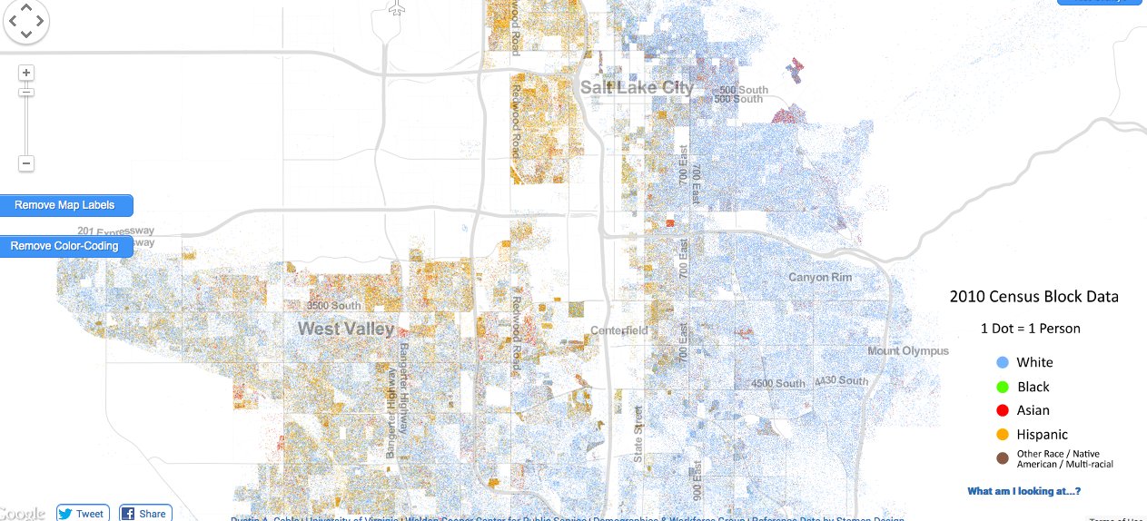
Salt Lake City.
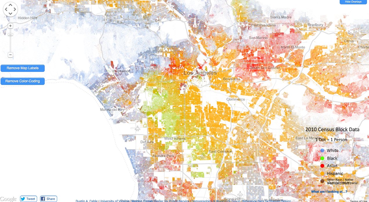
Los Angeles.
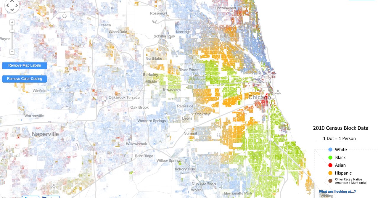
Chicago.
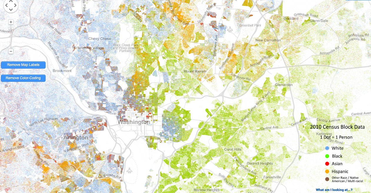
Washington D.C.
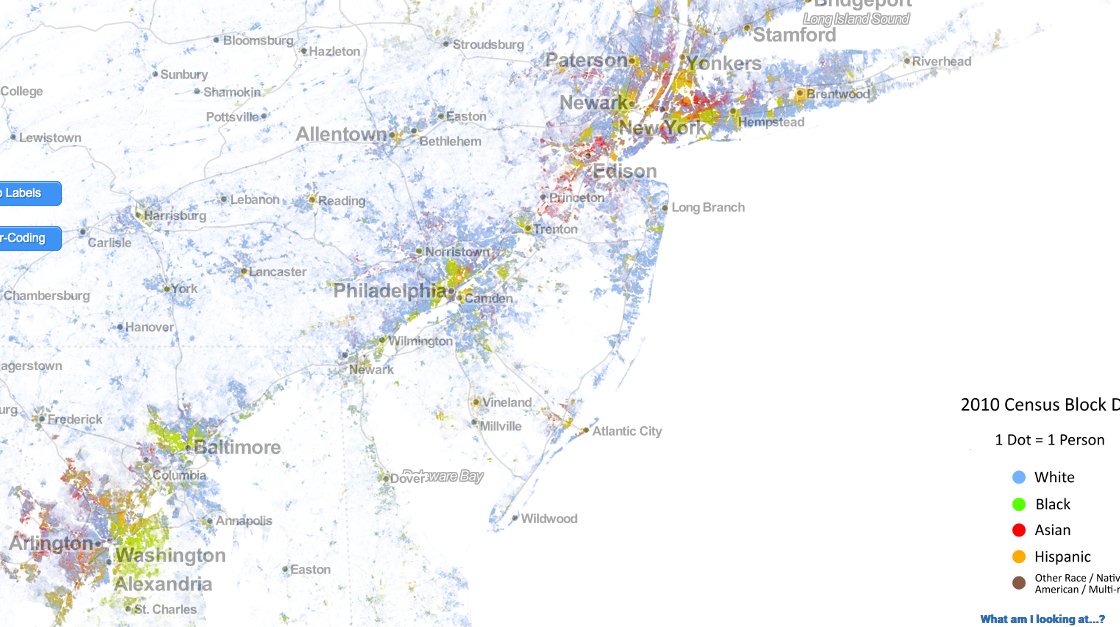
The United States East Coast.