Kadath and Yog-Sothoth

ys.jpg

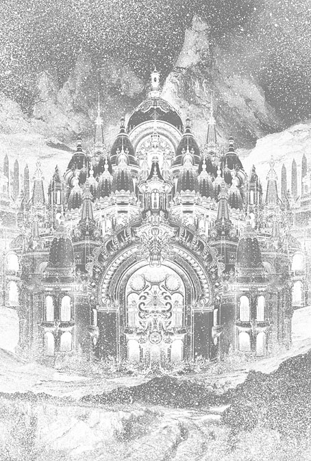
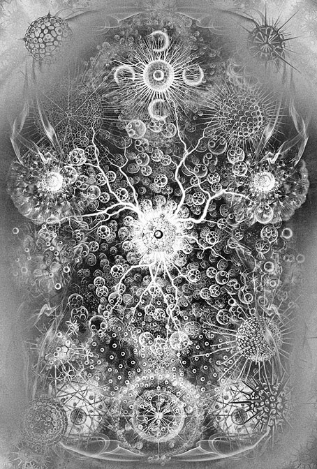
Last month I posted an updated version of the Yuggoth collage I created in 1994 for the Starry Wisdom story collection. I didn’t mention at the time that one purpose of the reworking was to freshen the piece for a more ambitious updating of my own Lovecraft book, The Haunter of the Dark, a volume which has now been through two different editions. I’m generally resistant to the temptation to tamper with old artwork, something which is always present when you’re using digital tools. I’d much rather create something new. In the case of The Haunter of the Dark, however, this has felt necessary when the plan for the new edition requires adding a quantity of my more recent Lovecraft-related pieces to the older art. The section of the book titled The Great Old Ones was a collaboration with Alan Moore in which deities and locations from the Cthulhu Mythos were mapped across the Sephiroth of the Kabbalistic Tree of Life. Most of the art for this section was done in 1999 when I’d only been using Photoshop for a couple of years. I was excited by the possibilities the software presented but some of the results look very typical of the period: lots of obvious filtering, and transparent layering of a kind I seldom do today. Since I finished reworking the Yuggoth collage (which happens to be a part of The Great Old Ones section) I’ve also reworked three more pieces: Nyarlathotep, Kadath and Yog-Sothoth. The latter two you see here, Nyarlathotep isn’t quite finished yet. My intention with the new versions has been to retain the idea, and in some cases the composition, of the original, while creating a new piece which avoids the shortcomings of the 1999 versions.

kadath.jpg

Kadath, 2025.

Of the two, the original Kadath was a piece I was never happy with. I hadn’t thought very much about how to represent Kadath beyond having a cluster of buildings in a snowy setting. Lovecraft is evasive about the details but the place is essentially a fantastic palace (or maybe a city) in an icy wasteland. My original version collaged together bits of Indian, Thai and Cambodian architecture which created a definite “exotic” appearance but I was never happy about using identifiable temples in this way. The composition was also rather messy. The new piece also takes the collage route, only this time I’ve used architectural details from some of the pavilions built for the Paris Exposition Universelle of 1900. Several of the themed pavilions built for the exposition were fanciful and fantastic extrapolations of the Beaux-Arts style that don’t resemble anything built before or after. The buildings were also temporary constructions so they’re a lot less identifiable than buildings with a longer history.

yog-sothoth.jpg

Yog-Sothoth, 2025.

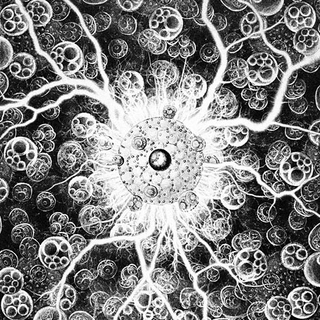
As for Yog-Sothoth, this one follows the idea of the original but with better choice of elements and presentation. Once again, details are vague as to Yog-Sothoth’s appearance but I always come back to the description of an inter-dimensional mass of spheres or globes. The original illustration manifested these globes by swiping a variety of globular creatures from Ernst Haeckel’s Kunstformen der Natur, something that worked quite well but the composition could have been better. The new picture follows suit, only this time I’ve borrowed details from another Haeckel book, Die Radiolarien (Rhizopoda radiaria): Eine Monographie (1862), which is less well-known and with illustrations of many more globular or radial organisms than in the other volume.

For the remaining pieces I’m going to be drawing rather than collaging. The results will be posted here in due course.

Elsewhere on { feuilleton }
The Lovecraft archive

Weekend links 762

max.jpg

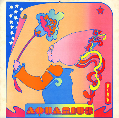
Aquarius from the 1971 Astrologicalendar by Peter Max. Via.

AOS of London: Psychogeographia Zosiana is a map guide to the London of Austin Osman Spare with accompanying illustrations by Ben Thompson. The book also contains an interview transcript in which Alan Moore talks about the importance of Spare’s work, and a contextual history by Gavin W. Semple.

Emigre was “…a (mostly) quarterly magazine published from 1984 until 2005 in Berkeley, California, dedicated to visual communication, graphic design, typography, and design criticism.” The magazine ran for 69 issues which can be downloaded here.

• “The ultimate reason for initiating something ambitious is not to fulfill certain notions but to find out what surprises might emerge.” Stewart Brand, quoted in a long read by Alec Nevala-Lee about the Clock of the Long Now.

• At the Criterion Current: David Hudson on David Lynch’s life and work, an overview of the reaction to last week’s news. I was surprised to find my comments about Alan Splet included in the collection.

• At Wormwoodiana: Mark Valentine on the connections between Charles Williams’ The Place of the Lion and an obscure piece of fiction (or is it?) by Ruaraidh Erskine.

• At Public Domain Review: Illustrations by Jay van Everen from The Laughing Prince: A Book of Jugoslav Fairy Tales and Folk Tales (1921).

• At Colossal: Beguiling botanicals fluoresce in Tom Leighton’s otherworldly photographs.

• New music: Glory Fades by Yair Elazar Glotman & Mats Erlandsson.

• Old music: Cités Analogues by Lightwave.

• At Dennis Cooper’s: Georges Perec Day.

The Clock Strikes Twelve (1959) by Bo Diddley | Clock Factory (1993) by The Sabres Of Paradise | Clock (1995) by Node

Novelty and curio catalogues

novelties01.jpg

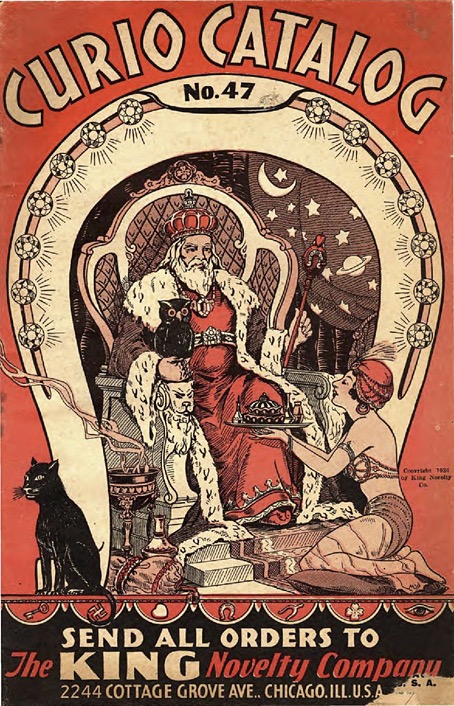
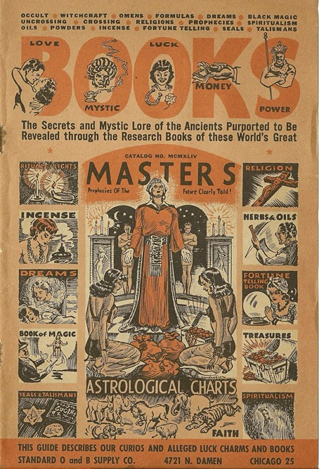
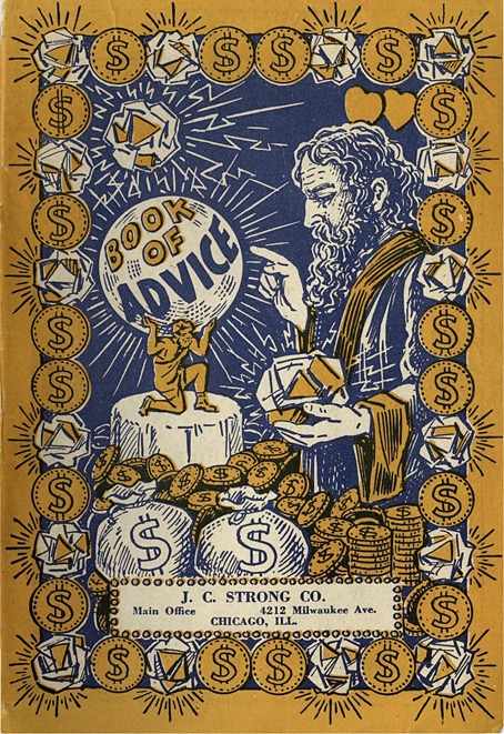
One of the more esoteric corners of the Internet Archive is the section devoted to the International Association for the Preservation of Spiritualist and Occult Periodicals: “The IAPSOP is a US-based private organization focused on the digital preservation of Spiritualist and occult periodicals published between the Congress of Vienna and the start of the Second World War.” The collection currently comprises over 30,000 items. I didn’t go looking for this while I was reading Nightmare Alley but the IAPSOP archive happens to contain the kinds of publications whose paranormal and religious jargon Stanton Carlisle uses to relieve chumps of their cash. A sub-section of the collection contains novelty and curio catalogues, publications from mail-order companies selling all manner of incense, lucky charms, cheap jewellery and minor items of occult significance. I wish I’d found these catalogues when I was working on the Bumper Book of Magic. The drawings are crude but with things like this it’s the general appearance that you’re after, the finesse you can supply yourself.

novelties02.jpg

novelties03.jpg

Continue reading “Novelty and curio catalogues”

Nightmare Alleys

nightmare05.jpg

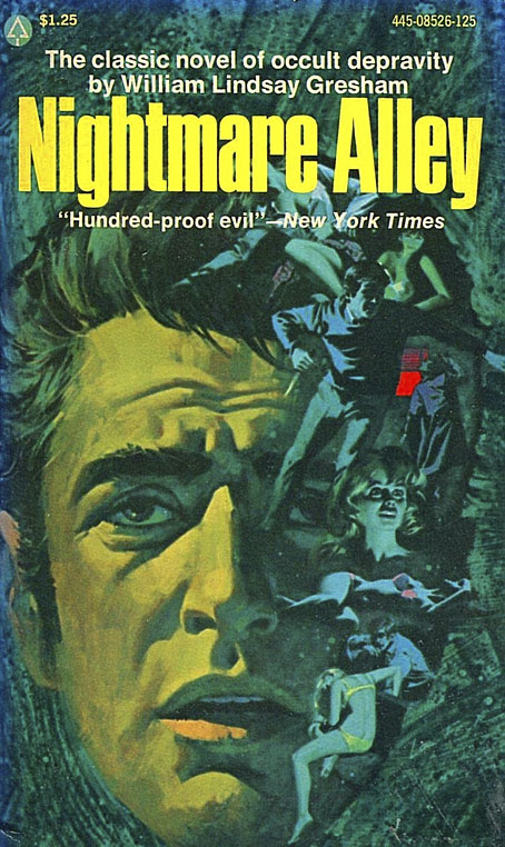
Undated paperback.

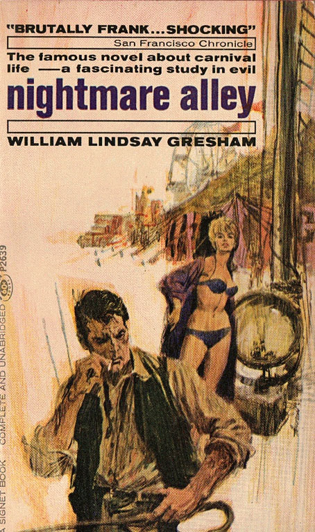
My reading this week has been William Lindsay Gresham’s Nightmare Alley, a novel I’d been intending to read for some time after becoming familiar with the story from the first film adaptation. (I haven’t seen the recent version.) Whenever I’m reading a novel that’s been around for a while I have to see how it was presented in the past by designers and illustrators. Nightmare Alley was published in hardback originally, and the book today is marketed as a literary classic, but Gresham’s account of cheap carnivals and fraudulent mediums is sufficiently lurid enough to warrant a variety of different treaments, including pulp excess. The paperback at the top of this post is an extreme example but the cover could easily be applied to any number of noirish thrillers, there’s nothing in the artwork to suggest the carny world or the Spiritualism that the novel’s protagonist, Stanton Carlisle, mercilessly exploits.

nightmare01.jpg

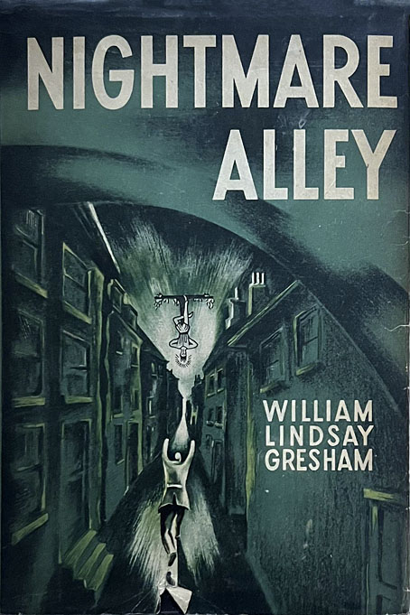
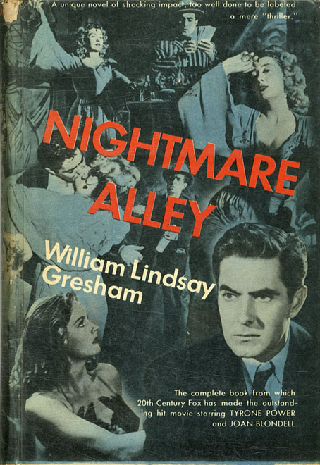
First edition, USA, 1946.

The first edition isn’t a great design but it happens to be faithful to the core storyline, more so than many of the covers that follow. In the film we’re left to guess what the “nightmare alley” of the title might be but in the novel this is a symbol that recurs throughout the story, a literal nightmare of Carlisle’s in which he dreams he’s being chased down a dark alleyway towards a light that remains continually out of reach. The dream weighs enough on Carlisle’s mind for him to regard it as a symbol of the human condition, or at least his soured perception of the same. The cover of the first edition combines this image with the Tarot trump of The Hanged Man which Carlisle turns up in a reading as a signifier of his destiny. Tarot scholars may quibble with this detail—The Hanged Man isn’t as doom-laden or negative as the novel suggests—but Gresham makes good use of Tarot as a structural element, with each chapter named after one of the trump cards, and with elements of the story reflecting the Tarot imagery. Given all this you’d expect cover artists to use Tarot symbolism much more than they do.

nightmare03.jpg

First paperback edition, USA, 1948.

Another odd omission is the colour of Carlisle’s hair which the novel repeatedly tells us is blond. When Carlisle begins his career as a phony preacher and medium his blue-eyed “golden boy” persona is one of his tools for charming and deceiving wealthy widows. Gresham reinforces this in the chapter named after The Sun trump card by having Carlisle identified with the god Apollo. The film adaptations and almost all of the book covers ignore this detail.

nightmare02.jpg

Film tie-in, USA, 1948.

The 1947 film adaptation was directed by Edmund Golding from a screenplay by Jules Furthman. The storyline is condensed and inevitably sanitised for the screen but it’s still one of the best film noir entries from the prime noir decade.

nightmare04.jpg

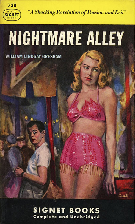
Art by James Avati, USA, 1949.

James Avati was one of the great paperback illustrators yet even he gives Carlisle dark hair. I suspect by this point everyone expected as much after Tyrone Power’s memorable performance.

nightmare06.jpg

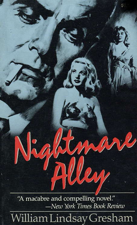
USA, 1986.

And Power’s saturnine features are still providing the dominant image forty years later.

Continue reading “Nightmare Alleys”

Weekend links 761

agate.jpg

• At Bandcamp: Marc Masters on The Curious Case of the Channeled New Age Tape; and Erick Bradshaw’s guide to Nurse With Wound.

• At Public Domain Review: Designing the Sublime – Boullée and Ledoux’s Architectural Revolution by Hugh Aldersey-Williams.

• The fifth installment of Smoky Man’s exploration of The Bumper Book of Magic has been posted (in Italian) at (quasi).

It does not follow that the scientific spirit of empirical inquiry runs against dreaming, and [André] Breton was wrong to think [Roger] Caillois’s investigative methods opposed wonder. Material mysticism led Caillois back to magical thinking, which he expanded further than the Surrealist interest in chance and coincidence as he probed for insights into the order of things. Caillois was equally, perhaps even more, fascinated with magic than the Surrealists, but he wanted to probe what might exist as phenomenally marvelous, beyond the subjective self—he was a scholar of the sacred, and from the episode of the jumping beans onwards, he looked for its character and its workings in actual phenomena. In this sense he was more of a believer—though not in a personal god or a religion. Where Breton exalted the perceiver, Caillois wanted to go beyond these anthropocentric limits.

Marina Warner on the imaginary logic of Roger Caillois

• Mixes of the week: DreamScenes – January 2025 at Ambientblog, and Unrush 093 at A Strangely Isolated Place.

• At Criterion.com: Reincarnations of a Rebel Muse – David Hudson on Delphine Seyrig.

• Old music renewed: Angherr Shisspa (Revisited) by Koenjihyakkei.

• At Dennis Cooper’s it’s Laura Dern’s Day.

Jussi Lehtisalo’s favourite music.

• Lynch music: The Beast (1956) by Milt Buckner | Honky Tonk (Part 1) (1958) by Bill Doggett | Something Wicked This Way Comes (1996) by Barry Adamson