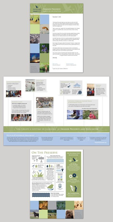
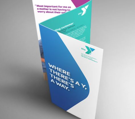
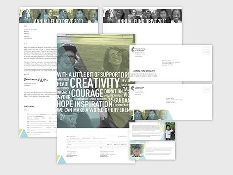
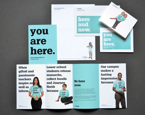
United Way Orange Nonprofit Brochure Example : Use a contrasting color to highlight important info -- If you want something to stand out from the text around it, use a contrasting color to make it pop. Color can be used to help indicate hierarchy in your design. Now if you are able to complementary colors, that’s even better and the content will stand out like a beacon. In this marketing brochure example, they use white text to highlight their motto and the donation values, while keeping all…
43

