Parabolic SAR Deviation [BigBeluga]Parabolic SAR + Deviation is an enhanced Parabolic SAR indicator designed to detect trends while incorporating deviation levels and trend change markers for added depth in analyzing price movements.
🔵 Key Features:
> Parabolic SAR with Optimized Settings:
Built on the classic Parabolic SAR, this version uses predefined default settings to enhance its ability to detect and confirm trends.
Clear trend direction is indicated by smooth trend lines, allowing traders to easily visualize market movements.
Trend Change Markers:
When a trend change occurs based on the SAR, the indicator plots a triangle at the trend change point.
The triangle is accompanied by the price value of the trend change, allowing traders to identify key reversal points instantly.
> Deviation Levels:
Four deviation levels are automatically plotted when a trend change occurs (up or down).
Uptrend: Deviation levels are positioned above the entry point.
Downtrend: Deviation levels are positioned below the entry point.
Levels are labeled with numbers 1 to 4, representing increasing degrees of deviation.
> Dynamic Level Updates:
When the price crosses a deviation level, the level becomes dashed and its label changes to display the volume at the breakout point.
This volume information helps traders assess the strength of the breakout and the potential for trend continuation or reversal.
> Volume Analysis at Breakpoints:
The volume displayed at crossed deviation levels provides insight into the strength of the price movement.
High volume at a breakout may indicate strong momentum, while low volume could signal potential exhaustion or a false breakout.
🔵 Usage:
Identify Trends: Use the trend change triangles and smooth SAR trend lines to confirm whether the market is trending up or down.
Analyze Deviation Levels: Monitor deviation levels **1–4** to identify potential breakout points and assess the degree of price deviation from the entry point.
Observe Trend Change Points: Utilize the triangles and price labels to quickly spot significant trend changes.
Volume Insights: Evaluate the volume displayed at crossed levels to determine the strength of the breakout and assess the likelihood of trend continuation or reversal.
Risk Management: Use deviation levels as potential stop-loss or take-profit zones, depending on the strength of the trend and volume conditions.
Parabolic SAR + Deviation is an essential tool for traders seeking a straightforward yet powerful method to identify trends, analyze price deviations, and gain insights into volume dynamics at critical breakout and trend change levels.
Indicators and strategies

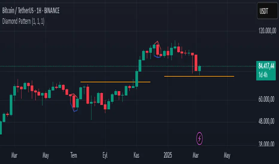
Diamond PatternDiamond Pattern Indicator
This indicator is designed to detect the Diamond Pattern, a technical formation that often signals potential trend reversals. The diamond pattern can lead to strong price movements, making it a valuable tool for traders.
Features:
✅ Automatic Detection – Identifies diamond patterns on the chart.
✅ Trend Reversal Signals – Highlights potential price direction changes.
✅ Multi-Timeframe Compatibility – Works across all timeframes.
✅ User-Friendly – Simple to use with no complex settings required.
How to Use:
1. Add the indicator to your chart.
2. Monitor for the formation of a Diamond Pattern.
3. Use the breakout direction to guide your trading decisions.
Range Breakout Signals [AlgoAlpha]OVERVIEW
This script detects range-bound market conditions and breakout signals using a combination of volatility compression and volume imbalance analysis. It identifies zones where price consolidates within a defined range and highlights potential breakout points with visual markers. Traders can use this to spot market transitions from ranging to trending phases, aiding in decision-making for breakout strategies.
CONCEPTS
The script measures volatility by comparing the ratio of the simple moving average (SMA) of price movements to their median value. When volatility drops below a threshold, the script assumes a range-bound market. It then tracks the cumulative volume of buying and selling pressure to assess breakout strength. The approach is based on the idea that market consolidation often precedes strong moves, and volume distribution can provide clues on the breakout direction.
FEATURES
Range Detection : Uses a volatility filter to identify low-volatility zones and marks them on the chart with shaded boxes.
Volume Imbalance Analysis : Evaluates cumulative up and down volume over a confirmation period to assess directional bias.
Breakout Signals : When price exits a detected range, the script plots breakout markers. A ▲ symbol indicates a bullish breakout, and a ▼ symbol indicates a bearish breakout. Additional "+" markers indicate strong volume imbalance favoring the breakout direction.
Adaptive Timeframe Volume Analysis : The script dynamically adjusts its volume calculation based on the chart’s timeframe, ensuring reliable signal generation across different trading conditions.
Alerts : Notifies traders when a new range is detected or when a breakout occurs, allowing for automated monitoring.
USAGE
Traders can use this script to identify potential trade setups by entering positions when price breaks out of a detected range. For breakout confirmation, traders can look at volume imbalance cues—bullish breakouts with strong buying volume may indicate sustained moves, while weak volume breakouts may lead to false signals. This script is particularly useful for breakout traders, range traders seeking to fade breakouts, and those looking to automate trade alerts in volatile markets.

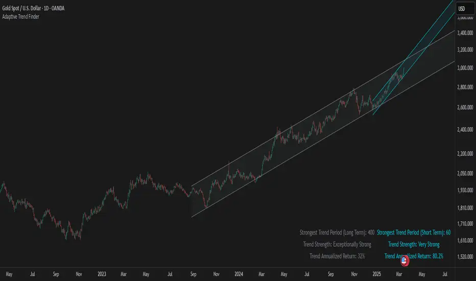
Adaptive Trend FinderAdaptive Trend Finder - The Ultimate Trend Detection Tool
Introducing Adaptive Trend Finder, the next evolution of trend analysis on TradingView. This powerful indicator is an enhanced and refined version of Adaptive Trend Finder (Log), designed to offer even greater flexibility, accuracy, and ease of use.
What’s New?
Unlike the previous version, Adaptive Trend Finder allows users to fully configure and adjust settings directly within the indicator menu, eliminating the need to modify chart settings manually. A major improvement is that users no longer need to adjust the chart's logarithmic scale manually in the chart settings; this can now be done directly within the indicator options, ensuring a smoother and more efficient experience. This makes it easier to switch between linear and logarithmic scaling without disrupting the analysis. This provides a seamless user experience where traders can instantly adapt the indicator to their needs without extra steps.
One of the most significant improvements is the complete code overhaul, which now enables simultaneous visualization of both long-term and short-term trend channels without needing to add the indicator twice. This not only improves workflow efficiency but also enhances chart readability by allowing traders to monitor multiple trend perspectives at once.
The interface has been entirely redesigned for a more intuitive user experience. Menus are now clearer, better structured, and offer more customization options, making it easier than ever to fine-tune the indicator to fit any trading strategy.
Key Features & Benefits
Automatic Trend Period Selection: The indicator dynamically identifies and applies the strongest trend period, ensuring optimal trend detection with no manual adjustments required. By analyzing historical price correlations, it selects the most statistically relevant trend duration automatically.
Dual Channel Display: Traders can view both long-term and short-term trend channels simultaneously, offering a broader perspective of market movements. This feature eliminates the need to apply the indicator twice, reducing screen clutter and improving efficiency.
Fully Adjustable Settings: Users can customize trend detection parameters directly within the indicator settings. No more switching chart settings – everything is accessible in one place.
Trend Strength & Confidence Metrics: The indicator calculates and displays a confidence score for each detected trend using Pearson correlation values. This helps traders gauge the reliability of a given trend before making decisions.
Midline & Channel Transparency Options: Users can fine-tune the visibility of trend channels, adjusting transparency levels to fit their personal charting style without overwhelming the price chart.
Annualized Return Calculation: For daily and weekly timeframes, the indicator provides an estimate of the trend’s performance over a year, helping traders evaluate potential long-term profitability.
Logarithmic Adjustment Support: Adaptive Trend Finder is compatible with both logarithmic and linear charts. Traders who analyze assets like cryptocurrencies, where log scaling is common, can enable this feature to refine trend calculations.
Intuitive & User-Friendly Interface: The updated menu structure is designed for ease of use, allowing quick and efficient modifications to settings, reducing the learning curve for new users.
Why is this the Best Trend Indicator?
Adaptive Trend Finder stands out as one of the most advanced trend analysis tools available on TradingView. Unlike conventional trend indicators, which rely on fixed parameters or lagging signals, Adaptive Trend Finder dynamically adjusts its settings based on real-time market conditions. By combining automatic trend detection, dual-channel visualization, real-time performance metrics, and an intuitive user interface, this indicator offers an unparalleled edge in trend identification and trading decision-making.
Traders no longer have to rely on guesswork or manually tweak settings to identify trends. Adaptive Trend Finder does the heavy lifting, ensuring that users are always working with the strongest and most reliable trends. The ability to simultaneously display both short-term and long-term trends allows for a more comprehensive market overview, making it ideal for scalpers, swing traders, and long-term investors alike.
With its state-of-the-art algorithms, fully customizable interface, and professional-grade accuracy, Adaptive Trend Finder is undoubtedly one of the most powerful trend indicators available.
Try it today and experience the future of trend analysis.
This indicator is a technical analysis tool designed to assist traders in identifying trends. It does not guarantee future performance or profitability. Users should conduct their own research and apply proper risk management before making trading decisions.
// Created by Julien Eche - @Julien_Eche
Bitcoin Polynomial Regression Model💡Why this model was created:
One of the key issues with most existing models, including our own Bitcoin Log Growth Curve Model , is that they often fail to realistically account for diminishing returns. As a result, they may present overly optimistic bull cycle targets (hence, we introduced alternative settings in our previous Bitcoin Log Growth Curve Model).
This new model however, has been built from the ground up with a primary focus on incorporating the principle of diminishing returns. It directly responds to this concept, which has been briefly explored here .
📉The theory of diminishing returns:
This theory suggests that as each four-year market cycle unfolds, volatility gradually decreases, leading to more tempered price movements. It also implies that the price increase from one cycle peak to the next will decrease over time as the asset matures. The same pattern applies to cycle lows and the relationship between tops and bottoms. In essence, these price movements are interconnected and should generally follow a consistent pattern. We believe this model provides a more realistic outlook on bull and bear market cycles.
To better understand this theory, the relationships between cycle tops and bottoms are outlined below:https://www.tradingview.com/x/7Hldzsf2/
🔧Creation of the model:
For those interested in how this model was created, the process is explained here. Otherwise, feel free to skip this section.
This model is based on two separate cubic polynomial regression lines. One for the top price trend and another for the bottom. Both follow the general cubic polynomial function:
ax^3 +bx^2 + cx + d.
In this equation, x represents the weekly bar index minus an offset, while a, b, c, and d are determined through polynomial regression analysis. The input (x, y) values used for the polynomial regression analysis are as follows:
Top regression line (x, y) values:
113, 18.6
240, 1004
451, 19128
655, 65502
Bottom regression line (x, y) values:
103, 2.5
267, 211
471, 3193
676, 16255
The values above correspond to historical Bitcoin cycle tops and bottoms, where x is the weekly bar index and y is the weekly closing price of Bitcoin. The best fit is determined using metrics such as R-squared values, residual error analysis, and visual inspection. While the exact details of this evaluation are beyond the scope of this post, the following optimal parameters were found:
Top regression line parameter values:
a: 0.000202798
b: 0.0872922
c: -30.88805
d: 1827.14113
Bottom regression line parameter values:
a: 0.000138314
b: -0.0768236
c: 13.90555
d: -765.8892
📊Polynomial Regression Oscillator:
This publication also includes the oscillator version of the this model which is displayed at the bottom of the screen. The oscillator applies a logarithmic transformation to the price and the regression lines using the formula log10(x) .
The log-transformed price is then normalized using min-max normalization relative to the log-transformed top and bottom regression line with the formula:
normalized price = log(close) - log(bottom regression line) / log(top regression line) - log(bottom regression line)
This transformation results in a price value between 0 and 1 between both the regression lines. The Oscillator version can be found here .
🔍Interpretation of the Model:
In general, the red area represents a caution zone, as historically, the price has often been near its cycle market top within this range. On the other hand, the green area is considered an area of opportunity, as historically, it has corresponded to the market bottom.
The top regression line serves as a signal for the absolute market cycle peak, while the bottom regression line indicates the absolute market cycle bottom.
Additionally, this model provides a predicted range for Bitcoin's future price movements, which can be used to make extrapolated predictions. We will explore this further below.
🔮Future Predictions:
Finally, let's discuss what this model actually predicts for the potential upcoming market cycle top and the corresponding market cycle bottom. In our previous post here , a cycle interval analysis was performed to predict a likely time window for the next cycle top and bottom:
In the image, it is predicted that the next top-to-top cycle interval will be 208 weeks, which translates to November 3rd, 2025. It is also predicted that the bottom-to-top cycle interval will be 152 weeks, which corresponds to October 13th, 2025. On the macro level, these two dates align quite well. For our prediction, we take the average of these two dates: October 24th 2025. This will be our target date for the bull cycle top.
Now, let's do the same for the upcoming cycle bottom. The bottom-to-bottom cycle interval is predicted to be 205 weeks, which translates to October 19th, 2026, and the top-to-bottom cycle interval is predicted to be 259 weeks, which corresponds to October 26th, 2026. We then take the average of these two dates, predicting a bear cycle bottom date target of October 19th, 2026.
Now that we have our predicted top and bottom cycle date targets, we can simply reference these two dates to our model, giving us the Bitcoin top price prediction in the range of 152,000 in Q4 2025 and a subsequent bottom price prediction in the range of 46,500 in Q4 2026.
For those interested in understanding what this specifically means for the predicted diminishing return top and bottom cycle values, the image below displays these predicted values. The new values are highlighted in yellow:
And of course, keep in mind that these targets are just rough estimates. While we've done our best to estimate these targets through a data-driven approach, markets will always remain unpredictable in nature. What are your targets? Feel free to share them in the comment section below.

Bias TableOverview
The Bias Table Indicator is a multi-timeframe analysis tool designed to provide a quick sentiment overview across multiple timeframes. It combines signals from Moving Averages (MAs) and Oscillators to determine market bias, helping traders make more informed decisions.
Key Features
✔ Multi-Timeframe Analysis (MTF) – Displays market bias across up to five timeframes.
✔ Customizable Signals – Choose whether bias is based on Moving Averages (MAs), Oscillators, or a combination of both.
✔ Visual Table Format – The indicator presents the bias as a color-coded table in the bottom-right corner of the chart for quick reference.
✔ Adjustable Colors & Display Settings – Users can customize colors for different sentiment states (Strong Buy, Buy, Neutral, Sell, Strong Sell).
How It Works
Bias Calculation: The indicator evaluates market conditions using preset values (which can be replaced with actual logic) to determine sentiment for each timeframe.
Multi-Timeframe Support: The table can display bias from hourly to monthly timeframes, giving traders a broader view of market conditions.
Customizable Signals: Users can filter the table to show bias based only on MAs, Oscillators, or a combination of both.
Interpreting the Table
📊 Timeframes: The leftmost column shows selected timeframes (e.g., 1H, 4H, 1D, 1W, 1M).
📈 Signal Columns:
MAs – Bias based on Moving Averages.
Oscillators – Bias based on momentum indicators like RSI, Stochastics, etc.
All – A combined bias based on both MAs & Oscillators.
🚦 Color-Coded Ratings:
🔵 Strong Buy – High bullish strength.
🔹 Buy – Moderate bullish sentiment.
⚪ Neutral – No clear trend.
🔸 Sell – Moderate bearish sentiment.
🔴 Strong Sell – High bearish strength.
Best Used For:
📈 Trend Confirmation: Validate signals from your primary strategy.
⏳ Multi-Timeframe Analysis: See whether short-term and long-term trends align.
⚡ Quick Sentiment Check: Get a high-level view of market conditions without analyzing multiple indicators separately.
Customization Options:
Select which timeframes to include in the table.
Choose whether to base bias on MAs, Oscillators, or both.
Adjust colors for each signal type.

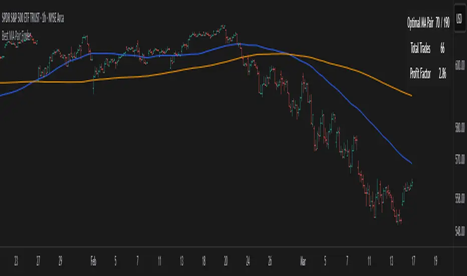
Best MA Pair Finder (Crossover Strategy)This indicator automatically identifies the optimal pair of moving averages (MAs) for a crossover strategy using all available historical data. It offers several MA options—including SMA, EMA, and TEMA—allowing users to select the desired type in the settings. The indicator supports two strategy modes: “Long Only” and “Buy & Sell”, which can be chosen via the options.
For each MA pair combination, the indicator performs a backtest and calculates the profit factor, considering only those pairs where the total number of trades meets or exceeds the user-defined "Minimum Trades" threshold. This parameter ensures that the selected optimal pair is based on a statistically meaningful sample rather than on a limited number of trades.
The results provided by this indicator are based on historical data and backtests, which may not guarantee future performance. Users should conduct their own analysis and use proper risk management before making trading decisions.
Multi Swing Point ConnectionsMulti Swing Point Connections — Tool for custom Highs & Lows structure mapping. This indicator allows to create fully customizable connections between multiple types of swing points, offering advanced visual structure of price dynamics.
Features:
Dynamic Swing Detection using adjustable pivot period.
Connect up to 8 swing relationships, with individual controls for swing points: 🔴 Higher High, 🟠 Lower High, 🔵 Higher Low, 🟢 Lower Low
Countback customization (steps for historical/future reference)
Optional enabling/disabling per connection
Visual Structure Mapping with configurable line color and width.
Perfect for identifying key structure shifts
Mapping trending vs consolidating phases
Building your own internal order flow frameworks
Inputs:
Swing Period: Defines how many bars to the left/right are used to detect pivot highs/lows.
Line Customization: Adjust style, width and color for visual clarity.
Connection Parameters: Select which swing types to connect, and control how far back and forward to look when making the connection.
Connection Examples:
HH to LH - Mapping potential bearish transition. Often signals weakening bullish momentum and a potential bearish shift in structure.
LL to HL - Mapping potential bullish transition. Suggests buyers stepping in earlier and potential bullish momentum building.
HL to LH (or LH to HL) - these can indicate sideways structure — often in consolidating or compressing price action depending on custom steps.
HH to HH (or LL to LL) - Connecting successive HHs or LLs visualizes higher highs in uptrends or lower lows in downtrends — a classic trend-following perspective.
HL to HL (or LH to LH) - Connecting successive HLs (or LHs) can highlight the “internal” structure between impulse legs, often defining minor trend channels or short-term ranges within the larger trend.

Cole's Market Structure BreakersCredit to LuxAlgo for the market structure breaker code which I've altered to add extendable boxes when a market structure break is detected. You can alter the amount of Market Structures you want to be visible in the settings as well.
There are added arrows for engulfing patterns on MSS's and arrows for resistance patterns on MSB's. These arrows have a built in alert as well.
There is also 5 ema's plotted for a nice visual of how the trend is going. You can toggle these to display on/off in settings depending on preference.
I've added a trend table in right hand corner for a cleaner chart visualization. It pulls the trend from the 5 ema's. The logic is made so if all 5 ema's are apart from each other it will show either Green(uptrend), Grey(neutral) or Red(Downtrend).
I've found this to be an amazing tool for scalping XAUUSD on the 1mins time frame. Hope this is useful for many traders!

UT Bot with EMA 9UT Bot with EMA 9 Indicator
The UT Bot with EMA 9 is an advanced trend-following indicator that combines the UT Bot with an Exponential Moving Average (EMA 9) to generate reliable buy and sell signals. This powerful tool helps traders identify optimal entry and exit points, while also using the ATR (Average True Range) to calculate dynamic trailing stops.
Key Features:
UT Bot Trailing Stop: The indicator plots a dynamic trailing stop based on the ATR, adjusting itself to the market conditions and helping to lock profits while minimizing losses.
EMA 9: The Exponential Moving Average (EMA 9) is used to smooth out price action, providing a trend-following strategy that highlights short-term momentum shifts.
Buy Signals: A buy signal is generated when the EMA 9 crosses above the ATR trailing stop, with a condition that the current closing price is greater than the previous close, confirming upward momentum.
Sell Signals: A sell signal occurs when the EMA 9 crosses below the ATR trailing stop, with a condition that the current closing price is lower than the previous close, confirming downward momentum.
Bar Colors: The bar colors change dynamically based on whether the price is above or below the trailing stop, helping to visually represent bullish or bearish trends.
This indicator is perfect for traders who want a comprehensive tool for trend confirmation and price action analysis, using both the UT Bot's ATR trailing stop and EMA 9 to guide decisions with precision.

Elliptic Curve SAROverview
The Elliptic Curve SAR indicator is an innovative twist on the traditional Parabolic SAR. Instead of relying solely on a fixed parabolic acceleration, this indicator incorporates elements from elliptic curve mathematics. It uses an elliptic curve defined by the equation y² = x³ + ax + b* along with a configurable base point, dynamically adjusting its acceleration factor to potentially offer different smoothing and timing in trend detection.
How It Works
Elliptic Curve Parameters:
The indicator accepts curve parameters a and b that define the elliptic curve.
A base point (x_p, y_p) on the curve is used as a starting condition.
Dynamic Acceleration:
Instead of a fixed acceleration step, the script computes a dynamic acceleration based on the current value of an intermediate variable (derived via the elliptic curve's properties).
An arctan function is used to non-linearly adjust the acceleration between a defined initial and maximum bound.
Trend & Reversal Detection:
The indicator tracks the current trend (up or down) using the computed SAR value.
It identifies trend reversals by comparing the current price with the SAR, and when a reversal is detected, it resets key parameters such as the Extreme Point (EP).
Visual Enhancements:
SAR Plot: Plotted as circles that change color based on trend direction (blue for uptrends, red for downtrends).
Extreme Point (EP): An orange line is drawn to show the highest high in an uptrend or the lowest low in a downtrend.
Reversal Markers: Green triangles for upward reversals and red triangles for downward reversals are displayed.
Background Color: A subtle background tint (light green or light red) reflects the prevailing trend.
How to Use the Indicator
Input Configuration:
Curve Parameters:
Adjust a and b to define the specific elliptic curve you wish to apply.
Base Point Settings:
Configure the base point (x_p, y_p) to set the starting conditions for the elliptic curve calculations.
Acceleration Settings:
Set the Initial Acceleration and Max Acceleration to tune the sensitivity of the indicator.
Chart Application:
Overlay the indicator on your price chart. The SAR values, Extreme Points, and reversal markers will be plotted directly on the price data.
Use the dynamic background color to quickly assess the current trend.
Customization:
You can further adjust colors, line widths, and shape sizes in the code to better suit your visual preferences.
Differences from the Traditional SAR
Calculation Methodology:
Traditional SAR relies on a parabolic curve with a fixed acceleration factor, which increases linearly as the trend continues.
Elliptic Curve SAR uses a mathematically-derived approach from elliptic curve theory, which dynamically adjusts the acceleration factor based on the curve’s properties.
Sensitivity and Signal Timing:
The use of the arctan function and elliptic curve addition provides a non-linear response to price movements. This may result in a different sensitivity to market conditions and potentially smoother or more adaptive signal generation.
Visual Enhancements:
The enhanced version includes trend-dependent colors, explicit reversal markers, and an Extreme Point plot that are not present in the traditional version.
The background color change further aids in visual trend recognition.
Conclusion
The Elliptic Curve SAR indicator offers an alternative approach to trend detection by integrating elliptic curve mathematics into its calculation. This results in a dynamic acceleration factor and enriched visual cues, providing traders with an innovative tool for market analysis. By fine-tuning the input parameters, users can adapt the indicator to better fit their specific trading style and market conditions.

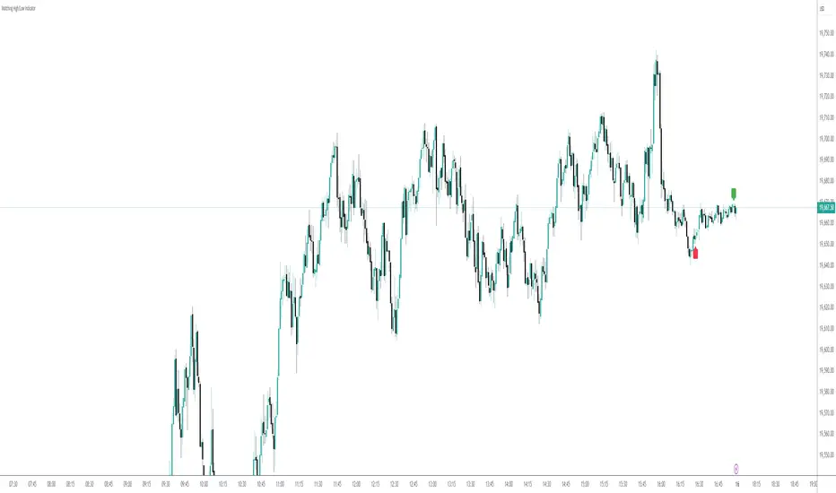
Exact High/Low IndicatorThis indicator identifies exact equal highs and lows between consecutive candles. If the current candle’s high matches the previous candle’s high (or low matches low), an arrow is plotted on the chart. The arrows disappear if any future candle break the identified high/low, thereby indicating that it is not an unmitigated liquidity pool any longer
Customizable options include:
Arrow size and color
Line thickness and color
Enable/disable plotting of arrows and lines
Offset the arrow so there is space between arrow and candle
Clean OHLC Lines | BaksPlots clean, non-repainting OHLC lines from higher timeframes onto your chart. Ideal for tracking key price levels (open, high, low, close) with precision and minimal clutter.
Core Functionality
Clean OHLC Lines = Historical Levels + Non-Repainting Logic
• Uses lookahead=on to anchor historical lines, ensuring no repainting.
• Displays OHLC lines for customizable timeframes (15min to Monthly).
• Optional candlestick boxes for visual context.
Key Features
• Multi-Timeframe OHLC:
Plot lines from 15min, 30min, 1H, 4H, Daily, Weekly, or Monthly timeframes.
• Non-Repainting Logic:
Historical lines remain static and never recalculate.
• Customizable Styles:
Adjust colors, line widths (1px-4px), and transparency for high/low/open/close lines.
• Candle Display:
Toggle candlestick boxes with bull/bear colors and adjustable borders.
• Past Lines Limit:
Control how many historical lines are displayed (1-500 bars).
User Inputs
• Timeframe:
Select the OHLC timeframe (e.g., "D" for daily).
• # Past Lines:
Limit historical lines to avoid overcrowding (default: 10).
• H/L Mode:
Draw high/low lines from the current or previous period.
• O/C Mode:
Anchor open/close lines to today’s open or yesterday’s close.
• Line Styles:
Customize colors, transparency, and styles (solid/dotted/dashed).
• Candle Display:
Toggle boxes/wicks and adjust bull/bear colors.
Important Notes
⚠️ Alignment:
• Monthly/weekly timeframes use fixed approximations (30d/7d).
• For accuracy, ensure your chart’s timeframe ≤ the selected OHLC timeframe (e.g., use 1H chart for daily lines).
⚠️ Performance:
• Reduce # Past Lines on low-end devices for smoother performance.
Risk Disclaimer
Trading involves risk. OHLC lines reflect historical price levels and do not predict future behavior. Use with other tools and risk management.
Open-Source Notice
This script is open-source under the Mozilla Public License 2.0. Modify or improve it freely, but republishing must follow TradingView’s House Rules.
📈 Happy trading!

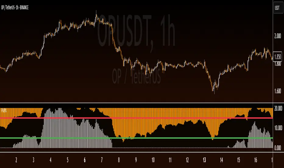
Pipstocrat Market Participant AnalysisPipstocrat Market Participant Analysis (PMPA) , analyzes the behavior of different types of traders in the market: Hot Money (short-term traders), Smart Money (institutional or professional traders), and Retail Traders . It uses RSI-based calculations to measure their activity and displays the results as colored bars on a chart.
Customizable Colors: Users can change the colors for each type of trader and other visual elements like reference lines.
Reference Lines: Horizontal lines at levels 5 (Support), 10 (Neutral), and 15 (Resistance) help interpret the data.
Focus on RSI: The script simplifies analysis by focusing solely on RSI-based signals.
This tool helps traders quickly identify trends and sentiment in the market, making it easier to spot potential opportunities.
Elliptic bands
Why Elliptic?
Unlike traditional indicators (e.g., Bollinger Bands with constant standard deviation multiples), the elliptic model introduces a cyclical, non-linear variation in band width. This reflects the idea that price movements often follow rhythmic patterns, widening and narrowing in a predictable yet dynamic way, akin to natural market cycles.
Buy: When the price enters from below (green triangle).
Sell: When the price enters from above (red triangle).
Inputs
MA Length: 50 (This is the period for the central Simple Moving Average (SMA).)
Cycle Period: 50 (This is the elliptic cycle length.)
Volatility Multiplier: 2.0 (This value scales the band width.)
Mathematical Foundation
The indicator is based on the ellipse equation. The basic formula is:
Ellipse Equation:
(x^2) / (a^2) + (y^2) / (b^2) = 1
Solving for y:
y = b * sqrt(1 - (x^2) / (a^2))
Parameters Explained:
a: Set to 1 (normalized).
x: Varies from -1 to 1 over the period.
b: Calculated as:
ta.stdev(close, MA Length) * Volatility Multiplier
(This represents the standard deviation of the close prices over the MA period, scaled by the volatility multiplier.)
y (offset): Represents the band distance from the moving average, forming the elliptic cycle.
Behavior
Bands:
The bands are narrow at the cycle edges (when the offset is 0) and become widest at the midpoint (when the offset equals b).
Trend:
The central moving average (MA) shows the overall trend direction, while the bands adjust according to the volatility.
Signals:
Standard buy and sell signals are generated when the price interacts with the bands.
Practical Use
Trend Identification:
If the price is above the MA, it indicates an uptrend; if below, a downtrend.
Support and Resistance:
The elliptic bands act as dynamic support and resistance levels.
Narrowing bands may signal potential trend reversals.
Breakouts:
Pipsttocra Technical Patterns: EV HV FVG & OBPipstocrat Technical Patterns , identifies and visualizes key technical analysis patterns and structures on a TradingView chart. Here's a simple breakdown of what it does:
Fair Value Gaps (FVG):
Detects and highlights bullish and bearish Fair Value Gaps as colored boxes.
Adds centerline markers to indicate potential price levels.
Order Blocks (OB):
Identifies bullish and bearish order blocks (areas of significant buying or selling).
Displays them as colored rectangles extending to the right of the chart.
Candlestick Patterns:
Detects Engulfing Patterns (bullish and bearish) with volume confirmation.
Highlights Hammer and Inverted Hammer patterns with customizable shapes and colors.
Customization Options:
Allows users to adjust colors, sizes, and styles for all patterns and structures.
Provides options to show/hide specific patterns like FVGs, engulfing candles, hammers, etc.
Alerts:
Generates alerts for detected patterns, such as FVGs, order blocks, engulfing candles, and confluence zones (combination of FVGs and order blocks).
Management Features:
Automatically removes older or "filled" patterns (optional).
Tracks and updates patterns dynamically as new bars form.
Purpose:
This tool helps traders spot high-probability trading opportunities by identifying key market structures (like FVGs and order blocks) and candlestick patterns. It combines multiple technical analysis concepts into one comprehensive indicator for better decision-making.

BEING RSI Divergence Buy/Sell Signals//@version=5
indicator("RSI Divergence Buy/Sell Signals", overlay=true)
// RSI Calculation
length = 14
rsiSource = close
rsi = ta.rsi(rsiSource, length)
// Overbought and Oversold Levels
overbought = 70
oversold = 30
// Price and RSI Pivot Points
pivotLeft = 5
pivotRight = 5
priceHighPivot = ta.pivothigh(high, pivotLeft, pivotRight)
priceLowPivot = ta.pivotlow(low, pivotLeft, pivotRight)
rsiHighPivot = ta.pivothigh(rsi, pivotLeft, pivotRight)
rsiLowPivot = ta.pivotlow(rsi, pivotLeft, pivotRight)
// Bearish Divergence (Price Higher High but RSI Lower High)
bearishDivergence = na(priceHighPivot) ? false : priceHighPivot > ta.valuewhen(priceHighPivot, priceHighPivot, 1) and rsiHighPivot < ta.valuewhen(rsiHighPivot, rsiHighPivot, 1) and rsiHighPivot > overbought
// Bullish Divergence (Price Lower Low but RSI Higher Low)
bullishDivergence = na(priceLowPivot) ? false : priceLowPivot < ta.valuewhen(priceLowPivot, priceLowPivot, 1) and rsiLowPivot > ta.valuewhen(rsiLowPivot, rsiLowPivot, 1) and rsiLowPivot < oversold
// Plot Buy/Sell Signals
plotshape(bullishDivergence, location=location.belowbar, color=color.green, style=shape.labelup, title="Buy Signal", size=size.small)
plotshape(bearishDivergence, location=location.abovebar, color=color.red, style=shape.labeldown, title="Sell Signal", size=size.small)
// Background Highlighting for Overbought/Oversold
bgcolor(rsi > overbought ? color.red : rsi < oversold ? color.green : na, transp=90)
// Display RSI on Chart
hline(overbought, "Overbought", color=color.red)
hline(oversold, "Oversold", color=color.green) OWNER; BY SOHAN SOLANKI

Entry & Risk Labels with Horizontal Target LinesEngulf with a MACD Confirmation and have 1-3R Lines Drawn for Targets

TPG RSI ProTPG RSI Pro" Indicator
This script is a customized version of the Relative Strength Index (RSI), providing enhanced functionality with signal lines, overbought/oversold zones, and smooth signals for buy and sell indications. Below are the key features and how to use them effectively:
1. Settings
Length: Defines the period for calculating the RSI (default: 14). This can be adjusted based on your trading preferences. A higher number smooths out the RSI line, while a lower number makes it more sensitive.
Method (smoType1): Allows you to choose the smoothing method for the RSI calculation. Options include EMA, SMA, RMA, TMA, or WMA.
Source: Defines the input source for the RSI calculation (default: Close price). You can modify it based on what price data you want to use.
2. Signal Line
Smooth: This defines the smoothing period for the signal line (default: 21).
Method (smoType2): Choose the smoothing method for the signal line. Options are EMA, SMA, RMA, TMA, or WMA.
Color: Customize the color of the signal line for better visibility.
3. Overbought/Oversold (OB/OS) Style
You can customize the upper and lower thresholds for overbought and oversold levels. Typically, 80 and 20 are used, but you can adjust these to suit your strategy.
Overbought Levels (obValue, obValue1): Set thresholds for overbought conditions. The default is 80, with an additional level at 90.
Oversold Levels (osValue, osValue1): Set thresholds for oversold conditions. The default is 20, with an additional level at 10.
Color Options: Customize colors for overbought/oversold areas and their filled backgrounds for better visual guidance.
4. RSI Calculation
The script uses an Augmented RSI calculation, factoring in high, low, and close prices to create a smoother and more responsive RSI.
Signal Line: A moving average of the RSI that acts as a trigger for buy or sell signals.
5. Visuals
RSI Plot: Displays the main RSI line.
Signal Line Plot: Displays the smoothed signal line.
Overbought/Oversold Zones: Highlight these zones using filled areas and horizontal lines for easy reference.
Gradient Fill: Adds a gradient effect to emphasize when the RSI crosses critical thresholds, helping you visually interpret the strength of the trend.
6. Buy and Sell Signals
Buy Signal: Occurs when the RSI crosses above the signal line and is below 50. This may indicate a potential upward reversal, signaling a buy opportunity.
Sell Signal: Occurs when the RSI crosses below the signal line and is above 50. This may indicate a potential downward reversal, signaling a sell opportunity.
Buy signals are labeled "B" in green, while sell signals are labeled "S" in red for clear identification on the chart.
7. How to Use
Identifying Overbought and Oversold Levels: When the RSI crosses above the overbought line (e.g., 80 or 90), it may signal that the asset is overbought, and a price reversal or pullback could be imminent. Conversely, when the RSI crosses below the oversold line (e.g., 20 or 10), it may signal that the asset is oversold, and a price reversal or bounce could occur.
Using the Signal Line: Look for crossovers of the RSI and signal line to identify buy or sell opportunities.
Set Alerts: You can use TradingView's alert system to notify you when the RSI crosses certain levels or when buy/sell signals appear.
This indicator is a versatile tool that can help traders fine-tune their entries and exits by providing clearer overbought and oversold signals, along with smoothed buy/sell signals. Customize the settings based on your trading strategy to make the most of this tool.

Maestros Trading EMAEsta es la versión personalizada de la EMA200 que utilizamos en Maestros Trading Community.
Nuestra EMA favorita y la única que utilizamos.
Incluye los colores de nuestra marca para ese pequeño toque extra, sin embargo, usted es libre de cambiar a lo que quieras.
This is the EMA200 custom version we use at Maestros Trading Community.
Our favorite EMA and the only one we use.
It includes our brand colors for that little extra touch however you are free to change them to whatever you like.

Nebula Volatility and Compression Radar (TechnoBlooms)This dynamic indicator spots volatility compression and expansion zones, highlighting breakout opportunities with precision. Featuring vibrant Bollinger Bands, trend-colored candles and real-time signals, Nebula Volatility and Compression Radar (NVCR) is your radar for navigating price moves.
Key Features:-
1. Gradient Bollinger Bands - Visually stunning bands with gradient fills for clear price boundaries.
The gradient filling is coded simply so that even beginners can easily understand the concept. Trader can change the gradient color according to their preference.
fill(pupBB, pbaseBB,upBB,baseBB,top_color=color.rgb(238, 236, 94), bottom_color=color.new(chart.bg_color,100),title = "fill color", display =display.all,fillgaps = true,editable = false)
fill(pbaseBB, plowBB,baseBB,lowBB,top_color=color.new(chart.bg_color,100),bottom_color=color.rgb(230, 20, 30),title = "fill color", display =display.all,fillgaps = true,editable = false)
These two lines are used for giving gradient shades. You can change the colors as per your wish to give preferred color combination.
For Example:
Another Example:
2. Customizable Settings - Adjust Bollinger Bands, ATR and trend lengths to fit your trading styles.
3. Trend Insights - Candles turn green for uptrends, red for downtrends, and gray for neutral zones.
Nebula Volatility and Compression Radar create dynamic cloud like zones that illuminate trends with clarity.


SAR Hits Bollinger Bands StrategyEdner Parabolic SAR Hits Bollinger Bands Strategy. This is the strategy I used in my daily trading activities.
