**Submission by @jaderapbit**
So ever since I did that pretty miyuki whatsherface I started noticing more and more things about Mulberry’s art that I didn’t like or thought needed improvement and I finally am able to put it into word so here it goes
*Note: This isn’t to tear Mulberry down nor is it meant to make fun this is to point out the flaws in her work and help her grow even if your not Mullberry and you want to learn read this it will help*
With that said lets get started
Issue #1: Proportions/Anatomy
this is a big problem for Mulberry’s work and leaves her art looking stiff or just awkward most of the time if it isn’t the anatomy that’s off it’s the proportions
Example #1: Ryoba

This piece anatomically speaking is correct but the propotions are off to the point of being unattractive here I’d like to highlight probably what many people including myself dislike about Mulberry’s art and that is the face
Ryoba’s face in this picture is just bad honestly her eyes and nose are far too big compared to the rest of her face to allow any sort of detail or expression I get what mulberry is trying to do she’s trying to mimick anime and EVERY artist goes through the anime phase they either improve or they grow out of it but mulberry seems rather stagnant in this regard
the nose and eyes need to be smaller its too much and the face ends up looking fat/squashed or worst case scenario is everyone looks the same I’ll touch on another issue in the next example
Example #2: Mirae Dance Club Sensation
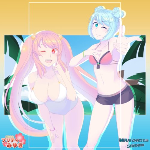
This picture once again is anatomically correct it even looks like she changed her style especially in the face so as to make it look nicer but unfortunately she still made some mistakes that being proportions again mainly in the chest for some reason Miyuki’s chest is not at all in proportion to the rest of her body they’re far too wide for them to be reasonable not to mention they look as though they’re floating
rookie mistake I’ll touch on it more in the next Example
Example #3: Student Council
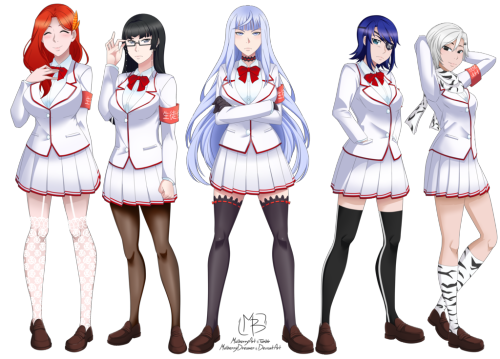
This picture is a prime example again of bad proportioning mainly with the girl in the middle and the girl to her left I don’t know how Mulberry herself looked at this and thought it was okay This is more of an issue with how Mulberry draws breast now I’m gonna sperg about boobs for a bit
Think of breast as water balloons it helps to better understand how they move like the picture above its a good example of not knowing how breasts move when you lean forward your breast droop imagine holding a water balloon by the end and just letting it hang there gravity takes effect and it looks like a teardrop but thats not happening here Miyuki’s breast seem to be supported by something but she’s not wearing anything that would support her breasts so they just look like ballons
The way Mulberry draws breast makes them look like they have no weight to them so they just look silly you mean to tell me miss Jugs over theres boobs just suspend themselves I don’t care what kind of bra she’s wearing they should still sag big breast naturally sag and sag is okay
Another issue Mulberry has is keeping the breast in proportion to the rest of the body for some reason these women will be built like tooth picks but have breast that reach to the horizon it makes absolutely no senes and there’s no way someone with such a small frame could support a chest anime is nice and all but it really leads to bad habits especially when it comes to proportions and anatomy to anyone who’s still learning or want to break out of that style please look to statues and real people to learn the basics then once you’ve learned that you can start exxagerating and changing things how you like but still allowing it to look reasonable
*also breasts breast don’t always touch breast do not have natural cleavage there is a space between them naturally with the space being at least 1-2cm I’m guilty of it too trust me*
Thats all I have to say regarding anatomy and proportions
Here are some positives
- Mulberry does have a good sense of anatomy at least when it comes to side views and front shots
- Her line work is very clean and very nice to look at (even I’m jealous it takes me hours)
- Her style while it could be improved can be cute at times
- Her original work is actually interesting and I’d like to see her explore that more
- Mulberry does look like she puts in a lot of effort and I think it is rather unfair to say she doesn’t
That’s part one of my critique done
I’ll be making another post about her colors next strap in its gonna be a rough one
Lastly @mulberryart I don’t hate you in the past I’ll be honest I was harsh and I wasn’t fair to you and I sincerely apologize I want you to see this post
This post is purely constructive and there is nothing but helpful things being said here so please do take what many people have said myself included and apply it to your work it will help immensly


