Millionaire migrations
This map, by Lisa Mahaptra, shows the number of minutes of minimum-wage work required to buy a Big Mac in countries around the world (2013).

Millionaire migrations
Millionaire migration
These maps, from the Economist, show the cost of a prepaid 500 MB/month cell phone data plan in countries around the world. The top (red) map shows the absolute dollar cost (PPP), while the second (green) map shows the cost as a percent of per capita gross national income. By the latter measure, Austria has the world’s most affordable cell phone data service (at 0.1% of per capita GNI); service in the US is surprisingly expensive (2.1%, possibly due to the industry’s near-duopoly), but that’s nothing compared to the DRC’s 126.4%.
This map, by Philippe Rekacewicz, shows the areas of the world with significant limits on international and internal migration.
These maps, from The Atlantic Cities, show net total migration, net domestic migration, and net international migration to and from US cities.
This map, by Lisa Mahaptra, shows the number of minutes of minimum-wage work required to buy a Big Mac in countries around the world (2013).
This map (from ChartsBin) shows countries’ Gender Inequality Index for 2011, an index that includes reproductive health, political and economic participation, and educational attainment. Lower values indicate greater equality.

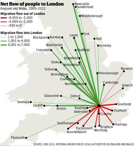
This map shows net migration between London and the rest of England and Wales.
This map divides the world into regions with equal GDP - each colored area has a gross regional product of approximately one trillion dollars.
This map shows each US county’s Gini coefficient for income distribution. While “Gini coefficient” technically only refers to a measure of inequality among values of any variable, it is most commonly applied to income distributions. The coefficient ranges from zero (perfect equality - income is evenly distributed among individuals within the country) to one (perfect inequality - all income concentrated in one person’s hands). The values in the legend range from 0.39, approximately equal to the Gini coefficient of Israel, to 0.49, approximately equal to that of Nigeria. The coefficient for the US overall is 0.45.
(Sources: latest available data, World Bank and CIA)
Great Friesland
