Page MenuHomePhabricator

Places: Build a "list" view of places, alongside the "map" view.
Closed, ResolvedPublic

Assigned To
Authored By
Dbrant
Sep 25 2023, 6:59 PM
Referenced Files
F41731152: Screenshot_20240130-114343.png
Jan 30 2024, 10:51 AM
F41731147: Screenshot_20240130-114333.png
Jan 30 2024, 10:51 AM
F41731143: Screenshot_20240130-114320.png
Jan 30 2024, 10:51 AM
F41722221: Screenshot_20240127-102601 copy 2.png
Jan 27 2024, 9:35 AM
F41722215: Screenshot_20240127-102755.png
Jan 27 2024, 9:35 AM
F41722212: Screenshot_20240127-102804.png
Jan 27 2024, 9:35 AM
F41719247: Screenshot_20240126-111314.png
Jan 26 2024, 10:38 AM
F41719256: Screenshot_20240126-111236.png
Jan 26 2024, 10:38 AM

Description

Design (Figma)

1.- Features a switch to change from map to list view (T347336). Useful links:

    • Details on the Material 3 toggle component
    • Prototype video of the map/list view interaction
  1. List view
    image.png (1×752 px, 410 KB)
    | 3. Overflow menu
    image.png (1×752 px, 337 KB)
  • The list view lives side by side with the map view (T351397)
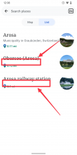
  • A list item contains
    • Title of the article
    • Title description of the article (if not available: show the article's first sentence). Both should be truncated after two lines.
    • Distance to article/location (icon, label), ideally dynamically updated
    • Image of the article (if not available: expand title and description to full-width)
  • Tapping a list item leads directly to the article (T351395). @Sharvaniharan, we might need to experience a bit here, e.g. see how it feels to lead users back to the map view when tapping an item.
  • Long pressing an item reveals a contextual menu that contains Save (or Saved), Share, Watch (or Watched), Open in new tab, Copy link address, and Get directions. These are the same actions as listed in T351395.

APK: https://github.com/wikimedia/apps-android-wikipedia/pull/4182/checks

Event Timeline

Sharvaniharan renamed this task from Places: Build a "list" view of places, alongside the "map" view. to Nearby: Build a "list" view of places, alongside the "map" view..Nov 20 2023, 6:56 PM
scblr updated the task description. (Show Details)
scblr added a subscriber: Sharvaniharan.
Sharvaniharan renamed this task from Nearby: Build a "list" view of places, alongside the "map" view. to Places: Build a "list" view of places, alongside the "map" view..Dec 7 2023, 2:29 AM

Hi @scblr

Just wanted to note here that I removed the switch UI for map|list from here and added it to the ListView task.

Regarding the map alignment to direction, I think it is built into the library. Here is the experience:
https://youtube.com/shorts/i83BRtsRhIA

Hi @scblr

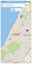
The MaterialButton with MaterialToggleButtonGroup does not have the oval button background, does the following look good to you?

Active: 
Background: addition_color 
Text: progressive_color

Inactive: 
Background: paper_color
Text: placeholder_color

Other configuration
<item name="android:textSize">14sp</item>
<item name="strokeWidth">3dp</item>
<item name="strokeColor">?attr/paper_color</item>

Screenshot_20240104-151708_Wikipedia Dev.jpg (2×1 px, 119 KB)

Hi @scblr

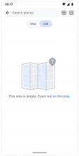
Sometimes the current location does not have any markers available, which will cause an empty list. What kind of empty state do you like to present? Thanks!

Screenshot_20240111-180718_Wikipedia Dev.jpg (2×1 px, 27 KB)

Here you go @cooltey. The list empty uses the same illustration as in T351158 👇

Design:

Copy: This area is empty. Zoom out on the map.

Note: The link takes users to the map (same action as tapping the toggle button).

Hi @scblr

Long pressing an item reveals a contextual menu that contains Save (or Saved), Share, Watch (or Watched), Open in new tab, Copy link address, and Get directions. These are the same actions as listed in T351395.

The "Watch" function will require another API call when tapping on the list item, which will cause a slight delay in loading the data and getting the watch status.

Would it be possible to do one of the following:

  1. Remove the "Long press" action and change the click action to open the same link preview dialog we are using in the map. That way we can reuse the link preview dialog and also have the same user experience between the map and the list.
  2. Keep the "Long press" action, but remove the "Watch" item. Click action remains the same, which opens the article directly.

Which one do you prefer? Please let me know, thanks!

Thanks, @cooltey — let’s go with 2, then: remove the Watch action from the long press menu. Users can still tap Watch in the article itself. After all, it’s an editor feature that < 0.5% of people will use.

Hi @scblr

The implementation is completed. Please download the APK from the ticket description, thanks!

Thanks for the excellent work @cooltey – I’m reviewing the segmented buttons as well because I saw it for the first time in an APK.

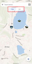
1) Apply a 0.5dp border to the segment buttons:

ImplementationvsDesign
Screenshot_20240122-120627 copy 2.png (2×1 px, 821 KB)
image.png (1×752 px, 764 KB)

2) Buttons are currently too wide. Set the min-width of each button to 60dp and a 16dp left and right padding to the text labels. As a reference, the total width of the (English) segmented buttons component should be 126dp (2 x 3dp border + 2x 60dp button).

ImplementationvsDesign
Screenshot_20240122-120627 copy 3.png (2×1 px, 822 KB)
image.png (1×752 px, 764 KB)

3) Ensure the compass and buttons are precisely 36dp high. Also, make sure to align the segmented buttons with the compass vertically.

ImplementationvsDesign
Screenshot_20240122-122318.png (2×1 px, 1004 KB)
image.png (1×752 px, 764 KB)

4) Can both "segmented buttons" be 1 tap target (because they only have two options)?

Screenshot_20240122-120627 copy 2.png (2×1 px, 821 KB)

  • If Map is active, tapping the component toggles List
  • If List is active, tapping the component toggles to Map

5) Type is too big, apply h3-article not h1-article

Screenshot_20240122-123800 copy 4.png (2×1 px, 283 KB)

6) Apply a 4dp padding between marker icon and distance

Screenshot_20240122-123800 copy 2.png (2×1 px, 298 KB)

7) If there’s no article (title) description, please use the first sentence of the article and truncate it with an ellipsis after the first line for consistency:

Screenshot_20240122-123800 copy 6.png (2×1 px, 300 KB)

8) Apply a 12dp padding between text (title, article description, distance) and image:

Screenshot_20240122-123800 copy 8.png (2×1 px, 279 KB)

9) The top and bottom padding of a list component should be 12dp (maybe the font change in 5) will correct this)

Screenshot_20240122-123800 copy 3.png (2×1 px, 285 KB)

10) Animation: I created a prototype of how the switch between the two states should animate:

CleanShot 2024-01-22 at 12.52.22.gif (500×800 px, 551 KB)

🎥 Video: https://wikimedia.slack.com/archives/C7P3N5E6P/p1700589707168929

Is there any chance to explore this as well?

Hi @scblr, please download the latest APK to see the changes, thanks!

Thanks for the excellent work @cooltey – I’m reviewing the segmented buttons as well because I saw it for the first time in an APK.

1) Apply a 0.5dp border to the segment buttons:

It currently applies the white border with a 3dp width, it is not possible to apply another border to the buttons.

2) Buttons are currently too wide. Set the min-width of each button to 60dp and a 16dp left and right padding to the text labels. As a reference, the total width of the (English) segmented buttons component should be 126dp (2 x 3dp border + 2x 60dp button).

Done.

3) Ensure the compass and buttons are precisely 36dp high. Also, make sure to align the segmented buttons with the compass vertically.

Done.

4) Can both "segmented buttons" be 1 tap target (because they only have two options)?

I checked the library and did not see any option to achieve your request. Can we keep the current behavior since it is a default behavior from the library?

5) Type is too big, apply h3-article not h1-article

Done.

6) Apply a 4dp padding between marker icon and distance

Done.

7) If there’s no article (title) description, please use the first sentence of the article and truncate it with an ellipsis after the first line for consistency:

Done.

8) Apply a 12dp padding between text (title, article description, distance) and image:

Done.

9) The top and bottom padding of a list component should be 12dp (maybe the font change in 5) will correct this)

Done.

10) Animation: I created a prototype of how the switch between the two states should animate:
Is there any chance to explore this as well?

I tried a bit but it looks like it cannot be achieved without extra hacking on the animation. The buttons are separated and the background colors are not connected.

Thanks @cooltey 👊

1)

Can both "segmented buttons" be 1 tap target (because they only have two options)?

I checked the library and did not see any option to achieve your request. Can we keep the current behavior since it is a default behavior from the library?

Ok, let’s keep it then. Small request, though: can you make sure that the tap targets for each of these buttons are 48dp high? It currently feels to small when using it.

image.png (1×720 px, 256 KB)

2)

Type is too big, apply h3-article not h1-article

Done.

Screenshot_20240123-103538 copy.png (2×1 px, 468 KB)

There’s still something off with the type hierarchy. Either a) is not using the h3-article specs:

font-family: Droid Serif
font-weight: Regular
font-size: 16sp
line-height: 24sp/1.5em

Or b) is not using the list specs:

font-family: Roboto
font-weight: Regular
font-size: 14sp
line-height: 24sp/1.71em

If everything is already defined like that, please make a global change to the h3-article definition (use 17sp instead of 16sp):

font-family: Droid Serif
font-weight: Regular
font-size: 17sp
line-height: 24sp/1.5em

3)

If there’s no article (title) description, please use the first sentence of the article and truncate it with an ellipsis after the first line for consistency:

Done.

This does not work for me yet; see this screenshot where the first sentence of the article is missing:

Screenshot_20240123-103538.png (2×1 px, 458 KB)

4) Make this text (title, description) go full-width if the article does not have an image.

Screenshot_20240123-103538 copy 2.png (2×1 px, 458 KB)

Thanks @cooltey 👊

1)

Can both "segmented buttons" be 1 tap target (because they only have two options)?

I checked the library and did not see any option to achieve your request. Can we keep the current behavior since it is a default behavior from the library?

Ok, let’s keep it then. Small request, though: can you make sure that the tap targets for each of these buttons are 48dp high? It currently feels to small when using it.

The current settings:

minHeight: 44dp + strokeWidth: 3dp = 44 + (3x2) = 50. It should pass the 48dp accessibility recommendation.

2)

Type is too big, apply h3-article not h1-article

Done.

Screenshot_20240123-103538 copy.png (2×1 px, 468 KB)

There’s still something off with the type hierarchy. Either a) is not using the h3-article specs:

font-family: Droid Serif
font-weight: Regular
font-size: 16sp
line-height: 24sp/1.5em

Or b) is not using the list specs:

font-family: Roboto
font-weight: Regular
font-size: 14sp
line-height: 24sp/1.71em

Updated!

3)

If there’s no article (title) description, please use the first sentence of the article and truncate it with an ellipsis after the first line for consistency:

Done.

This does not work for me yet; see this screenshot where the first sentence of the article is missing:

Done! Sorry, I didn't catch it correctly.

There is a thread talking about the empty content for an article on Slack, please see here: https://wikimedia.slack.com/archives/C7P3N5E6P/p1706036253845779

4) Make this text (title, description) go full-width if the article does not have an image.

The screenshot you attached has ended with , Switzerland, which is expected. Can you look at another area to see if it happens again? Thanks!

Thanks @cooltey

1)

Current behaviorvsExpected behavior
Screenshot_20240124-105527.png (2×1 px, 340 KB)
Screenshot_20240124-105536.png (2×1 px, 648 KB)

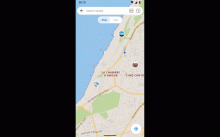
The behavior when launching places has changed: it does not zoom in anymore on launch, see this video. Can you make sure it’ll zoom in on launch?

2) "Open in new tab" in the overflow menu does not work as expected, see this video.

The issue occurs when there aren’t any tabs open yet (0):

  • Tapping "Open in new tab" in the overflow menu of the preview does not show the
  • The tab animation overlaps with the language indicator

3) There are some issues when opening articles from the list or map view and tapping the back button (system and in-app back button):

  • Current behavior: the previous article in the tab stack is shown (list issue video, map issue video)
  • Expected behavior: go back to the list/map view.

Could a straightforward solution be to always open a new foreground tab and take users to that tab?

Hi @scblr

Please download the latest APK to see the changes, thanks!

Thanks @cooltey

1)

Current behaviorvsExpected behavior
Screenshot_20240124-105527.png (2×1 px, 340 KB)
Screenshot_20240124-105536.png (2×1 px, 648 KB)

The behavior when launching places has changed: it does not zoom in anymore on launch, see this video. Can you make sure it’ll zoom in on launch?

This is an expected behavior. We will save the latest location + zoom level after you exit the Places screen, so next time when you open the Places, the map will be located to your previous location within the previous zoom level.

Can you try it again to see if it works for you?

2) "Open in new tab" in the overflow menu does not work as expected, see this video.

The issue occurs when there aren’t any tabs open yet (0):

  • Tapping "Open in new tab" in the overflow menu of the preview does not show the
  • The tab animation overlaps with the language indicator

Fixed. (Not sure why the APK didn't include the fix 🤔)

3) There are some issues when opening articles from the list or map view and tapping the back button (system and in-app back button):

  • Current behavior: the previous article in the tab stack is shown (list issue video, map issue video)
  • Expected behavior: go back to the list/map view.

Could a straightforward solution be to always open a new foreground tab and take users to that tab?

Done. Now it opens the article in a foreground tab.

Hi @scblr ,

@cooltey 's work on this task was merged to the main feature branch, so the location of APK changed because of that : https://github.com/wikimedia/apps-android-wikipedia/pull/4182/checks
Have updated this on the task as well. Just leaving you a note too so you do not miss :-)

Thanks @cooltey @Sharvaniharan 👏

1)

Current behaviorvsExpected behavior
Screenshot_20240124-105527.png (2×1 px, 340 KB)
Screenshot_20240124-105536.png (2×1 px, 648 KB)

The behavior when launching places has changed: it does not zoom in anymore on launch, see this video. Can you make sure it’ll zoom in on launch?

This is an expected behavior. We will save the latest location + zoom level after you exit the Places screen, so next time when you open the Places, the map will be located to your previous location within the previous zoom level.

Can you try it again to see if it works for you?

Ok, thanks for clarifying, let’s keep it like that!

2)

"Open in new tab" in the overflow menu does not work as expected, see this video.

The issue occurs when there aren’t any tabs open yet (0):

  • Tapping "Open in new tab" in the overflow menu of the preview does not show the
  • The tab animation overlaps with the language indicator

Fixed. (Not sure why the APK didn't include the fix 🤔)

Ok, great!

3)

There are some issues when opening articles from the list or map view and tapping the back button (system and in-app back button):

  • Current behavior: the previous article in the tab stack is shown (list issue video, map issue video)
  • Expected behavior: go back to the list/map view.

Could a straightforward solution be to always open a new foreground tab and take users to that tab?

Done. Now it opens the article in a foreground tab.

Perfect!

4)

Screenshot_20240126-111347.png (2×1 px, 536 KB)

Question: These articles have actual text (example) but still lack a description in the list view or preview sheet. I understand that we can’t pull anything from articles like this, since they don’t have any content at all, but not for the others. Can you help me understand the issue?

5)

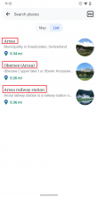
A related issue: vertical gaps between the title and description are inconsistent.

A)
Screenshot_20240126-112548.png (2×1 px, 562 KB)
B)
Screenshot_20240126-111428.png (2×1 px, 191 KB)

The vertical gaps in A) are too big. The vertical gaps for B) are good.

6)

Screenshot_20240126-111236.png (2×1 px, 291 KB)

Nitpick: Does h3-article have the following line-height settings? 👇

line-height: 24sp/1.5em

If not, please apply it. If yes, please apply a 1dp top padding to the description (only WHEN it’s displayed) to ensure the vertical type rhythm is correct.

Screenshot_20240126-111314.png (2×1 px, 497 KB)

Hi @scblr

Please download the latest APK to see the changes, thanks!

4)

Screenshot_20240126-111347.png (2×1 px, 536 KB)

Question: These articles have actual text (example) but still lack a description in the list view or preview sheet. I understand that we can’t pull anything from articles like this, since they don’t have any content at all, but not for the others. Can you help me understand the issue?

After digging into the API, I have noticed that the prop=extracts API has a limit of 20, which can only output the content for the top 20 items, and that's why the remaining items do not have a description even if they have content.

I checked the prop=extracts API and noticed it is old and unmaintained and might cause a heavy load on the server, so there is no reliable/sustainable API for getting the 'first sentence' of multiple articles at a time.

The best way to do this is: to remove the prop=extracts usage and only show the description if the article has it, otherwise hide the space (do not show the first sentence of the article).

5)

A related issue: vertical gaps between the title and description are inconsistent.

A)
Screenshot_20240126-112548.png (2×1 px, 562 KB)
B)
Screenshot_20240126-111428.png (2×1 px, 191 KB)

The vertical gaps in A) are too big. The vertical gaps for B) are good.

Updated!

6)

Screenshot_20240126-111236.png (2×1 px, 291 KB)

Nitpick: Does h3-article have the following line-height settings? 👇

line-height: 24sp/1.5em

If not, please apply it. If yes, please apply a 1dp top padding to the description (only WHEN it’s displayed) to ensure the vertical type rhythm is correct.

Screenshot_20240126-111314.png (2×1 px, 497 KB)

It is using 24sp for the line-height. I added the 1dp for to the description.

Ok thanks @cooltey 👍

The best way to do this is: to remove the prop=extracts usage and only show the description if the article has it, otherwise hide the space (do not show the first sentence of the article).

Agreed, let’s do it like this! However:

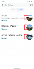
1) I noticed that sometimes a gap between the description and distance happens now:

Screenshot_20240127-102804.png (2×1 px, 547 KB)

2) When there’s no description, like this:

Screenshot_20240127-102755.png (2×1 px, 499 KB)

Can you ensure the text is vertically centered in the list item so the spaces above and below are even? 👇

Screenshot_20240127-102601 copy 2.png (2×1 px, 527 KB)

3)

It is using 24sp for the line-height. I added the 1dp for to the description.

Can you add another 1dp to the top of the description – then we got it right! 🚀


After these, we are ready to release! 🪩

Hi @scblr,

Please download the latest APK from ticket description, thanks!

Ok thanks @cooltey 👍

The best way to do this is: to remove the prop=extracts usage and only show the description if the article has it, otherwise hide the space (do not show the first sentence of the article).

Agreed, let’s do it like this! However:

1) I noticed that sometimes a gap between the description and distance happens now:

I cannot reproduce it. Could you please try again and see if it happens again?

2) When there’s no description, like this:

Screenshot_20240127-102755.png (2×1 px, 499 KB)

Can you ensure the text is vertically centered in the list item so the spaces above and below are even? 👇

Done!

Screenshot_20240127-102601 copy 2.png (2×1 px, 527 KB)

3)

It is using 24sp for the line-height. I added the 1dp for to the description.

Can you add another 1dp to the top of the description – then we got it right! 🚀

Done!


After these, we are ready to release! 🪩

The best way to do this is: to remove the prop=extracts usage and only show the description if the article has it, otherwise hide the space (do not show the first sentence of the article).

Agreed, let’s do it like this! However:

1) I noticed that sometimes a gap between the description and distance happens now:

I cannot reproduce it. Could you please try again and see if it happens again?

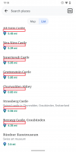
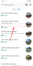
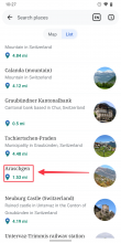
1) The bigger gap is now mostly below the articles. Steps to reproduce:

  1. Open search in Places, type in "new york city" and select the "New York City" article (English)
  2. Switch to list view
  3. Scroll down the list, and you will see the extra margins/the gap several times:
Screenshot_20240130-114320.png (2×1 px, 493 KB)
Screenshot_20240130-114333.png (2×1 px, 461 KB)
Screenshot_20240130-114343.png (2×1 px, 488 KB)

Other than that – it is perfect! 🎇

@scblr

Done! It was because of the multiple lines issue. Now it is resolved. Please download the APK to see the changes, thanks.

Looks great now @cooltey 👏

@ABorbaWMF please check this in all themes thoroughly when doing QA. Thanks!