Page MenuHomePhabricator

Agree a new overall design for VisualEditor on mobile phone-sized devices
Closed, ResolvedPublic40 Estimated Story Points

Assigned To
Authored By
Jaredzimmerman-WMF
Mar 20 2015, 3:56 AM
Referenced Files
F2918886: undo.png
Nov 5 2015, 3:55 PM
F2915248: keyboard-up.png
Nov 4 2015, 11:15 PM
F2915249: keyboard-down.png
Nov 4 2015, 11:15 PM
F2661007: Keyboard-normal-editing.png
Oct 6 2015, 12:50 AM
F2661013: link panel.png
Oct 6 2015, 12:50 AM
F2661021: citation panel.png
Oct 6 2015, 12:50 AM
F2661019: keyboard up link.png
Oct 6 2015, 12:50 AM
F2661010: keyboard up- edited-undo.png
Oct 6 2015, 12:50 AM
Tokens
"Love" token, awarded by Florian.

Description

Define mobile device:

  • Screen size
  • Input method

Use cases

  • Add/edit text
  • Link to other pages
  • Add a citation
  • Add a picture from camera roll
  • Format text

Product Goals

  • Put the article as it is into edit mode
  • Make editing a lightweight task
  • Editor shouldn’t be perceived as a heavy interface
  • Reduce the chrome and focus on the content
  • Improve performance
  • Increase number of citation done via mobile
  • Make links and formatting very easy to access
  • Make Insert modular and scalable
  • Aim for small but frequent edits
  • Measure interactions in terms of success and failure
  • Think about splitting Page settings (categories, redirects, show titles) from "editor" and surface it on article

Design Principles

  • One thing at a time
  • Context is short so make it important
  • Surface the most basic and obvious things
  • Take advantage of what mobile users are used to
  • For advance tasks, translate desktop interface to mobile
  • Polished systems are perceived as well working systems
  • Avoid broken experiences

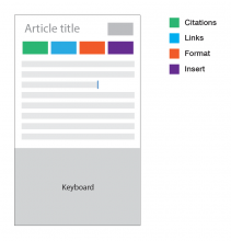
wireframe.png (930×895 px, 14 KB)

The wireframes conveys that citations, links and formatting will be front and center of the editor.

There are considerations done on when to show the keyboard and when to hide. It will be more clear in the actual prototype. the considerations are done based on "insertion" "inspection" and "property addition"
More on this will be added here with more structure.

The rest of the design goals of context, one thing at a time are achieved with the interactions and re-using the chrome for different intentions (different tasks that user has shown interest in)

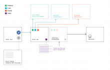
The information will flow like shown in the diagram below
edit-article-flow.png (1×2 px, 73 KB)

Event Timeline

There are a very large number of changes, so older changes are hidden. Show Older Changes
Jdforrester-WMF renamed this task from Provide design guidance for minimal VisualEditor header on phones to Agree a new overall design for VisualEditor on mobile phone-sized devices.Jun 3 2015, 4:21 PM
Jdforrester-WMF added a project: Epic.
Jdforrester-WMF edited a custom field.

@matmarex we can keep this task to discuss the wider scope of design for editing on mobile. the component level details can be tasks of their own. and there can be one blocking (and tracking) task to this epic task that deals with specifics of components on mobile devices.

I suspect we will need an 'other' menu for things that don't fall under the basic four groups (cf hamburger menu in desktop VE). Also I think the undo button would be useful in mobile given the increased likelihood of making a mistake on a small screen, and the fact CTRL+Z is unavailable.

Also could you post some screenshots from your awesome prototype!

@Esanders good point about other menu. I forgot to include that here because we were thinking hard about the problem of page settings/options and whether it's possible to surface them on article level rather than visual editor level. page options will never be emphasized inside an editor on mobile since the use cases written above will take precedence.

If we split the page options outside of editing and present it on an article with options like "page settings" and "edit this page" then it will surface and and more people will likely be able to find it. edit will purely mean editing the content. this will bring more structure to "kind" of edit.

again, i will be able to illustrate this with few mockups. so hold on.


About VE mockups from prototype
Certainly :)

Comments from today's product pitch meeting

  • When you clicked on the link button, I thought maybe I had lost what I was doing
    • Just an issue with viewing in the simulator; the real prototype animates the menu flying out. Need to be careful of the complication of which view/simulation is used to judge mobile prototypes
  • Problem: this mockup assumes all of the button labels are short. But other languages may use much longer words, so it’s important to include those tougher cases in mockups

Also missing from the prototype:

  • A back/cancel/leave edit mode button
  • Contexts (e.g. when you click on a link)

@Esanders updated the task with information diagram and pholio mocks.

A back/cancel/leave edit mode button

Taken care of in the mockups

Contexts (e.g. when you click on a link)

The template contexts is shown, the link will work similarly, i can upload link inspection mocks specifically

@Nirzar, I don't see undo/redo buttons in the mocks. Do you have any plans to include them?

@neil_p._Quinn_WMF yes "recovering from mistakes" is something on the table right now for "design goals" bucket. I need to work on it. these mocks are up there so we can start development process. I am thinking about more ways to recover from mistakes than undo/redo. Also, undo is will be supported with common gestures such as html5 vibration api. shake to undo.

Thanks Nirzar, these look great, couple of issues:

I really think an undo button is essential in VE as actions are far more complicated that simple text inputs. Shake to undo is only native on iOS so Android users will not be familiar with it. Even most iOS users will not be familiar with it. Personally I think it's a terrible user experience.

I think 'format' being modal is probably a step too far, and it will look very strange to lose all paragraph context when all you are doing is making a single word italic. For links and citations it makes sense, and I don't see a problem with format behaving slightly differently.

I really think an undo button is essential in VE as actions are far more complicated that simple text inputs. Shake to undo is only native on iOS so Android users will not be familiar with it. Even most iOS users will not be familiar with it. Personally I think it's a terrible user experience.

I understand. I am working on a way which doesn't increase the editor chrome and still allows undo.

I think 'format' being modal is probably a step too far, and it will look very strange to lose all paragraph context when all you are doing is making a single word italic. For links and citations it makes sense, and I don't see a problem with format behaving slightly differently.

format-bar.png (1×640 px, 185 KB)

Yes, the first iteration i had worked on was on these lines but it was introducing one more UI pattern. I wanted to keep only 2 UI patterns in whole of VE. It follows the design principal of "one thing at a time" but doesn't quite follow "surface most obvious and most frequent features on top" but i am very skeptical about adding one more UI pattern just for the format menu. In the pholio, format follows exactly same pattern as of all inspectors and citation and links. I think it's a trade off. Also, the sliding menu would be difficult to implement on mobile web. if we have modal window widget in place, we can re-use it for these items.

I was wondering if it is possible to use context information to (a) anticipate user actions and (b) reduce chrome even more.

For example, adding a link with the current approach requires to select text (which has more friction on mobile), and pick the right article from the link inspector. Most of the time the added link is the first suggestion maybe we can surface that suggestion earlier and save the user from going through the whole process.

I created an example mockup to illustrate these ideas in case they can be useful:

mobile-ve-contextual.png (768×2 px, 309 KB)

Edited. To add more context, I'm adding a more detail analysis of the different ideas mentioned:

  1. Show actions when they are more relevant. Cite makes more sense when the user is at the end of sentence/paragraph they need to provide a reference for, while links make more sense when the user is in the context of a word. So we can show them in the relevant contexts.
    • Benefit. Making actions appear when they are relevant may encourage more their use: "I just wrote a sentence and I'm provided the option to cite it, maybe I should provide the sources of the information I wrote." vs. "this cite option which is always on top".
    • Benefit. Making actions appear when they are easier to use encourages users to take the most convenient routes. When you are outside the context of a word (e.g., no text selection), adding a link is possible but the resulting link label has chances of needing editing (which has been problematic even on desktop). Encouraging the pattern of select first and then link, can avoid those problems.
    • Benefit. Less actions upfront reduce clutter (and there is a clear entry point to access the rest of actions).
    • Concern. If some actions are hidden at some point, discoverability can be reduced for those actions. The two context we defined make it quite hard to not go through all of them just by any action such as typing a single character or moving the cursor position: when you start editing the cursor is at the beginning of a paragraph (where we can show "cite") and as soon as the user types the link option can be shown (in a generic form or suggesting a specific article if it exists and enough characters have been written). I think in the editing context we can assume that is reasonable to happen, and users will be exposed to the different actions multiple times.
  2. Surfacing which is the active element based on cursor position. (in addition to explicit text selection, which is painful on mobile)
    • Benefit. For the specific case of one-word operations, saves users from selecting text on mobile, making interactions more fluent.
    • Benefit. Anticipates expectations of action results. By highlighting the word the user is acting on, the outcome of clicking on "link" (that specific word becoming linked) is more clear than not providing that cue.
    • Concern. One-word operations common enough to make them easier? There are some cues that suggest that one-word operations are frequent: if you look at articles you'll often find one-word links. On desktop, double-clicking a word is a shortcut that exists and it is commonly used when editing. On mobile, a similar strategy is used for spell-checking function of keyboards (spell corrections are suggested for the word you are typing or selecting).
    • Concern. What happens with operations for more than one word? You have to use regular text selection. Regular text selection will still work even for one word operations. Making it easy for one-word operations is not making it harder for the rest.
  3. Anticipate the top link suggestion to create a link in one tap, without an extra context change. When the user selects "Edward Norton" to add a link it is likely that the intent is to add a link to the page on the well-known American actor. On desktop users are provided that as a first suggestion when users indicate they want to ad a link. On mobile I think it makes sense to optimise for the common case and surface a more specific "Edward Norton· link as soon as the user selects the text.
    • Benefit. Make the process of adding links more fluent most of the time. For simple cases, users just need to select the text (or place the cursor if we consider also idea #2 and we want to link just one word) and tap on the given suggestion.
    • Benefit. Avoid context changes. Switching back and forth between two different contexts often may make actions feel less fluent. Being able to avoid going to a separate link view helps us optimise for repetition avoiding reorientation costs.
    • Benefit. Direct manipulation. Being able to add a link and see the effects of the word becoming a link just in front of you makes the effects of the action really obvious. When users have to go to a different place and go back to a content that changed, they need to figure out what has changed.
    • Concern. The top-suggestion is not always what the user is looking for. The idea is to optimise the common case (even if some edge cases get some small penalisation) to make the overall experience better. Measuring how often these suggestions are used compared to adding other links should be an easy thing to do if we want to give this idea a try. If we really consider that an extra tap for the cases where the top suggestion is not working is a big concern,we can also incorporate an provide a secondary access to the generic link function: imagine we have a "Edward Norton" link card wide enough to include a "..." button on it that users can use to link to a different suggestion (that requires some extra room but idea #1 may gave us enough of that).
    • Concern. What happens with edge cases like disambiguation, external links or redlinks? There is always the possibility to access a regular add link tool for those cases. We can add some smart behaviour to better deal with some of them (e.g., for disambiguation pages we can show a generic card for users to chose what to link on the next step, or show more than one card if disambiguation is about two concepts). But the main goal is to optimase for the common while making the edge cases possible. I'd avoid premature optimisation until we have tested that the general approach works.
  4. Show actions together in an easy to reach area. Providing manipulation actions together at the bottom simplifies their use in terms of easy to reach and avoiding having two separate places to go.
    • Benefit. Bottom area is easier to reach on a mobile device, especially when typing on a keyboard which is at the bottom (the closer the action the lesser time it will take to reach them).
    • Benefit. The "+" button is visually presented as a continuation of existing actions: "you can do A, B, C and more" which can clarify the mental model for "+" and
    • Concern. If we still need a top-bar (for save) there is not a significant increase in space. While this is true, this allows us to (a) be more permissive on when to hide the top bar (e.g., we can hide it on scroll since it is only going to be used when the editing manipulations are done), (b) accommodate other navigation or general action needs (e.g., undo?).

I think we need to assume much less vertical space. Both iOS and Android have an autocomplete bar above the keyboard (as shown in Pau's designs above), but also both show an address bar when the keyboard is open (iOS shows a narrower one, but we need to design for the worst case). So while the designs show about 60% of the the height available, it's going to be 40% or less. We also should not assume that the browser will tell us when the keyboard is open. There are hacks for guessing, but I don't think they work on all platforms.

@Esanders I will update the mockups to have browser in it. but can we look into HTML5 fullscreen api if we can enter into a fullscreen mode once you hit edit on an article?

It's not supported for iOS safari but safari has minimal chrome to begin with.

@Pginer-WMF I like the idea behind it but it would require a really good logic to figure out which thing to surface when. and it might be frustrating if the wrong thing is surfaced and there is no way to change it. but this gives me another idea of having floating buttons and no labels for format and link and reducing the vertical height even further.

I like the idea behind it but it would require a really good logic to figure out which thing to surface when.

I'm not sure we need a very complex logic if we focus only on the three main actions of format, cite, and link: How often do we expect users to select some text and click on "cite"?

and it might be frustrating if the wrong thing is surfaced and there is no way to change it.

That is true, but having a clear entry point for accessing what you really want can compensate that frustration. For the specific case of suggesting a specific page for links, we could get some numbers on the current behaviour (to check how often the first suggestion is selected) based on desktop VE or CX (where one-click link suggestions are provided).

@Esanders @Pginer-WMF
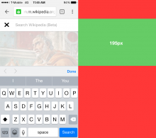
After thinking about this for a bit, i did little bit of research on space on mobile web.

Here's chrome on 4inch iPhone (you don't want to see 3.5inch iphone)

space-4inches.png (1×1 px, 231 KB)

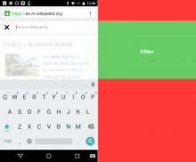
Here's high end android, 4.7inch nexus 4

space-4point7inch.png (1×1 px, 190 KB)

Then I looked for document editors that are out there. There are currently almost no document editors (please let me know if you know any) with advance capabilities on mobile web. Most of them use native apps so they get more control over the space.

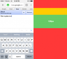
Google docs on 4inch iphone and google chrome as browser

docs.png (1×1 px, 90 KB)

Google docs on web is only plain text editing.

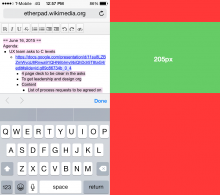
Etherpad on 4inch iphone and safari

etherpad.png (1×1 px, 143 KB)

This is the realty :) because we don't have much control over native components.
on average we will be getting 180px to 300px of vertical space.

We either have to accept the fact that the space is going to be tight or find a better solution (other than changing interface) to space problem. Like HTML5 fullscreen api. which will give us the top red band all to ourselves :)

@Pginer-WMF Also, this doesn't mean we should stop exploring in ways to improve VE interface. but this is what we have to account for.

That is true, but having a clear entry point for accessing what you really want can compensate that frustration. For the specific case of suggesting a specific page for links, we could get some numbers on the current behaviour (to check how often the first suggestion is selected) based on desktop VE or CX (where one-click link suggestions are provided).

contextual tools sound like a good idea. let me give it a shot.

Thanks Nirzar, good to get some real numbers to look at, and it confirms what I suspected.

So can we come up with a design that works with single unit high toolbar? We can move the title back into the body, and compress the remaining controls onto one line: back, link, cite, format, save

At this point we'll be running out of horizontal space, so we can consider other space saving options such as move the label under the icon as smaller text, or dropping the label for some actions (like you have done for back)

Thanks @Nirzar. The above examples are great to illustrate the space constraint on mobile editing. That is one of the reasons for which I proposed integrating all manipulation actions into a single area at the bottom instead of having two separate ones, but we can explore more options to reduce the chrome further (e.g., making some of the tools to hide as you scroll, compacting/expanding controls, or even use the vertical space).

In any case, space constraints (despite their big importance on mobile) should not be the only factor to drive the design since I think the design goals and principles you identified are very relevant.

Looking forward to seeing these designs evolve. Keep the great work.

@Esanders here is the next iteration of mobile VE

It takes the browser chrome in consideration. this is the realistic area that we get to work on a 4inch (most common) screen size.

With browser chrome - single toolbar.
no back button, browser back works as back with warning message.
android has dedicated back button on OS level.

iteration.png (1×640 px, 192 KB)

A sample modal window. visually different from the basic linear flow. (dark toolbars will suggest vertical flow and not horizontal) this will be reused on all vertical (modal) flows

modal.png (1×640 px, 36 KB)

and here are more detailed flow mockups https://phabricator.wikimedia.org/M63/177/

Change 227742 had a related patch set uploaded (by Esanders):
Collapse text style buttons in mobile

https://gerrit.wikimedia.org/r/227742

Jdforrester-WMF subscribed.

We'll keep iterating, but we've got enough of a first-pass design to mark this as done.

Esanders reopened this task as Open.EditedAug 6 2015, 10:56 AM

I don't think we've found a way to fit all of the required controls on the screen yet. The latest design omits undo, back and the editor switcher.

Change 229721 had a related patch set uploaded (by Esanders):
Redesign mobile toolbar

https://gerrit.wikimedia.org/r/229721

Change 229721 merged by jenkins-bot:
MobileArticleTarget: Give toolbar split focused/unfocused modes

https://gerrit.wikimedia.org/r/229721

Talked with Nirzar and we agreed that the different toolbars on focus/keyboard is sucky.

How about moving the switcher into the save button, and the insert alongside the other three (there's just about space at 400px+, which is fine for us):

Screen Shot 2015-09-28 at 13.56.02.png (400×400 px, 61 KB)

This would be: [ Undo ] [ Style v ] [ Link ] [ Cite ] [ Insert v ] [ Save v ]

Also Nirzar thinks that we shouldn't put Undo there, but I'm not sure where else it could go.

@Jdforrester-WMF: Is Undo really something we need in mobile? There is no undo function in the wikitext editor either.

Here's second iteration for the VE on Mobile -

Changes:

  • At any given time, the toolbar will *not change at all"
  • At any given time either the keyboard will be up or the "Context Panel" will be up
  • Treat links, citations, templates as Block elements
    • One thing at a time
  • All the features are either Context Panel or keyboard

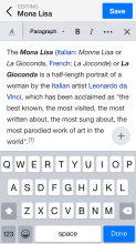
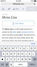
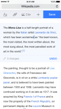
Normal editing flow, there are no changes done to this article yet. save is disabled and undo is not visible. cursor is visible and keyboard is up

Keyboard-normal-editing.png (1×750 px, 155 KB)

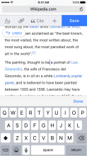
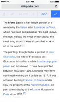
After making any change to the document undo will show up as a floating button. and save will be enabled

keyboard up- edited-undo.png (1×750 px, 195 KB)

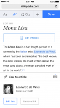
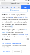
After clicking any link, first the Context Panel will pop from the bottom, and then if you want to edit the "text of" link there is a button on right top of the panel that will bring back the keyboard

link panel.png (1×750 px, 145 KB)

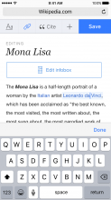
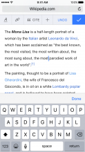
if you click on the keyboard pop button mentioned above -

keyboard up link.png (1×750 px, 157 KB)

Citation panel similar to link panel.

citation panel.png (1×750 px, 154 KB)

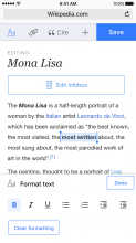
Format panel similar to link panel

format panel.png (1×750 px, 126 KB)

Some quick thoughts:

  • no change toolbar; drop the title, switch and replace with save
  • context replaces keyboard as a block panel (focus loss); first option for links and other rich annotations, as well as for blocks e.g. formula
  • context dismisses to be replaced by keyboard (focus gain)
  • replace drop-down toolbar menus with a tray menu from bottom of screen (and focus loss)
  • save button is now a tray menu with save/switch/cancel
  • ? undo button somehow, design TBD
  • ? smaller design, tweak sizes down a bit
  • ? lighter design

@Jdforrester-WMF

here are the iterated designs for smaller toolbar with undo in it.

Keyboard up

keyboard-up.png (1×750 px, 178 KB)

Keyboard down

keyboard-down.png (1×750 px, 171 KB)

Also if you can add

  • collapse info box for better editing (as shown in the earlier mock ups)

I wanted to capture some ideas we had in former discussions about undo:

  • Revert modifications in a paragraph. When content on a paragraph is modified, the paragraph is highlighted in some way (e.g., a line on the left side along the paragraph being blue for modifications and red to indicate a whole paragraph is missing). That will help with navigation: the user to move around the content and easily go back to where they were editing before. If the user acts on these indicators, the user is shown what was changed in the paragraph and can undo the changes (all of them or individually). This is helpful to isolate the corrections based on content. For example, if I rewrote a sentence in paragraph 1, and added the same idea in its own paragraph, I can easily restore the original sentence in paragraph 1 without losing the new content. This is not possible with a linear undo model without copy and paste operations which are hard on mobile.
  • Navigate the history of changes. We can think of undo as the access to the list of editing changes. When the user access it, a timeline-like panel can be shown at the bottom of the page (with a compact representation of the actions and how much the content was changed). Even though the default would be to move one step back, the user can swipe to move through it and preview how much to undo. This keeps the linear model of Undo but provides more predictability and control (at the expense of adding another panel/mode which we need to make sure it does not become intrusive).

Revert modifications in a paragraph

I had worked on that too, but it's very difficult to implement this as we don't have revisions by the paragraph

undo.png (1×750 px, 183 KB)

Removing Design-Research-Backlog

@Capt_Swing and @dchen to raise in next instance of regular Design Research/Editing checkpoint meeting

Jdforrester-WMF changed the task status from Open to Stalled.Jun 29 2016, 4:30 PM
Aklapper added a subscriber: Nirzar.

Removing @Nirzar as assignee, as that account has been disabled.

@ppelberg should this task be closed? Pretty old school.

@ppelberg should this task be closed? Pretty old school.

Thanks for surfacing, Jon. Yep – let's do it.

Note: the ideas and conversations in this ticket helped inform the enhancements the Editing-team made this past year to the mobile VisualEditor. See: "Active initiatives"

ppelberg claimed this task.