In 2024, we are already seeing a very conscious move towards much warmer, richer colors in our interior. It comes from that need to be comforted and cocooned in our interiors. A safe space that is warm, comforting and makes us feel calm.
Grey washing our interiors is totally out. Now, where neutrals are concerned, it’s all about leaning towards more modern, warmer neutrals, with green reigning supreme and touches of blue on the rise.
Brown is already carving out a huge space in our interior color schemes, and it looks amazing. I’ve rounded up some of the most on-trend Sherwin Williams paint colors for 2024 to inspire your next decorating project.
On-trend Sherwin Williams Paint Colors For 2024
Neutrals
Grays aren’t as trendy as they used to be, and there is an incessant lean towards richer, warmer neutrals that are soft and calming for our interior. Here are some of the best neutral paint colors from Sherwin Williams.
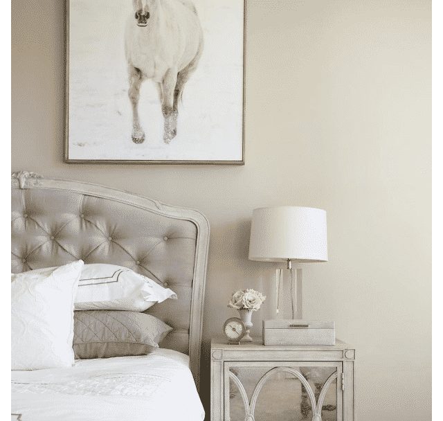
Accessible Beige
This is a much loved beige from Sherwin Williams and unlike most beiges which have a yellow undertone, this one has a gray undertone which gives a warm feel without it feeling yellowy in the space.
The beauty of this color is that it works well in any space no matter the orientation of the room. Pair with an earthy color scheme for a really comforting scheme. Introduce green tones, browns and black accents for added definition.

Wordly Gray
Whilst traditional cool grays are out, warmer grays are in, and Worldly Gray is one of my favorites!
This warm gray is a refreshing alternative to a beige yet is versatile for any room in the home. It pairs well both with a cool color scheme, or warm, earthy shades.

Aesthetic White
If you’re looking for an off white that’s not clinical or too yellow toned, this subtle violet undertoned white is the perfect choice for a neutral color scheme.
It provides a peaceful backdrop for bedrooms and beyond and looks great in farmhouse, minimalist and modern interior decor schemes.

Greens
Sage green has been rising in popularity in the last couple of years, but greens in general are just one of the most popular choices for a color scheme as green is easy on the eye and it connects us to the natural world. Here are some of the best green colors for 2024 by Sherwin Williams.
Soft Sage
In my opinion, soft sage is one of those perfect, timeless sage green colors. It is perfectly muted, has a gorgeous pigment and is the perfect basis for a calming color scheme.
Whether you choose to combine with neutrals or other earthy colors, this shade is restorative and a firm green staple in my projects.

Sage Green Light
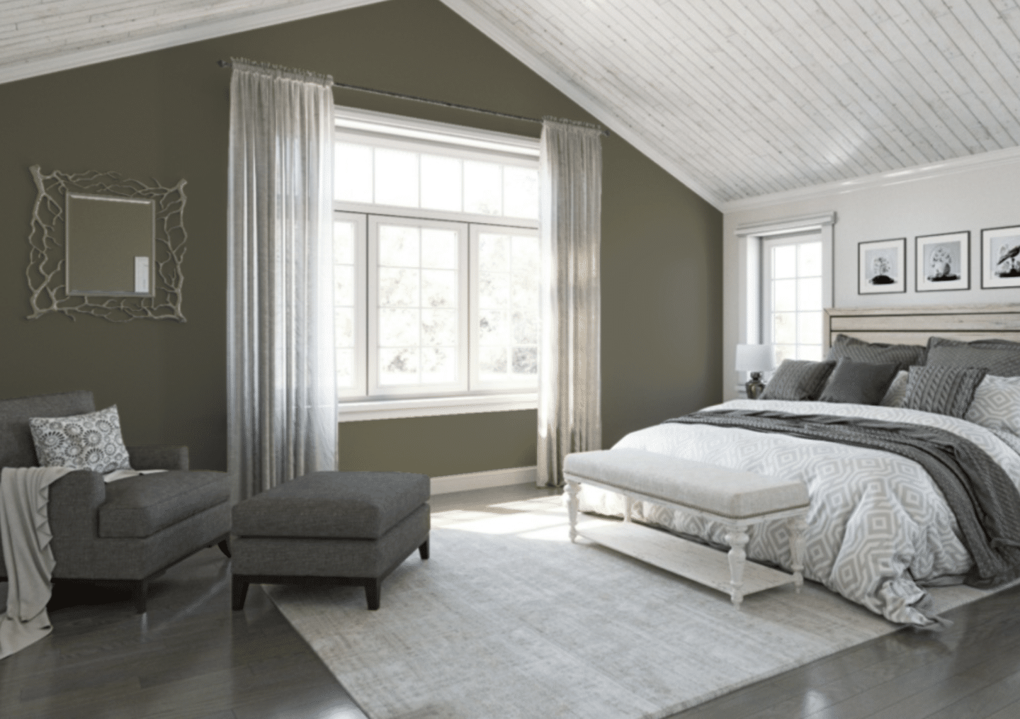
Richer, warmer greens are on the rise this year and it’s always good to have a staple olive green ready to go.
Sage Green Light is the perfect earthy shade. It looks amazing on a feature wall as shown below, on half wall paneling or color drenching a space.

Evergreen Fog
This versatile green is one of the most popular green colors from Sherwin Williams. The color takes on a metamorphic quality in different lights as it has a green meets gray look with a tiny undertone of blue.
A perfect mid range green which isn’t necessarily a sage or olive green shade. It sits perfectly with browns, creams and warm terracottas in a color scheme.

Reds
Like it or hate it, deep, rich reds are working their way into interiors in 2024. These deep, rouge shades are great for making a statement. Pairing well in earthy color schemes, or as an accent wall feature in a more neutral interior.
Sundried Tomato
This is a dynamic red with a real rich and earthy demeanour to it. It is one of the best Sherwin Williams deep reds which doesn’t have a primary color feel to it.
It’s decadent, rich and looks great color drenching a cozy space, or using as an accent wall feature in an entryway or bedroom.

Rojo Dust
The want for earthy colors is still ever popular, and warm terracottas are here to stay. They can be a more comfortable alternative if you find deep reds a little bit too dramatic for your space.
Rojo Dust is the perfect warm terracotta shade for smaller spaces.

Malted Milk
If you want a more modern neutral with a reddish undertone, Malted Milk is full of warmth and natural elegance. Whilst it’s a reddish pink, it doesn’t feel overly feminine.
It brings an uplifting look to any room in an interior.

Browns
From my own interior perspective and seeing the UK and US paint launches for the year, browns are the new beige. They are indulgent, rich, warm and you can create your own beautiful color story with them.
They lend themselves perfectly to an earthy color scheme, are perfect as a defining alternative to black, yet they add a modern warmth that is beautiful and cozy. Here are some of the best shades to lean into this year.
Redend Point
The paint color of the year from Sherwin Williams and a total precursor of the types of paint colors popular in 2024.
Redend Point is a medium toned brown with rosy and orange colored undertones. A super cozy tone that is rich and indulgent.
Use on a gorgeous half wall paneling look as shown below, or color drench a cozy cinema room or living room to really benefit from its cocooning effects. I would pair with green tones, creams and warm natural materials such as wood and rattan.

Threshold Taupe
Lighter tonal shades of brown are just as good for an interior. If you’re looking for an alternative to beige but still want a neutral color scheme, this light brown come taupe is such a stunning choice.
Pair with darker shades of brown through textiles for a really cozy, layered space.

Blues
Blue should always be seen in an interior and you don’t have to have a coastal interior scheme to get the most out of this color. Whether you lean into navy blue or more coastal inspired shades, they add a refreshing uplift to a space.
Aleutian
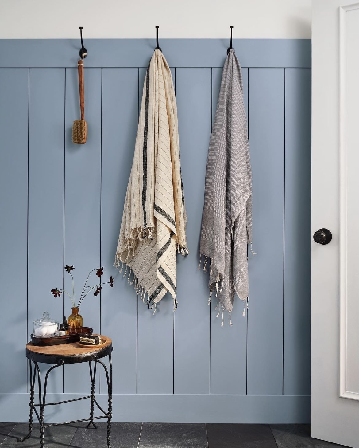
This cool denim shade is understated, definitely yet brings an on-trend look to bathrooms and beyond.
This mature shade of blue is calming and restorative, a great alternative to a sage green. I adore it paired with cool whites, creams, natural materials and a black for a defining color that pulls a space together.

Sea Mariner
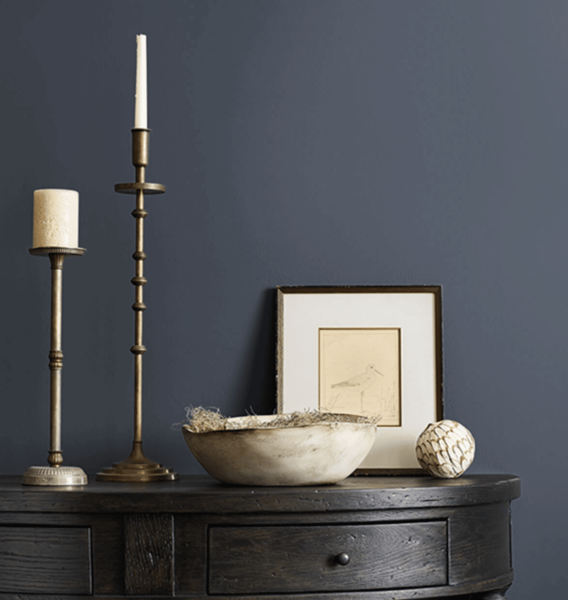
If you want to bring a defining shade to your color scheme, an inky dark blue can be a more refreshing alternative to black as it doesn’t appear as a flat color in different lights.
This is on-trend and perfect for zoning spaces, creating an accent wall or color drenching a room.

Which Sherwin Williams colors are you hoping to use this year? If you have any questions about pairing colors together, please leave me a comment below and I’ll come straight back with my recommendations! Save or pin the below image down for later!

