Final layout plans
- 1. Final Layout Plans Whilst we were producing our magazines, we found that many of the layout ideas we had planned didn’t quite work. So we rearranged the layout and these are our ideas.
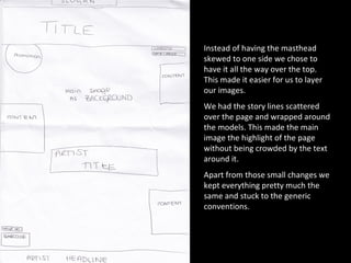
- 2. Instead of having the masthead skewed to one side we chose to have it all the way over the top. This made it easier for us to layer our images. We had the story lines scattered over the page and wrapped around the models. This made the main image the highlight of the page without being crowded by the text around it. Apart from those small changes we kept everything pretty much the same and stuck to the generic conventions.
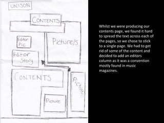
- 3. Whilst we were producing our contents page, we found it hard to spread the text across each of the pages, so we chose to stick to a single page. We had to get rid of some of the content and decided to add an editors column as it was a convention mostly found in music magazines.
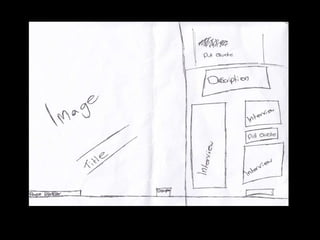
- 4. Jasmine Holmes-Parker Double page layout design
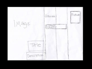
- 6. Charlotte McCaffrey Double page layout design
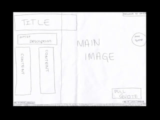
- 8. Natalie Bwete Double page layout design