Immigrants from Yemen vs Black/African American Single Mother Poverty
COMPARE
Immigrants from Yemen
Black/African American
Single Mother Poverty
Single Mother Poverty Comparison
Immigrants from Yemen
Blacks/African Americans
38.5%
SINGLE MOTHER POVERTY
0.0/ 100
METRIC RATING
337th/ 347
METRIC RANK
35.2%
SINGLE MOTHER POVERTY
0.0/ 100
METRIC RATING
322nd/ 347
METRIC RANK
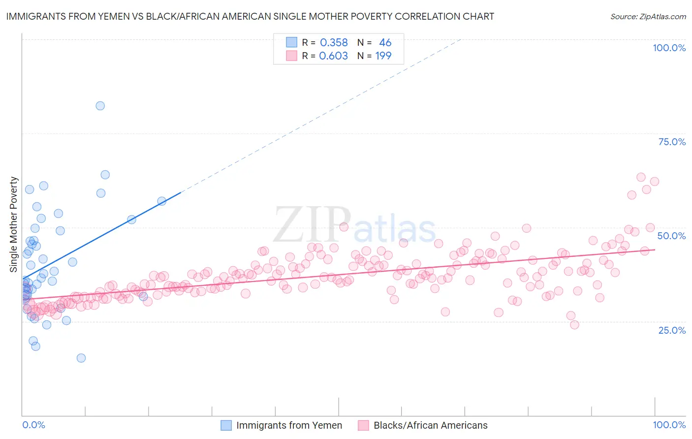
Immigrants from Yemen vs Black/African American Single Mother Poverty Correlation Chart
The statistical analysis conducted on geographies consisting of 82,094,093 people shows a mild positive correlation between the proportion of Immigrants from Yemen and poverty level among single mothers in the United States with a correlation coefficient (R) of 0.358 and weighted average of 38.5%. Similarly, the statistical analysis conducted on geographies consisting of 541,579,434 people shows a significant positive correlation between the proportion of Blacks/African Americans and poverty level among single mothers in the United States with a correlation coefficient (R) of 0.603 and weighted average of 35.2%, a difference of 9.4%.
Single Mother Poverty Correlation Summary
| Measurement | Immigrants from Yemen | Black/African American |
| Minimum | 15.2% | 24.1% |
| Maximum | 82.4% | 63.3% |
| Range | 67.2% | 39.2% |
| Mean | 40.2% | 37.4% |
| Median | 37.0% | 36.8% |
| Interquartile 25% (IQ1) | 31.9% | 33.1% |
| Interquartile 75% (IQ3) | 49.1% | 41.1% |
| Interquartile Range (IQR) | 17.3% | 8.0% |
| Standard Deviation (Sample) | 13.5% | 6.3% |
| Standard Deviation (Population) | 13.3% | 6.3% |
Demographics Similar to Immigrants from Yemen and Blacks/African Americans by Single Mother Poverty
In terms of single mother poverty, the demographic groups most similar to Immigrants from Yemen are Cheyenne (38.5%, a difference of 0.040%), Pima (38.6%, a difference of 0.21%), Crow (38.6%, a difference of 0.30%), Yuman (37.8%, a difference of 2.0%), and Pueblo (37.2%, a difference of 3.5%). Similarly, the demographic groups most similar to Blacks/African Americans are Paiute (35.1%, a difference of 0.20%), Kiowa (35.5%, a difference of 0.71%), Ottawa (35.5%, a difference of 0.92%), Iroquois (34.8%, a difference of 1.1%), and Chippewa (34.8%, a difference of 1.3%).
| Demographics | Rating | Rank | Single Mother Poverty |
| Chippewa | 0.0 /100 | #319 | Tragic 34.8% |
| Iroquois | 0.0 /100 | #320 | Tragic 34.8% |
| Paiute | 0.0 /100 | #321 | Tragic 35.1% |
| Blacks/African Americans | 0.0 /100 | #322 | Tragic 35.2% |
| Kiowa | 0.0 /100 | #323 | Tragic 35.5% |
| Ottawa | 0.0 /100 | #324 | Tragic 35.5% |
| Ute | 0.0 /100 | #325 | Tragic 35.7% |
| Seminole | 0.0 /100 | #326 | Tragic 35.8% |
| Yakama | 0.0 /100 | #327 | Tragic 36.4% |
| Choctaw | 0.0 /100 | #328 | Tragic 36.4% |
| Apache | 0.0 /100 | #329 | Tragic 36.6% |
| Natives/Alaskans | 0.0 /100 | #330 | Tragic 36.6% |
| Creek | 0.0 /100 | #331 | Tragic 36.7% |
| Dutch West Indians | 0.0 /100 | #332 | Tragic 36.8% |
| Menominee | 0.0 /100 | #333 | Tragic 37.1% |
| Pueblo | 0.0 /100 | #334 | Tragic 37.2% |
| Yuman | 0.0 /100 | #335 | Tragic 37.8% |
| Cheyenne | 0.0 /100 | #336 | Tragic 38.5% |
| Immigrants | Yemen | 0.0 /100 | #337 | Tragic 38.5% |
| Pima | 0.0 /100 | #338 | Tragic 38.6% |
| Crow | 0.0 /100 | #339 | Tragic 38.6% |