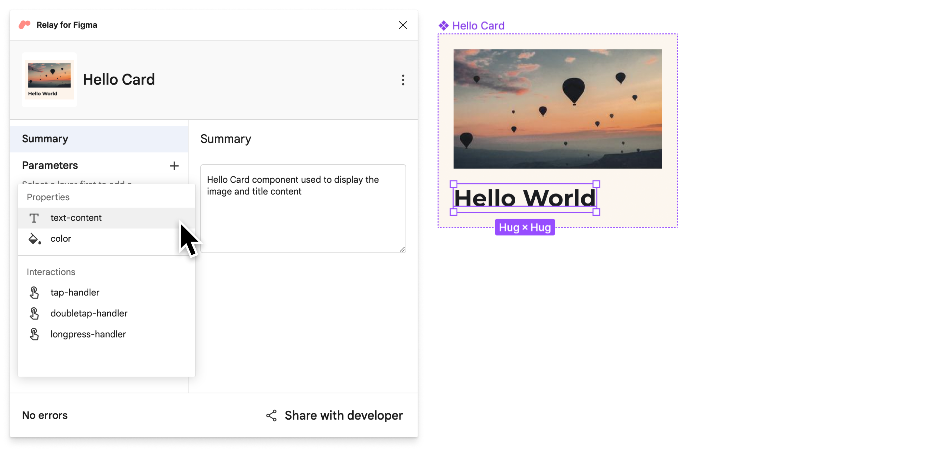
When implemented, the content of most components is not static — it changes depending on the data that is provided to a component. To reflect this in your designs, you can use content parameters. Content parameters let you specify which part of a design contains data, without hardcoding the actual data.

Add a content parameter
In your Figma file, select the component and open the Relay for Figma plugin (Plugins > Relay for Figma).

In the main Figma window, select the Title layer with ⌘ + click on Mac, or Ctrl + click on Windows and Linux. Then, in the plugin, click + next to “Parameters” and select text-content to add a parameter for the layer.

To change the name of the Title text content parameter, enter it in Name. For this tutorial, enter Title.

Besides editing the name, you can select different property types, or add a description to generate a comment in code. Work with your developers to find the most suitable naming scheme. The names of the content parameters translate to the names of the parameters in the generated composable.
Save named version
Let’s now mark this version as ready to be imported into code.
- Open the Figma Relay plugin, if not already open.
- Click Share with developer.
On the Share with developer screen, enter a name and description for the version.
Example Title: Hello World Card V3
Example Description: Added parameters
Update the component in Android Studio
Let’s update the component in Android Studio.
In Android Studio, make sure the Project tool window is in Android view. Then, right-click on
app/ui-packages/hello_card/, and click Update UI Package.
Click on
 to build your project again.
If you open
app/java/com/example/hellofigma/hellocard/HelloCard.kt, you’ll notice that a parameter has been added:title. The name of the parameter is the name of the content parameter that we specified in Figma:
Open
app/java/com/example/hellofigma/MainActivity.kt.Change one line in the
MainActivityclass to add a value to thetitleparameter:class MainActivity : ComponentActivity() { override fun onCreate(savedInstanceState: Bundle?) { super.onCreate(savedInstanceState) setContent { HelloFigmaTheme { // A surface container using the 'background' color from the theme Surface(color = MaterialTheme.colors.background) { HelloCard(title="Balloon World!") // Change this line } } } } }Further down in the same file, in the composable’s preview, change one line:
@Preview(showBackground = true)
@Composable
fun DefaultPreview() {
    HelloFigmaTheme {
        HelloCard(title="Balloon World!") // Change this line
    }
}
Build your project again, and see the updated component in the preview! Note that the new parameter value is now visible.

Run the app to see the same updates in the emulator.
Hooray! You've learned the basics of the Relay workflow.
Next step
That concludes the basic tutorial. While you have seen many of the features of the Relay workflow, there are several other features available. If you're interested in learning how to use features like interaction handlers, working with components that have multiple Figma variants and more, jump in to the advanced tutorial!
Recommended for you
- Note: link text is displayed when JavaScript is off
- Convert the designs to code in Android Studio
- Make and propagate design updates
- Compose layout basics
