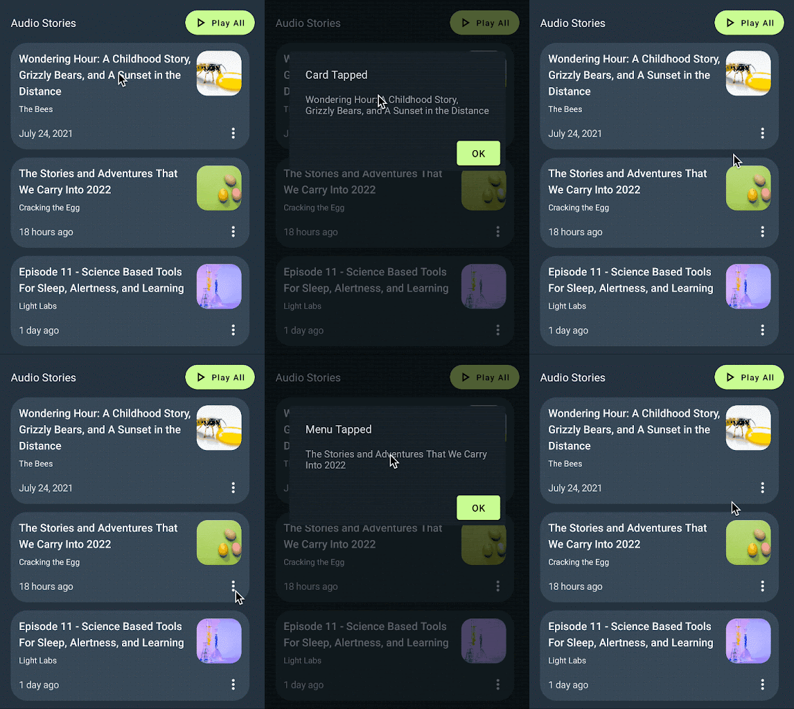
In this section, we will learn how to add interactions to our design via interaction handlers.

Interaction handlers provide a way to specify where a component can be interacted with (tapped, double tapped, etc.). Interaction handlers can be added to any layer inside of a design.
Add handlers
Interaction handlers can be added to any layer. This allows designers to specify which parts of the component are interactive.
Select the hero-item variant (the frame), click + next to the Parameter and select
tap-handlerto add an interaction handler. This allows developers to write code that reacts to a user tapping on the card.
Repeat the previous step with the menu icon layer in the audio-item variant. This allows developers to display a menu when a user taps on the menu icon.

If you select the on Menu tapped handler, you'll notice that it only applies to the audio-item variant, because the other variants don't have a menu icon. However, the on NewsCard tapped applies to all three variants. This means that you can supply one handler (in code) to run when any of the three variants are tapped, removing duplication of code and parameters. We'll see how that works in more detail in the following Update component in Android Studio section.

Save named version
Let’s now mark this version as ready to be imported into code.
Open the Figma Relay plugin, if not already open.
Click Share with developer in the lower right-hand corner of the dialog.
On the Share with developer screen, enter a name and description for the version.
Example Title: Added Interactions
Example Description: Two interaction handlers added to cards
Click Save.
Press CMD-L on a MAC, CTRL-L on Windows to copy the component link to the clipboard.
Update component in Android Studio
Let’s now update the NewsCard component:
In Android Studio, make sure the Project tool window is in Android view. Then right-click on
app/ui-packages/news_card/, and near the bottom of the context menu, click Update UI Package.
Click
 to build your project. This takes the updated UI Package and
generates an updated version of the composable code.
Look at
app/java/com/example/hellonews/newscard/NewsCard.ktand see that the interaction handlers are added as parameters to NewsCard (onNewsCardTapped,onMenuTapped).// Design to select for NewsCard enum class View { HeroItem, ArticleItem, AudioItem } /** * Displays a summary of a news article. * * This composable was generated from the UI package 'news_card'. * Generated code; do not edit directly */ @Composable fun NewsCard( modifier: Modifier = Modifier, view: View = View.HeroItem, thumbnail: Painter = EmptyPainter(), headline: String = "", author: String = "", date: String = "", onNewsCardTapped: () -> Unit = {}, onMenuTapped: () -> Unit = {} ) { ...
Integrate into app
Now let's add some handlers to our interactions.
In
app/java/com/example/hellonews/ui/home/HomeScreen.kt, scroll down toPostListArticleStories, around line 175.... @Composable fun HomeScreen(...) @Composable private fun PostList(...) @Composable private fun PostListArticleStoriesSection(...) @Composable private fun SearchArticlesSection(...) @Composable private fun PostListArticleStories( postTop: Post, posts: List<Post>, createOnTapped: (String, String) -> () -> Unit ) {...} @Composable private fun AudioStoriesTitle(...) @Composable private fun PostListAudioStories(...) @Composable fun Dialog(...) ...For
postTop, add handlers foronNewsCardTapped.createOnTappedopens a dialog with its parameters as the title and body.@Composable private fun PostListArticleStories( postTop: Post, posts: List<Post>, createOnTapped: (String, String) -> () -> Unit ) { ... Column( horizontalAlignment = Alignment.Start, modifier = ... ) { Spacer(modifier = Modifier.size(12.dp)) NewsCard( thumbnail = painterResource(postTop.imageId), headline = postTop.title, author = postTop.metadata.author.name, date = postTop.metadata.date, onNewsCardTapped = createOnTapped("Card Tapped", postTop.title), view = View.HeroItem ) Spacer(modifier = Modifier.size(12.dp)) ... } }For each post, add handlers for
onNewsCardTapped.@Composable private fun PostListArticleStories( postTop: Post, posts: List<Post>, createOnTapped: (String, String) -> () -> Unit ) { ... Column( horizontalAlignment = Alignment.Start, modifier = ... ) { ... posts.forEach { post -> NewsCard( thumbnail = painterResource(post.imageId), headline = post.title, author = post.metadata.author.name, date = post.metadata.date, onNewsCardTapped = createOnTapped("Card Tapped", post.title), view = View.ArticleItem ) Spacer(modifier = Modifier.size(12.dp)) } } }Still in
HomeScreen.kt, scroll down toPostListAudioStories, around line 260.... @Composable fun HomeScreen(...) @Composable private fun PostList(...) @Composable private fun PostListArticleStoriesSection(...) @Composable private fun SearchArticlesSection(...) @Composable private fun PostListArticleStories(...) @Composable private fun AudioStoriesTitle(...) @Composable private fun PostListAudioStories( posts: List<Post>, createOnTapped: (String, String) -> () -> Unit ) {...} @Composable fun Dialog(...) ...For each post, add handlers for
onNewsCardTapped. Since the Audio variant has a menu, assigncreateOnTappedtoonMenuTapped.@Composable private fun PostListAudioStories( posts: List<Post>, createOnTapped: (String, String) -> () -> Unit ) { Column( horizontalAlignment = ..., modifier = ... ) { posts.forEach { post -> NewsCard( thumbnail = painterResource(post.imageId), headline = post.title, author = post.metadata.author.name, date = post.metadata.date, onNewsCardTapped = createOnTapped("Card Tapped", post.title), onMenuTapped = createOnTapped("Menu Tapped", post.title), view = View.AudioItem ) Spacer(modifier = Modifier.size(12.dp)) } } }Click ▶ to build the app and run it in the emulator.


Hooray! You've learned the advanced features of Relay.
You can learn more about how to work with Relay in the Relay Workflow section. We'd also love to hear from you if you have any feedback.
Recommended for you
- Note: link text is displayed when JavaScript is off
- Content parameters
- Handling design variants
